SHI 11.13.19 King Consumer

SHI 11.6.19 – Sputtering Along on 5-Cylinders
November 6, 2019
SHI 11.20.19 A Tasty Visit to The Big Mac Index
November 20, 2019
“We would be in deep yogurt if ‘King Consumer’ stopped spending.”
Fortunately, this is one worry our consumption-fueled economy doesn’t have. Because the American consumer continues to spend…as the latest GDP reading demonstrated.
Of course, consumer spending requires money — whether earned or borrowed — and King Consumer continues to play his/her part. The growing civilian labor force (albeit slowly growing) combined with an ever increasing average hourly wage (albeit slowly increasing) fuels the “earned” component. What the consumer doesn’t earn, he/she borrows in order to keep spending. According the the most recent tally from the NY FED, consumer debt has increased once again in the most recent calendar quarter. In fact, total household debt increased by $92 billion, up to a total of $13.95 trillion, in the 3rd quarter of 2019. How does this compare to the prior peak borrowing number at the end of 2008?
The consumer now owes $1.3 trillion more than at the end of 2008. That’s almost 10% more debt. Hmmm….should we be worried?
Welcome to this week’s Steak House Index update.
If you are new to my blog, or you need a refresher on the SHI10, or its objective and methodology, I suggest you open and read the original BLOG: https://www.steakhouseindex.com/move-over-big-mac-index-here-comes-the-steak-house-index/
Why You Should Care: The US economy and US dollar are the bedrock of the world’s economy. This has been the case for decades … and will be true for years to come.
But is the US economy expanding or contracting?
According to the IMF (the ‘International Monetary Fund’), the world’s annual GDP is about $85 trillion today. According to the most recent estimate, US ‘current dollar’ GDP now exceeds $21.53 trillion. In Q3 of 2019, nominal GDP grew by 3.5%, following a 4.7% annualized growth rate in Q2. The US still produces about 25% of global GDP. Other than China — in a distant ‘second place’ at around $13 trillion — the GDP of no other country is close. The GDP output of the 28 countries of the European Union collectively approximates US GDP. So, together, the U.S., the EU and China generate about 70% of the global economic output.
The objective of this blog is singular.
It attempts to predict the direction of our GDP ahead of official economic releases. Historically, ‘personal consumption expenditures,’ or PCE, has been the largest component of US GDP growth — typically about 2/3 of all GDP growth. In fact, the majority of all GDP increases (or declines) usually results from (increases or decreases in) consumer spending. Consumer spending is clearly a critical financial metric. In all likelihood, the most important financial metric. The Steak House Index focuses right here … on the “consumer spending” metric. I intend the SHI10 is to be predictive, anticipating where the economy is going – not where it’s been.
Taking action: Keep up with this weekly BLOG update. Not only will we cover the SHI and SHI10, but we’ll explore related items of economic importance.
If the SHI10 index moves appreciably -– either showing massive improvement or significant declines –- indicating growing economic strength or a potential recession, we’ll discuss possible actions at that time.
The BLOG:
Should we be worried? It’s a question worth asking. And investigating. Because many believe excessive consumer debt was the primary cause of ‘The Great Recession’ of 2008. Could excessive debt levels trigger another recession?
Make no mistake: The US economy, and our economic growth, requires that the consumer keep spending. This is fundamental. Without spending growth, GDP growth may falter, sending the US economy into a recession. But if the consumer borrows excessively in order to fuel that growth, this action could also trigger a recession. Let’s dig deeper and see if we should be concerned.
Take a look at the chart below. These four (4) debt groups — the ‘non-housing’ debt groups — fuel consumer spending. We’ll ignore the “Other” category, since we see almost no change in the past decade. And while the increase in “Student Loan” debt is staggering, that’s another story for another day. One could argue student loan debt does fuel our consumer economy, but the student loan spending is more an indirect benefit to the economy than direct.
For now, let’s look at the “Credit Card” and “Auto Loan” debt categories on the chart.
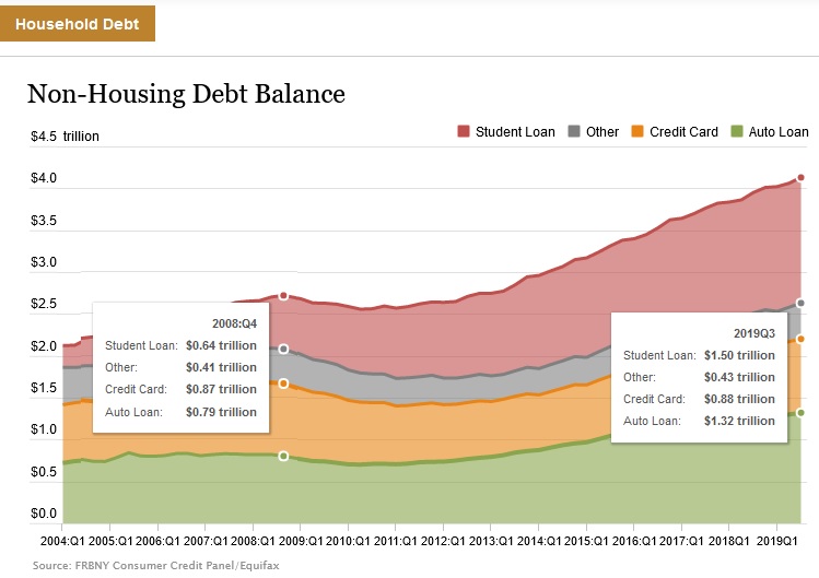
At the end of 2008, credit card debt totaled $0.87 trillion — today, that number tips the scales at $0.88 trillion. This level is almost unchanged from 2008. Auto loans balances, on the other hand, have changed dramatically: At the end of 2008, auto debt totaled $0.79 trillion — today, that number tips the scales at $1.32 trillion. This is a 67% increase in just over 10 years. Wow. The average cost o f a new car is currently $37,285, per Kelley’s Blue Book. According to the ‘MarkLines’ flash auto report, for the first 10-months of the year, a bit over 4.15 million new passenger cars were sold. That’s almost $155 billion worth of cars! In 10 months. And every one of those cars was filled to to the brim with components and equipment. Passenger car sales are down this year, by about 9.9%, but folks are still buying a whole bunch of cars!
It’s pretty clear from the chart that the Federal Reserve Board closely monitors consumer debt increases. But this metric, alone, does not tell the entire story. The other very important part is whether or not the monthly cost to “carry” this debt load has increased or decreased. In other words, what percentage of the consumer’s income is needed to make the payments on consumer debt? Has this increased since the end of 2008…along with the increased debt levels? To understand this issue, and dig into the data, we need to look at a FED report entitled, “Household Debt Service and Financial Obligations Ratio.”
The answer is no. In fact, the percentage of income needed to cover debt payments has shrunk.
At the end of Q4, 2008, the ‘financial obligations ratio’ was 17.87%. Meaning it took just under 18% of the consumer’s ‘disposable income’ to make the monthly payments on all their debt at the end of 2008. Focusing more precisely on the ‘debt service ratio’ for consumer debt alone, we see the consumer spent 5.86% of his/her disposable income on debt payments at the end of 2008. What are those percentages now?
At the end of Q4, 2008, the ‘financial obligations ratio’ was 15.03%. Meaning today our consumer has to pay about 15% of his/her ‘disposable income’ to make monthly payments on all debt — including housing debt. The ‘debt service ratio’ for consumer debt alone, as of Q3, 2019, was down slightly, at 5.56% of disposable income. Even with increased consumer debt levels, the cost of servicing that debt is lower today than at the end of 2008.
How can that be, you might ask? How can the debt load be higher … yet the payments are lower? Interest rates. Rates are down across the board. At lower rates, the consumer can shoulder more debt. Low rates, essentially, are fueling consumer spending which, in turn, is supporting GDP growth. Interesting, right? 🙂
In summary, it’s worth mentioning that the $1.3 trillion debt increase since 2008 can be attributed almost entirely to student loan and auto debt level increases. About $800 billion in student debt … and about $500 billion in new auto loans. Credit card debt levels are almost unchanged. So, while the “student debt thing” is worrisome, and has created a whole host of related problems, student debt is probably not an existential threat to our economy. Auto loans do create some challenges. However, most of these loans have fixed rates. They are not variable. And at the super-low fixed rates offered by banks today, the consumer seems to be shouldering the payments adequately. No, today’s lofty consumer debt level does not pose a threat to our continued economic growth.
If you’re interested in the methodology and underlying data, here’s the FRB commentary, complete with hyperlinks:
“To create the measure, payments are calculated separately for revolving debt and for each type of closed-end debt, and the sum of these payments is divided by disposable personal income as reported in the National Income and Product Accounts. For revolving debt, the assumed required minimum payment is 2-1/2 percent of the balance per month. This estimate is based on the January 1999 Senior Loan Officer Opinion Survey, in which most banks indicated that required monthly minimum payments on credit cards ranged between 2 percent and 3 percent, a ratio that apparently had not changed substantially over the previous decade. Payments on closed-end loans, which are calculated for each major category of closed-end loan, are derived from the loan amount outstanding, the average interest rate, and the average remaining maturity on the stock of outstanding debt. Estimates of the amount of mortgage debt are taken from the Federal Reserve Board’s Z.1 Financial Accounts of the United States statistical release, and estimates of outstanding consumer debt are taken from the Federal Reserve’s G.19 Consumer Credit statistical release. For consumer debt, a more detailed breakdown by type of closed-end loan is obtained using internal Federal Reserve estimates and data from the Federal Reserve’s Survey of Consumer Finances (SCF). Interest rates on closed-end consumer loans are obtained from the Federal Reserve Board’s G.19 Consumer Credit and G.20 Finance Companies statistical releases, the SCF, and additional proprietary data sources. An estimate of the interest rate on the stock of outstanding debt is obtained by weighting the recent history of interest rates using information on the age of outstanding loans in the SCF. The interest rate on the stock of outstanding mortgage debt is an estimate provided by the Bureau of Economic Analysis. Maturity series for consumer debt are taken from the SCF. Maturity series for mortgage debt are calculated using data from Lender Processing Services and Mortgage Bankers Association. The Financial Obligations Ratio is a broader measure than the Debt Service Ratio. It includes rent payments on tenant-occupied property, auto lease payments, homeowners’ insurance, and property tax payments. These statistics are obtained from the National Income and Product Accounts.”
Now, let’s check in with the steakhouses. Here is this weeks SHI10:
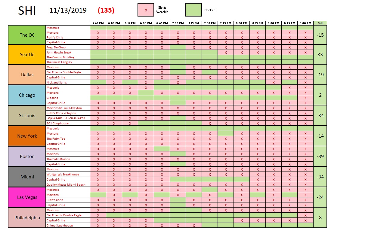
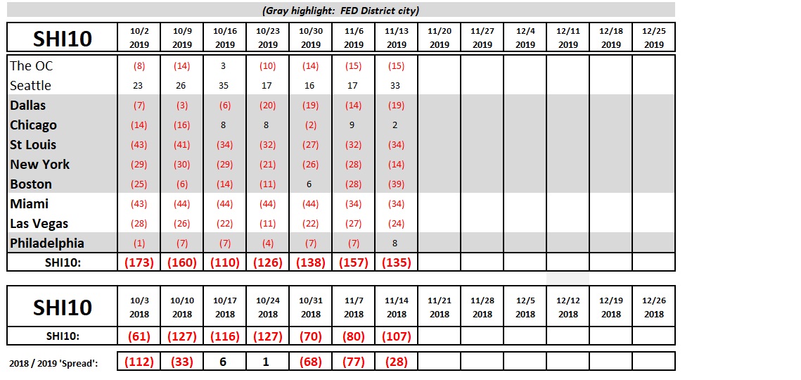
Not bad, right? As you know, a city’s SHI will be <-44> if every reservation time slot is available. This week, with an SHI of <-39> Boston is showing the weakest reservation demand in the 10 cities we track. If we weren’t also tracking Chicago, I’d suggest the weak showing might be due to weather. But that’s not it. Reservation demand in Chicago and NYC is fairly robust, weather notwithstanding. Here’s the longer term comparison chart:
We see this week’s reservation demand is reasonably strong. Our extravagant eateries are in high demand this weekend. And at the price they charge for a beautifully prepared medium rare Ribeye, a reasonably good Pomerol, and those yummy “sides,” I have no doubt our consumer and his/her table-for-4 will be putting the whole thing on plastic.
Consumer spending is fueling our GDP growth. Increasing consumer debt levels is helping, fueled by easy lending policies and low interest rates. Thus, by extension, out GDP growth is benefiting handsomely from the historic, ultra-low interest rates. Let the good times roll! 🙂
– Terry Liebman