SHI 8.28.19 – It Depends on How You Look at It

SHI 8.21.19 — Irrational Anxiety?
August 21, 2019
SHI 9.4.19 – Global Government Debt
September 4, 2019
“How fast is US GDP really growing? What’s the ‘real’ number?”
Truth is a precious commodity. Probably because there are so many versions.
Take US GDP growth, for example. A few weeks ago, on July 26, the Commerce Department’s ‘Bureau of Economic Analysis’ — the BEA — updated and revised a variety of previous GDP numbers. Once their report was posted, numerous news agencies, including the Wall Street Journal, Bloomberg and Reuters, reported on the updated data. And in almost every case, the media reported something like this, a quote from the Wall Street Journal:
“The White House thought it had achieved one of its goals when the Commerce Department’s initial estimates showed GDP rose 3.1% in the fourth quarter of 2018 from the same period of 2017. That figure was later revised to 3%, and now to 2.5%.”
Clearly, the Wall Street Journal would have us believe that in 2018 the US GDP grew by 2.5% over the prior year.
Yet, if one read the actual BEA report, as I did, one would see the BEA reported that 2018 GDP actually grew by 2.9% over 2017. When dealing with trillions of dollars, this small percentage difference matters. A lot. So which number is the ‘true’ number? 2.5% or 2.9%?
Welcome to this week’s Steak House Index update.
If you are new to my blog, or you need a refresher on the SHI10, or its objective and methodology, I suggest you open and read the original BLOG: https://www.steakhouseindex.com/move-over-big-mac-index-here-comes-the-steak-house-index/
Why You Should Care: The US economy and US dollar are the bedrock of the world’s economy. This has been the case for decades … and will be true for years to come.
But is the US economy expanding or contracting?
According to the IMF (the ‘International Monetary Fund’), the world’s annual GDP is about $85 trillion today. US ‘current dollar’ GDP now exceeds $21.3 trillion. In Q2 of 2019, nominal GDP grew by 4.6%. The US still produces about 25% of global GDP. Other than China — in a distant ‘second place’ at around $13 trillion — the GDP of no other country is close. The GDP output of the 28 countries of the European Union collectively approximates US GDP. So, together, the U.S., the EU and China generate about 70% of the global economic output. This is worth watching carefully, right?
The objective of the SHI10 and this blog is simple: To predict US GDP movement ahead of official economic releases — an important objective since BEA (the ‘Bureau of Economic Analysis’) gross domestic product data is outdated the day it’s released. Historically, ‘personal consumption expenditures,’ or PCE, has been the largest component of US GDP growth — typically about 2/3 of all GDP growth. In fact, the majority of all GDP increases (or declines) usually results from (increases or decreases in) consumer spending. Consumer spending is clearly a critical financial metric. In all likelihood, the most important financial metric. The Steak House Index focuses right here … on the “consumer spending” metric. I intend the SHI10 is to be predictive, anticipating where the economy is going – not where it’s been.
Taking action: Keep up with this weekly BLOG update. Not only will we cover the SHI and SHI10, but we’ll explore related items of economic importance.
If the SHI10 index moves appreciably -– either showing massive improvement or significant declines –- indicating growing economic strength or a potential recession, we’ll discuss possible actions at that time.
The BLOG:
The short answer: It depends on how you look at it. Are we comparing they year-over-year change? Or the year-over-year, measured by Q4 to Q4? Or are we measuring increased output in actual dollars, not ‘deflated’ by the GDP deflator that converts ‘nominal’ (current dollars) into ‘real’ (inflation adjusted) growth? And the difference is significant. 0.4% of $20 trillion is $80 billion. That’s a serious chunk of change by any measure.
So let’s take a look and explore the differences.
The image below, data that originated directly from from the BEA, shows the “real GDP” story. I’ve added the two red arrows. The section to the left reflects the ‘percent change from the prior year.’ So this is the year over year change. Said another way, if we took the 2018 ‘real GDP‘ number and divided it by the 2017 ‘real GDP‘ number, the result would be 1.029. Meaning the 2018 number is 2.9% higher than the 2018 number.
The section to the right reflects the change in GDP from Q4 2017 to Q4 2018. Remember: Each quarterly GDP number is ‘annualized’ to give us an annual consistent measurement metric. And so the difference between the annualized Q4 2017 number and the annualized Q4, 2018 number is 2.5%.
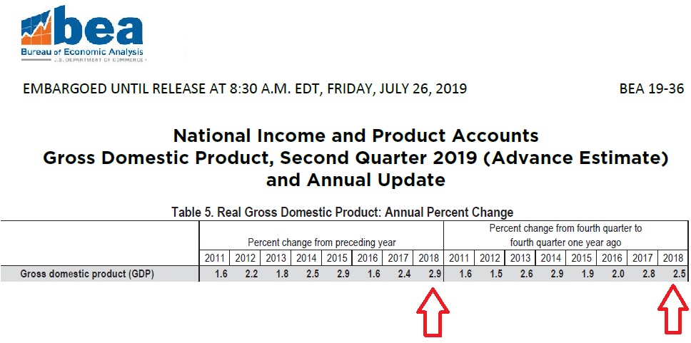
Which number is ‘right?’ Well, it depends on your viewpoint. I believe the number to the left — the 2.9% figure — is a more accurate representation of the actual 2018 change in real GDP. My opinion. But apparently just about every financial reporter out there disagrees with me. Because they trumpeted the “fact” that GDP grew by only 2.5% in 2018:
- WSJ: “Gross domestic product, a broad measure of the goods and services produced, was up 2.5% in the fourth quarter of 2018 from a year earlier, the Commerce Department reported Friday.”
- Reuters: “The department’s annual revisions to GDP data also showed the economy growing 2.5% in the 12 months through the fourth quarter of 2018, down from the previously reported 3.0%.”
- Politico: “The government says the U.S. economy grew more slowly in 2018 than it previously estimated, downgrading its estimate from 3% to 2.5%. President Donald Trump had frequently boasted of the 3% growth figure as evidence that his policies invigorated the economy.”
- Bloomberg: “Updated government figures show that gross domestic product expanded 2.5% on a fourth-quarter-over-fourth-quarter basis last year. That compares with a previous estimate of 3% and an upwardly revised 2.8% in 2017, the first year of Trump’s presidency.”
- Vanity Fair: “According to revised data from Trump’s own Commerce Department, released on Friday, the haters were right and U.S. economic growth did not hit the administration’s 2018 goal of 3% growth or higher. While the White House had initially crowed about reaching its target when it thought GDP for the fourth quarter had risen to 3.1%, on Friday that was revised to 2.5%…. Awkward!”
A few of the articles did make mention of both figures … but typically in a dismissive way. Why? Why didn’t the 2.9% growth rate get better coverage in the press? Why did the 2.5% figure see more headlines? Hmmm….. I’ll let you decide.
Here’s the point: Don’t believe everything you read. Right. You knew that. In fact, by now you’re probably questioning whether you can believe ME! Trust me. You can. I would never lie to you. 🙂
The bottom line is this: In 2018, the US ‘real’ GDP grew by 2.9% over the prior year. And since the ‘real’ GDP figure is reduced by the ‘GDP deflator’ — an inflation factor designed to convert the current-dollar GDP figure into an inflation-adjusted figure, the current dollar GDP figure is actually much, much higher. Take a look at the GDP growth story from a nominal perspective, courtesy of Moody’s Analytics.
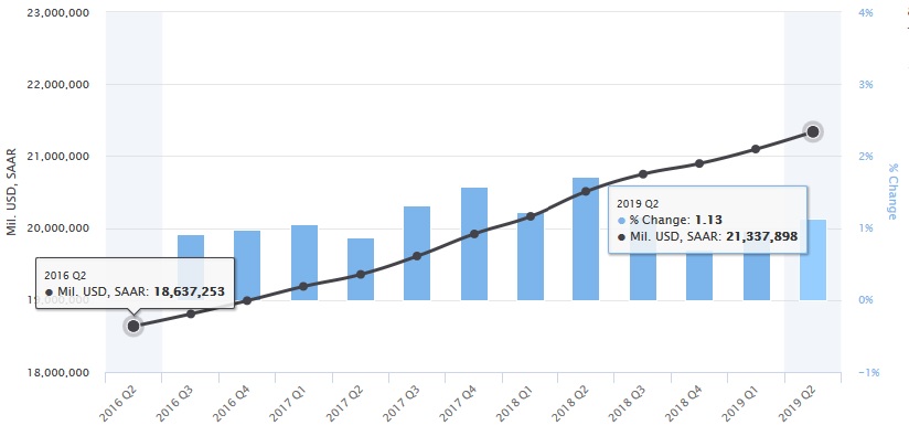
(SAAR = ‘Seasonally Adjusted Annual Rate)
In the 3-years ending with Q2, 2019, US ‘current-dollar’ GDP has increased from $18.637 trillion to $21.338 trillion. This is an almost 14.5% increase in nominal GDP in just 3 years. That’s a huge increase…in current dollar terms.
Why isn’t nominal (current-dollar) GDP the number used to measure our economy’s performance? Because policy makers have always felt this number overstates the economy’s real performance, given the fact that inflation erodes value over time. Thus, the ‘real GDP‘ number is considered to be a more accurate reflection of true economic performance. I agree this approach is probably better for measuring change. That’s how I look at it. 🙂
My only issue here is the government’s failure to consistently use of ‘inflation adjusted’ numbers in all federal metrics. I mean, if we’re adjusting GDP downward with an inflation factor, shouldn’t ALL government numbers be adjusted by the same inflation-adjusting factor? For example, consider our US national debt. There’s no doubt our national debt figures are alarming. Really alarming. But they are ‘current-dollar’ figures.
If we used the ‘GDP Deflator’ factor (index 2012=100) against the US national debt figures, we see a different story:
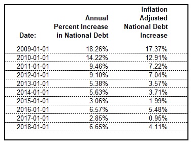
For example, above we see a 2.85% increase in US national debt in 2017. In nominal terms. If we apply the same ‘GDP Deflator’ factor used to calculate the ‘real GDP‘, we see the ‘real’ national debt increased by only .95% that year. Make no mistake, both increases are huge and disturbing. But the ‘real’ number is slightly less scary — and equally accurate. Once again, depending on how you look at it.
The same ‘inflation-indexing’ argument could be made for any other number of economic metrics, like, for example, the growth in hourly earnings. Earnings across America have been increasing — a good thing — and last year, they increased about 3%. But deflated, the ‘real’ earnings increase was closer to 2.7%.
I mention these facts only to highlight the government’s inconsistent use of inflation deflators. Just keep this in mind: Unless a government release figure is quoted as ‘real’ you should assume the number is nominal and not adjusted for inflation. Because it probably is.
Steaks on the other hand are always real, and should never be deflated or underappreciated! 🙂
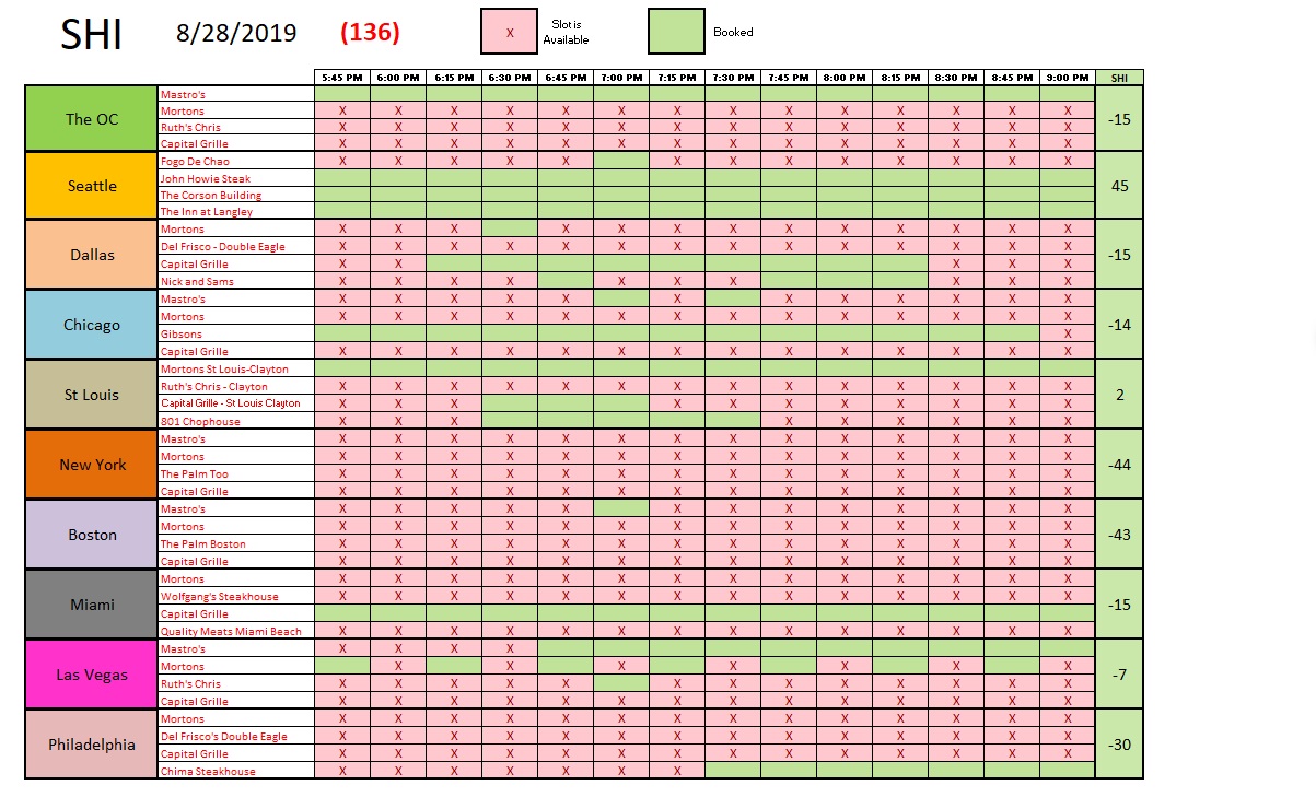
Good news! Reservations this Saturday, August 31st, at our expensive eateries are very much appreciated! Except in the ‘Big Apple.’ It’s rumored New Yorker’s have become Fruitarians. Judging by the fact that every time slot at every steakhouse we track is wide open, I’m inclined to believe the rumor!
Here is the long term trend chart:
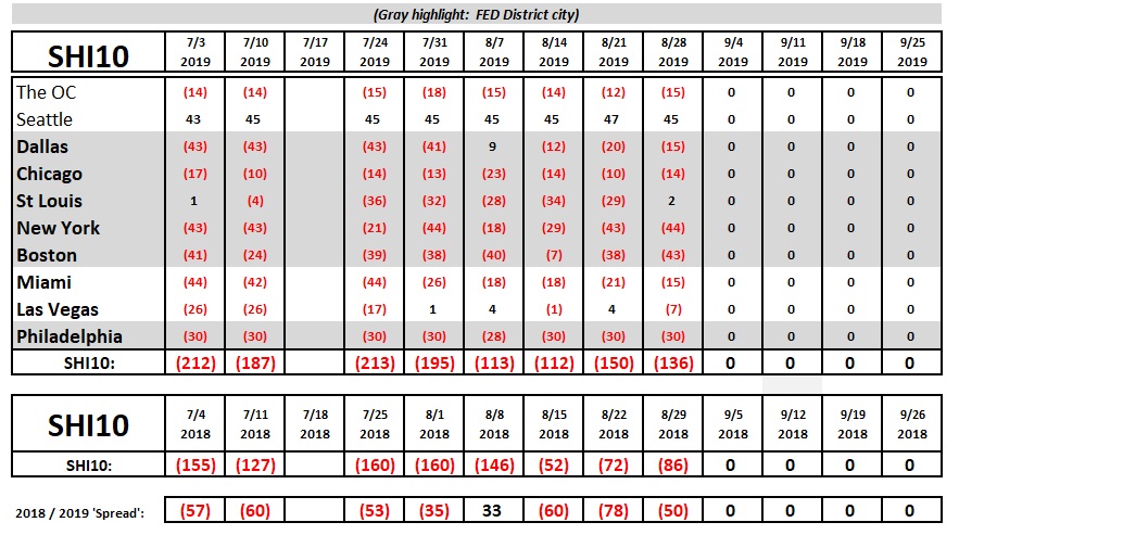
The SHI10 one year ago was 50 points better than today’s reading. But this is consistent with past trends. No change here. The bottom line: In general, consumer spending trends and consumer behavior continues to be supportive of our economic expansion. There are no signs or clear and present danger here.
In closing, permit me a brief comment on current state of the Treasury yield curve. It is definitely inverted. Big time.
Is it forecasting a recession? Or not? Once again, it depends on you look at it. Let’s take a look:
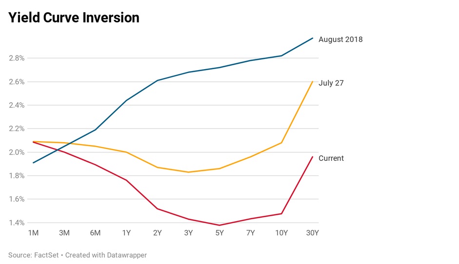
Wow. No doubt: The curve is completely inverted. It’s amazing to see that the 3-month Treasury rate is lower than the 30-year Treasury. I believe the 30-year Treasury is now at its lowest point ever.
Is a recession coming? Here are the two opposing viewpoints today.
Yes: Many economists believe the look of today’s curve is an absolute lock — a recession is coming. 100%. Why? Because a yield inversion of this magnitude, for this long, has always resulted in a recession. Every time, in the past 50 or 60 years, a US recession began within 12-18 months.
No: This ‘camp’ believes this time is different. They would tell you this inversion is resulting from external conditions — in other parts of the globe — and is not an accurate recession indicator. They believe the global debt markets are impacting the US experience. And they feel the US economy will continue chugging along.
My take? For now, our economy remains on solid footings. But do I think this will change? I’ll offer my prediction shortly. But for now, steady as she goes.
Next week I’ll be taking a deep dive into the global debt markets. I believe you’ll find the trip as fascinating as I did.
- Terry Liebman