SHI 9/6/17: Housing Redux

SHI 8/30/17: A Rising Tide …
August 30, 2017
SHI 9/13/17: Inflation Accelerates!
September 13, 2017
About 6 months ago, I suggested you buy a house. I hope you did.
Home prices continue to increase. Just as I predicted in my SHI update on March 22nd. Take a look: https://www.steakhouseindex.com/shi-update-32217-safe-houses/
Will the price increases continue? Or have we reached the peak? It’s been a while since we visited this important component of the US economy and driver of GDP. Let’s dig in.
Welcome to this week’s Steak House Index update.
As always, if you need a refresher on the SHI, or its objective and methodology, I suggest you open and read the original BLOG: https://www.steakhouseindex.com/move-over-big-mac-index-here-comes-the-steak-house-index/
Why You Should Care: The US economy and US dollar are the bedrock of the world’s economy. At present, is the US economy expanding or contracting? We need to know.
The world’s GDP is about $76 trillion. At last count, our ‘current dollar’ US GDP is now over $19 trillion — about 25% of the total. No other country is even close.
The objective of the SHI is simple: To help us predict US GDP movement ahead of official economic releases — important since BEA data is outdated the day they release it.
‘Personal consumption expenditures,’ or PCE, is the single largest component of US GDP — about 2/3 of the total. In fact, the majority of all US GDP increases (or declines) usually result from (increases or decreases in) consumer spending. Thus, this is clearly an important metric to track. The Steak House Index focuses right here … right on the “consumer spending” metric.
I intend the SHI is to be predictive, anticipating where the economy is going – not where it’s been. Thereby giving us the ability to take action early.
Taking action: Keep up with this weekly BLOG update.
If the SHI index moves appreciably -– either showing massive improvement or significant declines –- indicating expanding economic strength or a potential recession, we’ll discuss possible actions at that time.
The BLOG:
Home prices are up. Way up.
Why do we care? Because housing — and housing related expenses — make a large contribution to GDP growth. Take a look at this chart, data courtesy of the BEA:
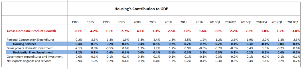
Clearly, as all Steakhouse Index readers know, ‘Personal Consumption Expenditures’ make the greatest contribution to GDP. “Housing services” are a component of PCE — and contributed to the 3.00% (annualized) Q2 2017 GDP growth rate. “Residential Fixed Investment” — contained within ‘Gross private domestic investment’ fell last quarter as fewer new homes and apartments were built. Both numbers, as we see above, have the ability to move the needle.
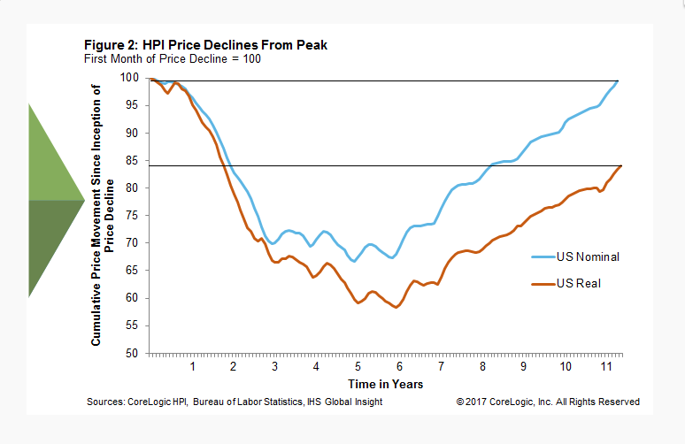
According to Corelogic, however, after adjusted for inflation US home values have now regained about 84% of their prior peak value. On a nominal basis (not adjusted for inflation) nationwide values are almost back to their prior peak, reached in April of 2006. Again, per Corelogic, after adjusting for inflation, U.S. home prices increased 5.7 percent year-over-year in July 2017.
So the actual annual value increase was about 7.5%. Impressive. The chart below shows both actual (or nominal) and the inflation-adjusted value increases since their peak back in April of 2006:
It is interesting to note that while, once again a “rising tide” has lifted all boats, some boats are floating higher than others.
Corelogic breaks home values into four (4) price segments, or tiers. The lowest home price tier increased 9.1% year-over-year, compared with 8.2% for the low-to-middle-price tier, 7.1% for the middle-to-moderate-price tier, and 5.5% for the high-price tier. Figure 1 below, again courtesy of Corelogic, shows the levels of the four price tiers indexed to January 2006, shortly before each of the tiers hit its peak index value:
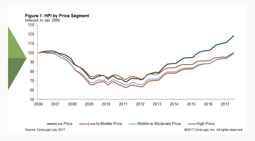
Why has the lower-price tier appreciated at almost double the rate of the highest tier? We have a supply vs. demand imbalance. Demand is fairly typical of this time of year; it’s supply that has been constrained. This year, only about 1/3 of the homes normally on the market during the “selling season” are available for purchase. Thus, demand is exceeding supply by a wide margin, pushing up lower-price tier values across the nation. The supply/demand relationship is more in-balance in the highest price tier.
Across all segments, however, limited “for sale” inventory has been a nagging theme. Low interest rates have helped keep borrowing costs at historic lows, helping fuel value increases.
“The recent drop in mortgage interest rates has not boosted housing market activity, which is being constrained by a severe lack of inventory,” said Matthew Pointon, a property economist at Capital Economics. “With housing starts faltering, we doubt inventory levels will improve much this year, so home sales will see little growth. Instead, prices are set to be driven up.”
Agreed. And this dynamic is having an effect on the market. Some potential home-buyers are finding themselves “priced out” of the market. Here’s an interesting chart, courtesy of Bloomberg, showing the relationship between how buyers feel about “buying conditions” set against home price movement. Take a look:
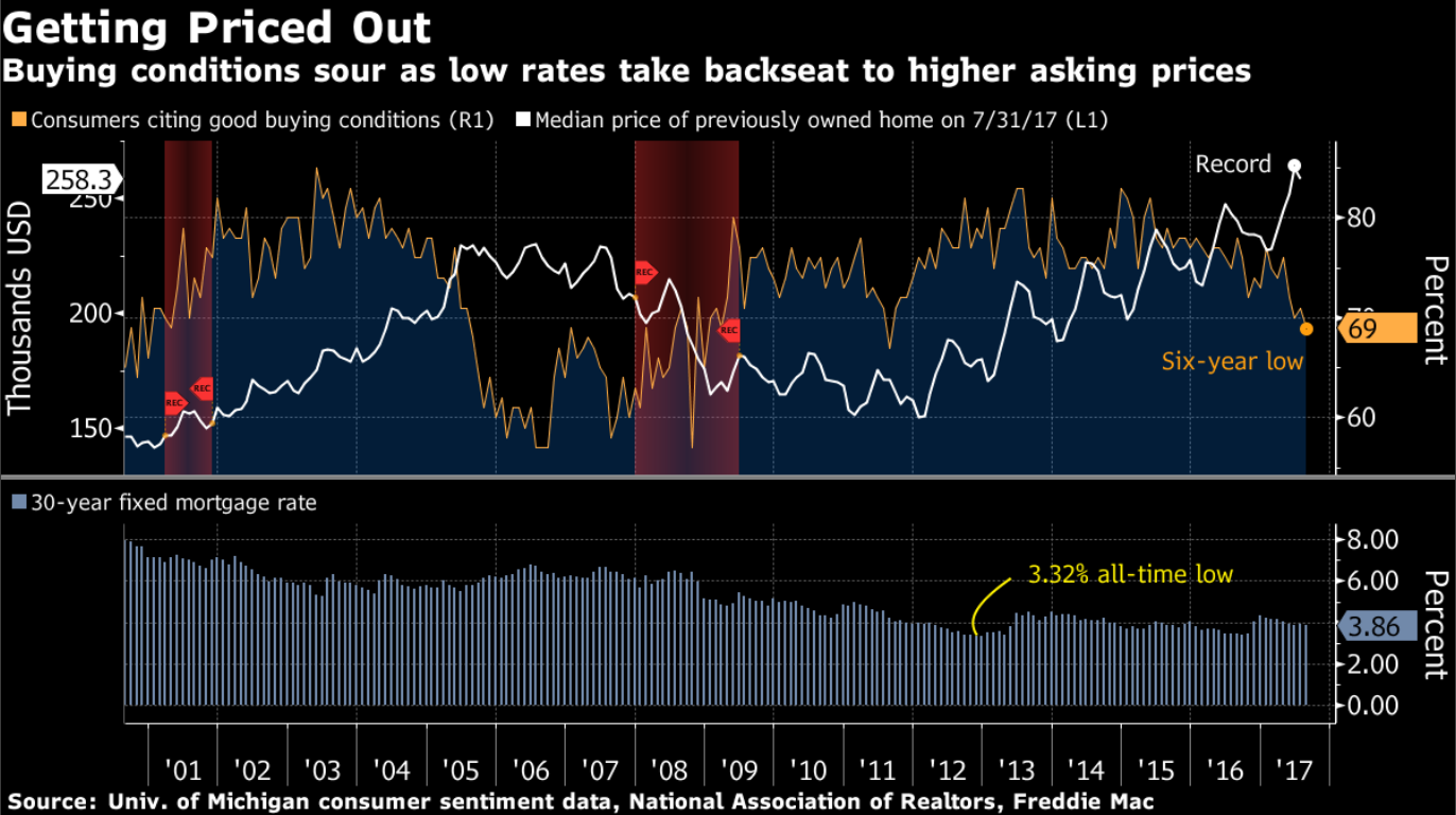
Did you notice the work “Record” in the chart above? Nominally, yes, this is a record. Adjusted for inflation since 2006, however, prices are still about 15% below their prior peak. The data is accurate, just not precise. 🙂
Are we now near or at the peak? Will home prices fall from here as fewer buyers feel good about buying today? Perhaps, but I doubt it. It is more likely the rate of increase will slow, but I feel home prices will continue to rise in the foreseeable future.
A significant increase in long-term interest rates could change my forecast. But as you long-time readers of the SHI know, I expect long-term interest rates to remain at about where they are. If this changes — for any reason — we’ll revisit this discussion. Let’s head to the steakhouse. Is Mastro’s still fully booked?
Nope. Almost. But they can still squeeze you in at 9:00 pm. Be sure to bring your American Express card because this dinner for 4 won’t be cheap.
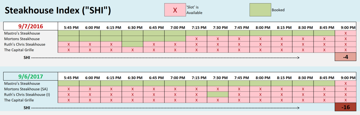
Yet again, when we compare table demand in 2017 to the same time period in 2016, this year demand is weaker. Let’s take another look at the longer term trend:
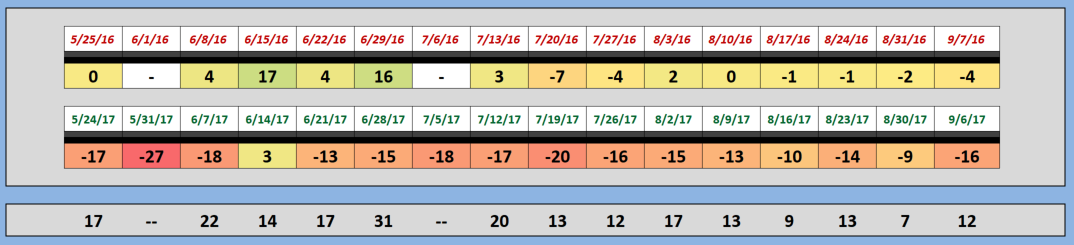
The trend continues. Demand for reservations has been significantly weaker this year than in 2016. For this reason, assuming the SHI is an accurate barometer of PCE, we’re forecasting a contribution reduction from PCE in the Q3 GDP numbers.
Take another look at the numeric chart above (the first chart) — where we show the housing contribution to the GDP. In Q2, 2017, by itself PCE generated a 2.3% GDP annualized increase — out of 3% total. That’s a 70% contribution factor. In other words, 70% of all GDP growth in Q2 was attributable to PCE increases. If PCE growth is appreciably weaker in Q3, thereby making a smaller contribution, GDP growth will likely also shrink significantly. If, for example, the contribution from PCE slides from the 2.3% Q2 rate to, say, 1.3% in Q3 — and assuming the contribution from all other components remains unchanged — our Q3 GDP growth rate will slip to an annual rate of 2.0%.
This is why expensive steaks are important. And, of course, also because they taste good. 🙂
- Terry Liebman