
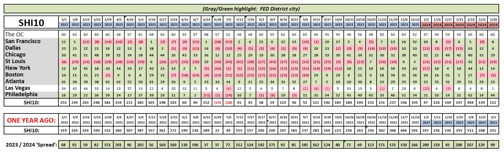
SHI 2.28.24 – Money, Money, Money

SHI 2.21.24 – Landmine Explosions
February 21, 2024
SHI 3.6.24 – China Redux
March 7, 2024
Without money, consumers cannot spend.
Well, no, that not completely accurate. Both cash or credit work. And whether the consumer is spending their cash or using credit cards, consumer spending is the linchpin of the American economy.
“
Every year, consumer spending generates
70% of all US GDP.“
“Every year, consumer spending generates
70% of all US GDP.“
So if one is obsessed with the US economy, as I clearly am, current levels of consumer savings, consumer wealth and access to credit are important metrics.
Welcome to this week’s Steak House Index update.
If you are new to my blog, or you need a refresher on the SHI10, or its objective and methodology, I suggest you open and read the original BLOG: https://www.steakhouseindex.com/move-over-big-mac-index-here-comes-the-steak-house-index/
Why You Should Care: The US economy and US dollar are the bedrock of the world’s economy.
But is the US economy expanding or contracting?
Expanding …. By the end 2023, in ‘current-dollar‘ terms, US annual economic output rose to an annualized rate of $27.94 trillion. After enduring the fastest FED rate hike in over 40 years, America’s current-dollar GDP still increased at an annualized rate of 4.8% during the fourth quarter of 2023. Even the ‘real’ GDP growth rate was strong … clocking in at the annual rate of 3.3% during Q4.
According to the IMF, the world’s annual GDP expanded to over $105 trillion in 2022. Further, IMF expects global GDP to reach almost $135 trillion by 2028 — an increase of more than 28% in just 5 years.
America’s GDP remains around 25% of all global GDP. Collectively, the US, the European Common Market, and China generate about 70% of the global economic output. These are the 3 big, global players. They bear close scrutiny.
The objective of this blog is singular.
It attempts to predict the direction of our GDP ahead of official economic releases. Historically, ‘personal consumption expenditures,’ or PCE, has been the largest component of US GDP growth — typically about 2/3 of all GDP growth. In fact, the majority of all GDP increases (or declines) usually results from (increases or decreases in) consumer spending. Consumer spending is clearly a critical financial metric. In all likelihood, the most important financial metric. The Steak House Index focuses right here … on the “consumer spending” metric. I intend the SHI10 is to be predictive, anticipating where the economy is going – not where it’s been.
Taking action: Keep up with this weekly BLOG update. Not only will we cover the SHI and SHI10, but we’ll explore “fun” items of economic importance. Hopefully you find the discussion fun, too.
If the SHI10 index moves appreciably -– either showing massive improvement or significant declines –- indicating growing economic strength or a potential recession, we’ll discuss possible actions at that time.
The Blog:
The “money” issue I’ve highlighted above is critically important to our economy. But so are jobs. Therefore, before I show you the money … a quick comment on jobs.
Consumers are employed. In fact, as I’ve mentioned a few times before, the US unemployment rate remains near 50-year lows. Not only are they employed, experts who track this type of thing tell me that employment earnings for the lowest household quartile by income, after adjustment for inflation, have grown the most. Which means their earnings fuel their ability to continue to spend. Even after their post-pandemic savings decline.
And they have. Consumers continue to chip away at their pile of post-pandemic savings. This outcome is inevitable. Everyone agrees. However, what everyone does not agree on is the extent to which consumer savings have declined. The chart below, courtesy of the FED and Haver Analytics tells both stories:
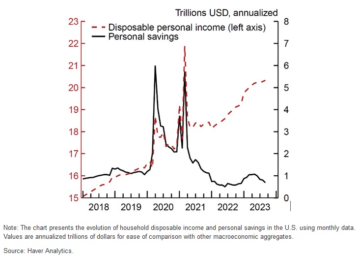
As evidenced by the red line above, “disposable personal income” — for all 4-quartiles — is significantly higher. Savings, however, were lower as 2023 ended. Take another look at this graph. What caused those massive savings spikes in 2020 and 2021? Uncle Sam handed out massive pandemic stimulus. Trillions of dollars. Much of that, of course, has now been spent. Much of that fueled the huge GDP increases over the past few years. And 70% of those GDP increases can be attributed to consumer spending.
Will the consumer continue to spend?
Yes. Data and anecdotal evidence suggest they will. Recurring monthly earnings will keep the lower half, measured by wealth, in the spending game. And residual wealth will keep the top 50% spending:
Peter Coy writes a financial newsletter for the NY Times. The graphs below are his. They show the change in household wealth viewed two ways: First by age cohort and then by income group. Within those frames, the dark gray colored bars represent the change from the pandemic start thru Q3, 2.22. The much lighter gray bars reflect change in the one year — from Q3, 2022 thru Q3, 2023.
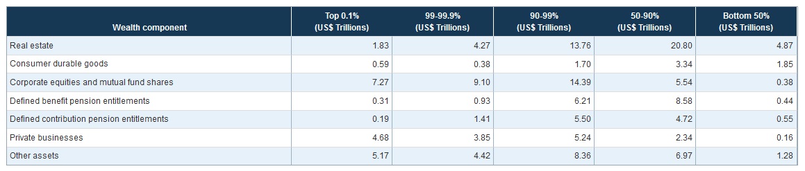
The data itself is sourced from the Federal Reserve.
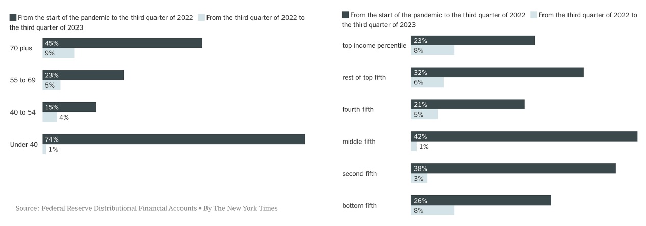
Permit me to point out two meaningful take-aways. First, by any yardstick, household wealth grew significantly during the pandemic. This is validation of something we all knew already: This is where the fiscal and monetary stimulus landed.
Second, The largest pandemic wealth increase was the “under 40” group. This is a group that loves to spend. Let’s see if they plan to spend some of that pandemic wealth at our steakhouses this weekend.
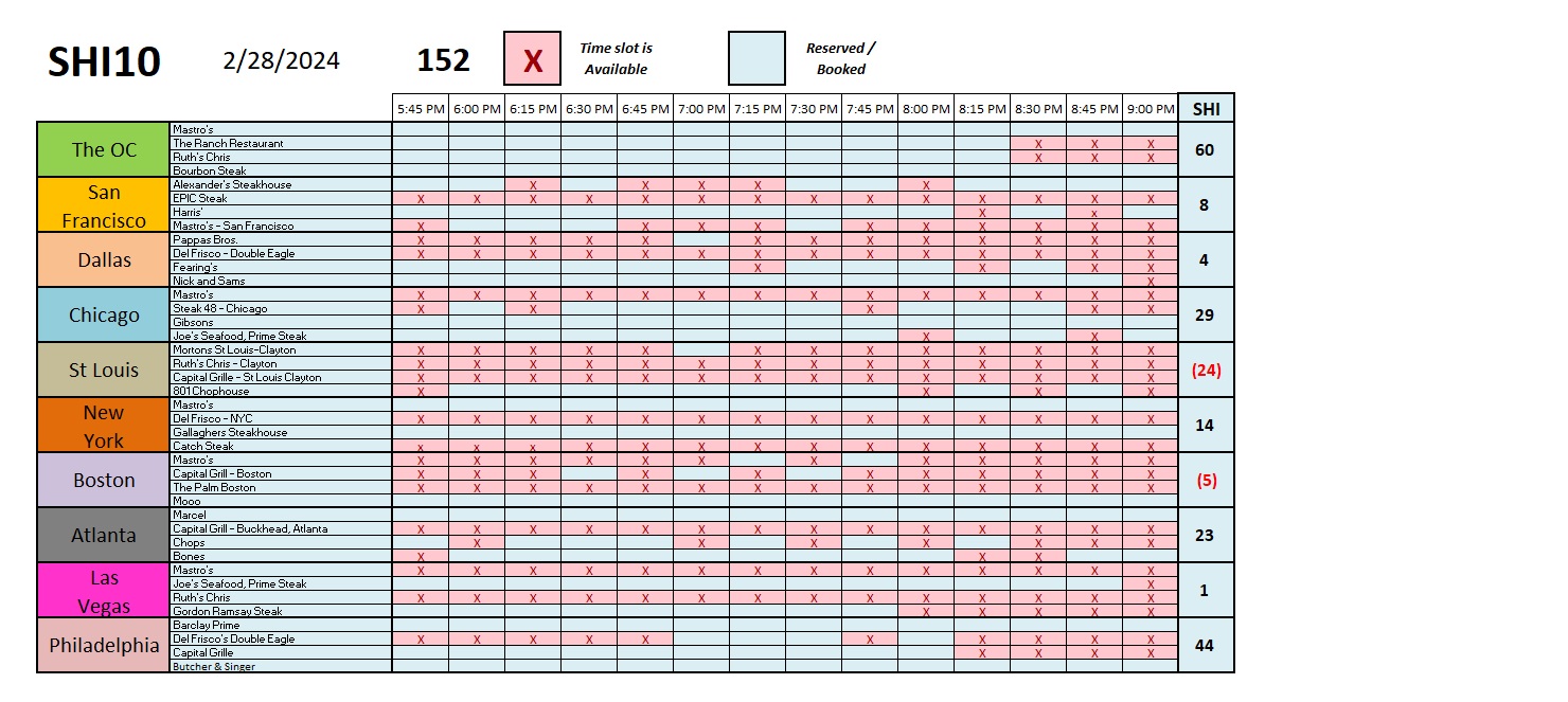
Reservation demand for pricey tables at our expensive eateries remains solid. Here in the OC, where a table of 4 will likely spend up to $800 for a perfectly prepared Filet or NY Strip, the “sides,” and a bottle or two of moderately-priced wine, only six time slots remain up for grabs — and all from 8:30 and beyond. Demand in the 9 other SHI cities is weaker, but in the aggregate, reservation demand across all 40 SHI steakhouses is consistent with prior weeks. Here’s the longer term trend chart:
You probably noticed I posted this blog on Thursday morning. I wanted to see one more data point. Earlier this morning — at 5:30 AM here in CA — the US government agency known as the “Bureau of Economic Analysis” or BEA for short posted a new report. This release measures the most current personal income numbers for all Americans.
During January of 2024, the personal income of all Americans increased by another 1%, or when measured in dollars, by almost $238 billion. That is a one-month figure, folks. Personal income continues to rise … and by extension, consumer spending is likely to continue to increase as well.
This report contains another important data point: The inflation metric favored by the Federal Reserve. And since the FED watches this index very closely, so do we.
Known as the “Personal Consumption Expenditures” index or PCE for short, in the opinion of the FED this index is a more accurate measure of US inflation levels. It’s a fairly long report, chock full of data, so let me summarize for you: Inflation continues to cool. The trend is clear and obvious.
Of course, the best way to observe data is over time. Each month, the FED measures the “percent change from one month one year ago” and shows that data in a chart. That chart, therefore, reflects a monthly change in this inflation metric, compared to the same month precisely one year ago. Here’s that portion of today’s chart:
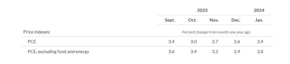
Comparing the January of 2024 reading to the January of 2023 number, the PCE was up by only by 2.4% — very close, indeed, to the FEDs long-term target of 2%. We can easily see, however, that this PCE metric has declined significantly and consistently, every single month. The same is true with the “core” PCE number above, a metric that excludes the highly volatile food and energy measures.
Inflation is falling. Consumers are earning. And consumers are spending — steaks are flying off the grills. Our US economy remains on sound footing.
<::> Terry Liebman


