
Is This as Good as it Gets? (Part 2)
Is This as Good as it Gets? (Part 1)
April 29, 2016Is This as Good as it Gets? (Finally! Part 3)
May 2, 2016This is the second installment of a 3-part BLOG series. Be sure to “follow” this blog so you are notified when part 3 appears!
Why you should care: Is the US economy fundamentally different today? If yes, the future could be very different than the picture being painted by the FED. As (public) corporate profits are highly correlated to GDP growth, long term impacts may even be felt in the stock and bond markets. These thoughts and concerns are important to every investor.
Be sure to read Part 1 of this series: https://terryliebman.wordpress.com/2016/04/30/is-this-as-good-as-it-gets-part-1/
Taking action: Again, I suggest you see the 2004 movie I, Robot staring Will Smith. And then, start thinking about investing in robotics and automation. Perhaps iRobot…or ABB Robotics…or take a look at the companies on the RBR 50. (Part 3).
OK … I know. How do these dots connect? What do robots have to with GDP? Let’s take a look.
THE BLOG: What’s wrong with the US economy?
In Part 1, I suggested the United States finds itself, today, in a unique and unexpected place, rooted in, and caused by, two unexpected long-term structural, foundational changes. Let’s continue our look at each … and assess their impact and implications.
First, remember, we’re discussing GDP – gross domestic product – and whether or not the US can ever again grow at 3-4%+ rates. GDP growth is an outcome, the result of a combination of capital and labor. Adam Smith, Karl Marx, and many others have their opinions on these topics. Again, as this is an economic discussion – not a social or political commentary – I’ll leave those ideas for another day.
Change in Demographics: In the macro, our population is aging. Even as it grows in size, the percentage of younger people is declining. This isn’t news, we’ve all heard this before, but what – precisely- are the implications of these structural changes?
Unlike the centuries before, in the past 100 years, a persistent – and growing – reduction in the fertility rate (again, this not unique to the US – this has happened in all developed nations around the globe) has created some vexing, and unanticipated, results.
Here are the ‘population pyramids’ from 1950 and 2000. Each horizontal bar (with the exception of the first) represents an age cohort of 5 years:
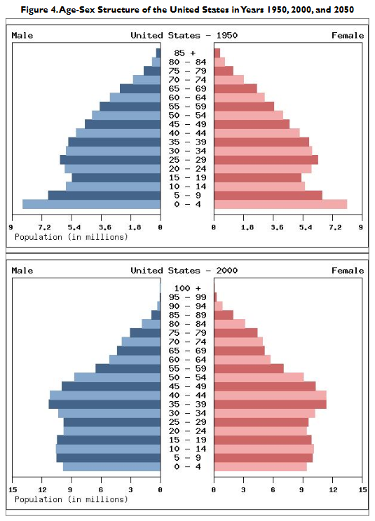
Notice anything interesting … or odd? Yes, the bottom is thinning and the ‘middle’ is getting fat. Said another way, today the US has a bunch more older folks – as a percentage of total population – than we did 50 years ago. (Be sure to note the ‘population’ scales at the bottom of each image are different – the outer edge in 1950 was 9 million … in 2000, 15 million.)
This trend is not expected to change. This was the conclusion of a 2011 report by the US Congressional Research Service:
“The United States Is Getting Older. Aside from the total size, one of the most important demographic characteristics of a population for public policy is its age structure. The United States has been in the midst of a profound demographic change: the rapid aging of its population, as reflected by an increasing proportion of persons aged 65 and older, and an increasing median age in the population.”
Here’s a forecast for 2050:
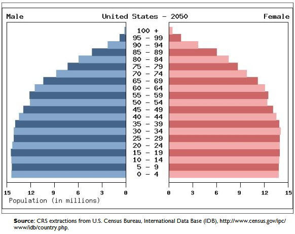
Even more older folks as a percent of total population. The trend is accelerating.
This from a US Census Bureau report (May of 2014) entitled ‘An Aging Nation: The Older Population in the United States:’
“The aging of the population will have wide-ranging implications for the country. By “aging,” demographers often mean that the proportion of the population in the older ages increases. The projected growth of the older population in the United States will present challenges to policy makers and programs, such as Social Security and Medicare. It will also affect families, businesses, and health care providers.”
Why is this important, and how is it related to the GDP?
First, because of a thing called the ‘dependency ratio.’ Per the Census Bureau:
“Dependency ratios are an indicator of the potential burden of the dependent population, approximated by those under 18 years and those 65 years and over, on those in the working-age population.”
Meaning, how much of a cost/burden is the combined total of people <18 plus >65 on the ‘workers’ supporting them – working and generating GDP – between the ages of 18 and 65?
This issue is closely studied in all developed countries. Here’s what the data shows:

Note the huge increase in the US dependency ratio up to 2030 – but between 2031 and 2050 the ratio is forecast to remain almost static. Notice that the <18 group is expected to grow by 1.7% (purple) by 2030 while the >65 group could increase by 13.5% (green)?
Japan (the developed country with the lowest fertility rate) seems to be in the worst shape … the US, not quite as bad. (And we all know how bad the Japan economy is … right?)
Summarizing, here is the importance of this piece: The number of available ‘workers’ (those from 18 to 65) as a percentage of the population is declining. This is a fact. And it creates two problems. First, the economy must have sufficient labor to function and grow. Without it, potential GDP growth will be truncated. Second, as the percentage of non-workers is growing rapidly (specifically those over 65), the financial demands imposed by this group grow at an increasing rate, burdening the economy as a whole, further limiting potential GDP growth.
The second correlation to GDP has to do with the quantity of available labor. Without a sufficient quantity of labor, economic growth is muted. The cost of that labor and it’s productivity are both critically important.
Labor Cost and Availability: All developed nations – by comparison to ‘emerging market‘ nations – have a very high cost of labor. And the largest emerging market nations – China and India – have current and projected GDP growth rates far in excess of the US and other developed nations. Here’s a February 2016 forecast from the OECD:

GDP in India is expected to grow at over 7% in 2016 and 2017. China, just slightly less. Combined, these countries have over 2.6 billion people. And they are very young.
Per ‘Trading Economics,’ the average annual salary in China (2014) was about $57,300 yuan – about $8,300. And this is WAY up from 10 years ago:

In 2006, the average worker earned $21,000 yuan, or about $3,250 a year. It’s interesting to note that the average wage in China has increased 255% in 10 years. Wow.
It’s a bit harder to get this same information for India. Data is separated in segments: ‘high skilled’, ‘low skilled,’ ‘manufacturing’, etc. So let’s take a look at their minimum wage. In July of 2015, the Indian government raised the minimum wage to 160 Indian Rupee per day. As one US dollar is equal to 66.42 IR, the daily minimum wage is now $2.41. Annualized, the Indian minimum wage is now $879.25.
Wages in manufacturing are a bit higher – and are growing at about 7-8% per year. (Note: the 2014 annual equivalent, in USD, is $1,908.)

Unfortunately, the opposite is true in the US and other developed nations.
What’s happened to US household income in the past 10 years? Let’s take a look:

It has declined. From $56,598 in 2006 to $53,657 in 2014. A reduction of about 5%. Very different than China.
Perhaps the only ‘silver lining’ for the US household is (1) they have less debt today (as a percent of GDP) and (2) due to lower interest rates, it costs less to have debt.
‘Deleveraging’ – or a reduction of outstanding consumer debt – since the Great Depression has proceeded fairly quickly. Today, US households carry debt balances (as a % of GDP) about 10% lower than in 2009:

And at rates much lower: In November of 1994, credit card rates averaged 15.69% and auto loans averaged about 8.75%.

And by 2016, those same rates had fallen to 12.31% and 4.16%, respectively.

In August of 2009 – comparing ‘apples to apples’ when consumer debt was about 215% of GDP, these same rates were 13.71% and 6.61%, respectively.
Applying a bit of math, this means the consumer ‘debt load’ fell by over 30% between 2009 and 2016. Said another way, the average consumer is spending 30% less on credit card and auto debt today. And since consumer debt is not tax deductible, this has a very significant impact on disposable income. In the absence of wage growth, this development has been very beneficial to the average consumer.
In summary, there is no meaningful comparison between wages in India, China and the US. The countries, and their economies, are simply too different. But three things are very clear:
- Labor is very inexpensive in China and India;
- Labor is plentiful in emerging nations; and,
- The emerging market cost of labor is rising rapidly.
And it’s clear their potential GDP growth is much higher as a result. The correlations seem clear: Abundant inexpensive labor correlates with strong potential GDP growth.
We haven’t touched on labor productivity yet. A critical component. And here is where it starts to get very interesting. Here’s our working definition of labor productivity:
“Labor productivity measures the amount of goods and services produced by one hour of labor. More specifically, labor productivity measures the amount of real GDP produced by an hour of labor. Growing labor productivity depends on three main factors: investment and saving in physical capital, new technology and human capital.”
And this is where we’ll start up next time. Thanks for reading … I know this was a long one. Please come back … we’ll solve the mystery in Part 3!
- Terry Liebman


2 Comments
Great stuff Terry!
[…] ← Is This as Good as it Gets? (Part 2) […]