SHI 1.11.23 — Economics Used to be Easy

SHI 1.5.23 — Jobs, Jobs, Jobs. And Money.
January 4, 2023
SHI 1.18.23 – Is Our Economy Slowing?
January 18, 2023
Ahhh … the good old days.
I remember when the relationship between ‘supply‘ and ‘demand‘ meant something. I remember when calculating equilibrium within an economic system was simple. I remember when the number of variables wasn’t, well, highly-variable. And I remember the days when economists and economic forecasters generally shared a vision of the future.
No longer. Simple and easy have left the building. And quite often economic ‘consensus’ has become roadkill under the wheels of identity politics, financial self-interest, and reams of ‘fake news.’
“
But hey: It’s still fun, right?”
“
But hey: It’s still fun, right?”
Sure. But it’s a lot harder to figure out what’s really happening out there. Economically speaking. Which is why I write this blog. Please have no illusions, however, about the accuracy of my economic forecasts in this blog — I only hope I move the ball a little closer to the goal line, so to speak. If I can add just a bit more clarity or understanding, I feel I’ve done my job for both you and for me.
Welcome to this week’s Steak House Index update.
If you are new to my blog, or you need a refresher on the SHI10, or its objective and methodology, I suggest you open and read the original BLOG: https://www.steakhouseindex.com/move-over-big-mac-index-here-comes-the-steak-house-index/
Why You Should Care: The US economy and US dollar are the bedrock of the world’s economy.
But is the US economy expanding or contracting?
Expanding. At the end of Q3, 2022, in ‘current-dollar’ terms, US annual economic output rose to $25.74 trillion. Thru Q3, America’s current-dollar GDP has increased at an annualized rate exceeding 7%. The world’s annual GDP rose to over $100 trillion during 2022. America’s GDP remains around 25% of all global GDP. Collectively, the US, the euro zone, and China still generate about 70% of the global economic output. These are the 3 big, global players.
The objective of this blog is singular.
It attempts to predict the direction of our GDP ahead of official economic releases. Historically, ‘personal consumption expenditures,’ or PCE, has been the largest component of US GDP growth — typically about 2/3 of all GDP growth. In fact, the majority of all GDP increases (or declines) usually results from (increases or decreases in) consumer spending. Consumer spending is clearly a critical financial metric. In all likelihood, the most important financial metric. The Steak House Index focuses right here … on the “consumer spending” metric. I intend the SHI10 is to be predictive, anticipating where the economy is going – not where it’s been.
Taking action: Keep up with this weekly BLOG update. Not only will we cover the SHI and SHI10, but we’ll explore “fun” items of economic importance. Hopefully you find the discussion fun, too.
If the SHI10 index moves appreciably -– either showing massive improvement or significant declines –- indicating growing economic strength or a potential recession, we’ll discuss possible actions at that time.
The Blog:
For example, ‘inflation’ used to simply be ‘inflation,’ right? No longer.
Today we have CPI inflation, PCE inflation, ‘core’ inflation, ‘super-core’ inflation, and the Atlanta FEDs ‘sticky-price CPI‘ inflation. Yes, there are four — count ’em — four different types of Sticky-Price CPI numbers according to the Atlanta FED: Sticky CPI, the Core Sticky CPI, the Flexibility CPI, and the Core Flexible CPI.
Google the words ‘types of inflation‘ and you’ll find there are even four (4) types of inflation, based on speed: Hyperinflation, galloping, walking, and creeping. And don’t forget about ‘stagflation’ — that important, too! And finally, also in the mix, we have deflation — which is, essentially, negative inflation.
The distinctions don’t end there, however. There seems to be no end to the complexities and methods of measuring inflation. In my opinion many are not overly helpful, and some are worth a closer look. For example, consider this graph taken from a WSJ article published earlier today.
I like the chart to the right.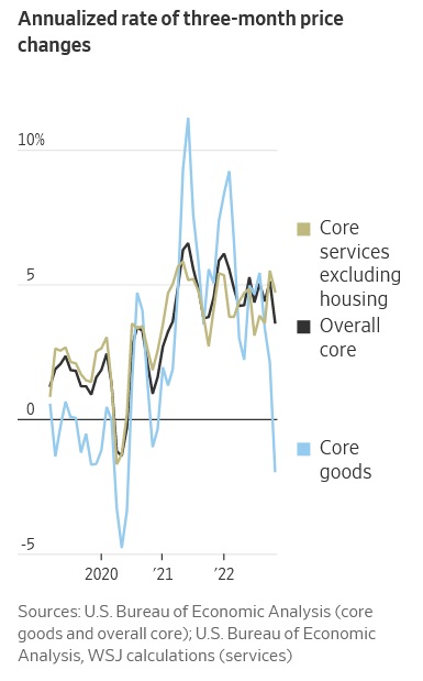
First, the numbers are not monthly. They are an ‘annualized’ version of a running 3-month average. In this way, the charts are able to capture movement over time without wide monthly fluctuations. And yet the fluctuations are still significant.
We’ve talked extensively about housing in this blog. I’ve discussed the prices of single family homes here in the US and across the globe. The impact of interest rates on home values. We’ve discussed how ‘fixed’ rate home-loan financing can dampen home-price volatility when compared to price movement in countries where the vast majority of home loans available to borrowers are variable. We’ve discussed the challenging supply vs. demand dynamics here in the US, vis a vis the inadequate amount of construction of all forms of housing post the Great Recession of 2008. And, finally, in this blog we have discussed the myriad of obstacles home builders face when contemplating increasing housing supply — whether the road-block is complex zoning restrictions, red-tape regulation, expensive building codes or NIMBY-ism.
The housing problem is a mess. And inasmuch as between about 1/3 and 40% of the CPI is housing-related or impacted, while we absolutely must track cost movement in the housing arena, the whole thing remains a mess. If for no other reason than the fact that ‘home price’ changes themselves are NOT tracked in the CPI. That’s right. SFR home price increases do not impact the CPI calculation. Because official statistics define the purchase of a home as an ‘investment’ and not consumption, home price fluctuations do not impact CPI.
Withing the CPI, the ‘housing‘ component measured is a type of ‘rent.’ Only ‘rent’ movement impacts the CPI calculation. And since that distinction and calculation is so complex and esoteric, I’ll say only this before moving on: When considering inflation statistics, it is wise to look at the numbers both including and excluding housing.
Which is what the chart to the right does. There are three lines in the graph. The ‘black’ line is the overall ‘core’ CPI inflation number. What is ‘core?’ It simply excludes ‘energy’ and ‘food’ — two wildly fluctuating components — from the calculation.
And then we have the ‘gold’ line and the ‘blue’ line. The gold-line distinguishes the ‘services’ portion of CPI components. The blue-line reflects only the “goods” portion of the CPI. Goods is another word for “stuff.” Stuff that we buy and use. Services is probably best defined as ‘experiences’ that we enjoy. Like an expensive steak dinner at our favorite SHI steak house!
Here’s a fact I doubt you’ve heard in the media:
By November of 2022, the CPI component covering goods was
declining at the annual rate of 1.93%.
Using the ‘inflation’ definitions from above, that’s NEGATIVE inflation, or deflation. That’s a word you haven’t heard lately, right? Thru that lens, the cost of ‘goods’ was actually falling in November. Stuff became cheaper. Sure, it’s only a very short period of time … but take another look at that blue line. It has fallen thru the floor!
Why separate the CPI into the two buckets of goods and services? Simple: the two are behaving very differently right now, courtesy — once again — of the Pandemic. Take a look at this graph that makes the distinctions much easier to see:
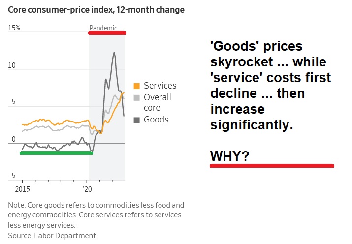
Before the Pandemic, the cost we all paid for stuff was fairly consistent. Globalization has helped keep a very firm lid on goods prices. This fact is highlighted by the heavy green line — note much of the time it rests below zero? In the most recent decade, most core inflation has been fueled by services. Enter the pandemic — highlighted by the red line. Goods prices skyrocketed. Simultaneously, the prices we all paid for services fell significantly for the first time in years.
Why?
Lock-downs, labor and bottlenecks. And fiscal stimulus. Armed with trillions of newly-minted-dollars, courtesy of the federal government, Americans went shopping. But global supply-chain bottlenecks simultaneously eroded the supplies of stuff. And what happens when a market in general equilibrium experiences a simultaneous demand-spike and supply-constraint? Yep — the cost of stuff skyrockets. The dark gray line on the chart shows just how much prices increased in 2020 and 2021. By 2022, many of those supply problems were fixed. And the government-dollar tap was off. So the increased supply met with lower demand … and price increases in the cost of stuff began to decline. Significantly.
But service prices kept on rising. Because this is a labor story, folks. Services are provided by people … and as the post-Pandemic labor markets remained extremely tight, the cost of labor directly impacted the cost of services. Everywhere. And this problem continues today.
Thru this lens, it’s very easy to understand the huge bifurcation in the CPI tracking of goods and services. And it’s easier to understand the battle raging between the FED and inflation. The battle, in the final analysis, comes down to labor. And the post-Pandemic labor shortage we find ourselves in. The FED‘s challenge, of course, is while they can directly impact short-term interest rates, their actions can only tangentially impact the labor markets. Sure, if they raised short term rates to, say, 50% per annum, they could very directly and very quickly affect employment levels. Borrowing, lending, employment and GDP growth would quickly become a thing of the past. The US economy would seized up like an internal combustion engine without oil. Such an action by the FED would completely destroy the American economy.
Which is why they haven’t raise rates to 50%. They have raised them in far smaller increments … intended to only partially destroy the American economy. A little bit at a time. 🙂
To the steakhouses? Let’s start with the trend report:
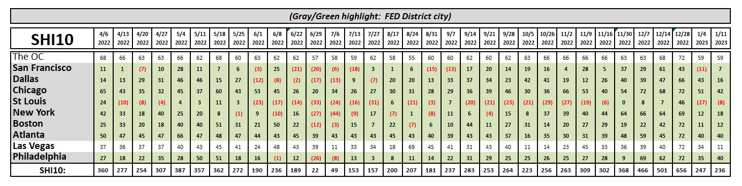
The bottom line: While ‘activity’ in reservations demand for Saturday next moved around a bit, the final SHI10 number came in very close to last week. The OC was identical to last week; demand in Chicago, Atlanta and Philly remained quite brisk. But expensive eatery reservations fell significantly in ‘Vegas. Meaningfully? As always, one week doesn’t make a trend … but we’ll keep a close eye on the market here.
Let me point out a couple of interesting developments in two SHI markets. Here’s the chart:
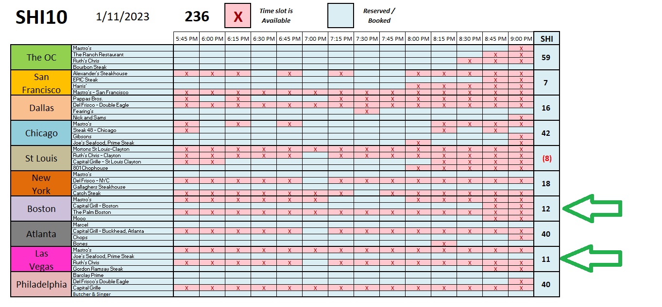
In both Boston and ‘Vegas, something unusual happened: You can get a table at Mooo or Gordon Ramsey’s Steak Saturday night! I don’t remember the last time Saturday-night tables were available at Mooo on Boston’s Beacon Hill. Probably about the last time I saw Hailey’s Comet. It’s almost equally rare to have openings at Gordon Ramsey’s place in ‘Vegas. Again, is this change meaningful? Time will tell.
Thanks for tuning in.
<:> Terry Liebman