SHI 11.4.2020: Money Makes the World Go ‘Round

SHI 10.28.2020: Tomorrow is the BIG DAY!
October 28, 2020
SHI 11.11.2020: Financial Stability Report
November 11, 2020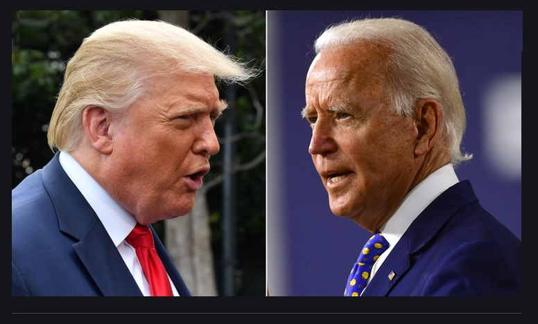
We don’t yet know the winner of the presidential election. It’s close, but too early to call.
Personally, I find it fascinating, looking at the “red and blue” map, seeing how our country and citizens divide. Below is the most up-to-date CNN map, showing the obvious geographic lines between supporters of each position:
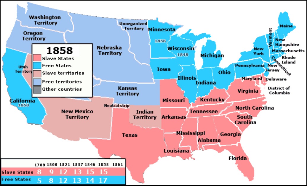
OK, you caught me. Fake news. Sorry. This is actually a map of the United States pre-Civil War, 2 years before Lincoln was elected. I’m guessing my chicanery was pretty obvious from the large 1858 date image. 🙂
Like today, over 160 years ago, the United States was geographically divided. But back then the issue was slavery — and the clear economic implications of that policy. In my opinion, back then, like now, the issue for many people ultimately boils down to money. Sure, power too. But in the final analysis, it boils down to money.
“
Liza Minnelli had it right in ‘Cabaret.'”
“
Liza Minnelli had it right in ‘Cabaret.'”
Money, money, money, money. Unlike 1858, the country today is not divided north/south. But divisions remain, as the map below clearly shows. Of course, this map will continue to evolve and change as election updates are available, but the lines separating our citizens are obvious. And the issue, I believe, is money. Now, like then, economics drive politics.
Welcome to this week’s Steak House Index update.
If you are new to my blog, or you need a refresher on the SHI10, or its objective and methodology, I suggest you open and read the original BLOG: https://www.steakhouseindex.com/move-over-big-mac-index-here-comes-the-steak-house-index/
Why You Should Care: The US economy and US dollar are the bedrock of the world’s economy.
But is the US economy expanding or contracting?
Before COVID-19, the world’s annual GDP was about $85 trillion. No longer. It shrank. Until recently, annual US GDP exceeded $21.7 trillion. Again, no longer. According the the Q2 final numbers, annual US GDP is down to $19.5 trillion. We can thank the Great Lockdown for this one. But what has not changed is the fact that together, the U.S., the EU and China still generate about 70% of the global economic output.
The objective of this blog is singular.
It attempts to predict the direction of our GDP ahead of official economic releases. Historically, ‘personal consumption expenditures,’ or PCE, has been the largest component of US GDP growth — typically about 2/3 of all GDP growth. In fact, the majority of all GDP increases (or declines) usually results from (increases or decreases in) consumer spending. Consumer spending is clearly a critical financial metric. In all likelihood, the most important financial metric. The Steak House Index focuses right here … on the “consumer spending” metric. I intend the SHI10 is to be predictive, anticipating where the economy is going – not where it’s been.
Taking action: Keep up with this weekly BLOG update. Not only will we cover the SHI and SHI10, but we’ll explore related items of economic importance.
If the SHI10 index moves appreciably -– either showing massive improvement or significant declines –- indicating growing economic strength or a potential recession, we’ll discuss possible actions at that time.
The Blog:
I’m sharing the CNN image below not because I’m a fan of CNN, but because the map is attractive and demonstrates my point. Take a look.
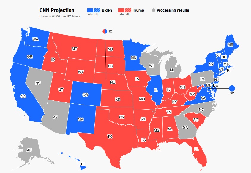
Take a closer look at both maps. Compare 1858 to the CNN map above. You’ll have to work with me a bit, and while there are some clear exceptions, do you see how many of the ‘blue’ states in 1858 remain blue today … and many of the red states remain red?
The west coast and the Atlantic northeast were anti-slavery “free states” 160 years ago … and today, collectively, they firmly support the democratic agenda. States in the center of the country have shifted around more … but the population of our country’s center clearly supports the Trump economic agenda today.
Fascinating. Here we are, more than a century and a half later, and the political landscape appears little changed.
Money definitely makes the world go ’round. At least here in America. OK … I’m heading back to watch the election results. More next week! 🙂
- Terry Liebman