SHI 11.11.2020: Financial Stability Report

SHI 11.4.2020: Money Makes the World Go ‘Round
November 4, 2020
SHI 11.18.2020: Is Run-a-way Inflation Here?
November 18, 2020
How safe are the banks, our stock markets and other investments?
With their finger on the pulse, and to answer this question, twice a year — in May and November — the Federal Reserve publishes a financial stability report. The report differentiates between “shocks” and “vulnerabilities.” It’s an interesting distinction:
- SHOCKS, such as sudden changes to financial or economic conditions, are typically surprises and are inherently difficult to predict.
- VULNERABILITIES tend to build up over time and are the aspects of the financial system that are most expected to cause widespread problems in times of stress.
Said another way, vulnerabilities are observed and shocks are surprises. Thus, shocks are difficult, if not impossible, to predict. But our financial system’s vulnerabilities can be observed and, to some extent, managed. In the ‘vulnerabilities’ category, the FED identifies 4 potential threats to observed economic fundamentals:
- Asset prices that appear too high.
- Excessive borrowing by businesses or households.
- Excess leverage by lending institutions.
- Possible “run on the bank” scenarios by spooked investors/depositors.
“
This report presents the FEDs current assessment
of the resilience of the US financial system.”
“
This report presents the FEDs current assessment
of the resilience of the US financial system.”
So, how sound is our financial system? How safe are your investments?
Welcome to this week’s Steak House Index update.
If you are new to my blog, or you need a refresher on the SHI10, or its objective and methodology, I suggest you open and read the original BLOG: https://www.steakhouseindex.com/move-over-big-mac-index-here-comes-the-steak-house-index/
Why You Should Care: The US economy and US dollar are the bedrock of the world’s economy.
But is the US economy expanding or contracting?
Before COVID-19, the world’s annual GDP was collectively about $85 trillion. Then it shrank … then bounced back! We can thank global fiscal and monetary policy for the bounce. According the the Q3, 2020 ‘preliminary’ numbers, annual US GDP is back UP to about $21.1 trillion. And still, together, the U.S., the EU and China continue to generate about 70% of the global economic output.
The objective of this blog is singular.
It attempts to predict the direction of our GDP ahead of official economic releases. Historically, ‘personal consumption expenditures,’ or PCE, has been the largest component of US GDP growth — typically about 2/3 of all GDP growth. In fact, the majority of all GDP increases (or declines) usually results from (increases or decreases in) consumer spending. Consumer spending is clearly a critical financial metric. In all likelihood, the most important financial metric. The Steak House Index focuses right here … on the “consumer spending” metric. I intend the SHI10 is to be predictive, anticipating where the economy is going – not where it’s been.
Taking action: Keep up with this weekly BLOG update. Not only will we cover the SHI and SHI10, but we’ll explore related items of economic importance.
If the SHI10 index moves appreciably -– either showing massive improvement or significant declines –- indicating growing economic strength or a potential recession, we’ll discuss possible actions at that time.
The Blog:
Let me begin with the FEDs warning in the report:
“The effects of the pandemic have increased the vulnerabilities of the financial system to future shocks, including additional waves of substantial COVID-19 outbreaks. “
This is worth remembering. Volatility remains high … and investment risks remain. Shocks — unexpected events — are possible. Be warned.
In the report, the FED addressed each of the four (4) systemic risks that keep Powell up at night:
Asset Valuations: While asset values have “generally increased” since May, “when adjusted for low interest rates” valuations appear in line. The FEDs interest rate comment is meaningful. I’ve commented numerous times in prior blogs that investment expectations must be interest-rate adjusted. Today, rates are on the floor. I expect them to remain either on, or very close to, the floor for a long time into the future.
Excessive Borrowing: The report states “historically high levels of business debt and weakening household finances” might be a problem. Perhaps. Once again, interest rates are a factor. Higher debt levels are tolerable at lower interest rates. We all know this. Household finances? Yep. They might be a problem. But we must remember the massive increase in household savings we’ve seen in the past 6 months.
Leverage: Bank leverage remains low. No risks here.
Funding Risk: The words “run on the bank” are mine. The FEDs concern is more global. Shocks like COVID-19 impact global financial flows, not just those in the US. And as the lender-of-last-resort to the world, the FED must manage these risks too. They created emergency ‘dollar’ funding facilities for this purpose. On page 47 of the report, you can see the total outstanding facilities, as of Q2 2020, exceeded $17.3 trillion. That’s a big wow. But the FED is the central bank backstop for the world … and they are doing a stellar job. In my opinion.
Interested in reading the report? Here’s a link: https://www.federalreserve.gov/publications/files/financial-stability-report-20201109.pdf
My Bottom Line: ‘Systemic’ risk is more of a constant than a unique condition.
Risk is ever-present. We never know what’s around the next corner. Regardless, today’s investment choices should probably be made with a bit more trepidation than usual. Conditions are definitely more unpredictable. But intelligent, calculated risk probably remain the best choice. My opinion. You decide.
While you’re thinking about it, let me share a chart from the FEDs report I think you’ll find interesting.
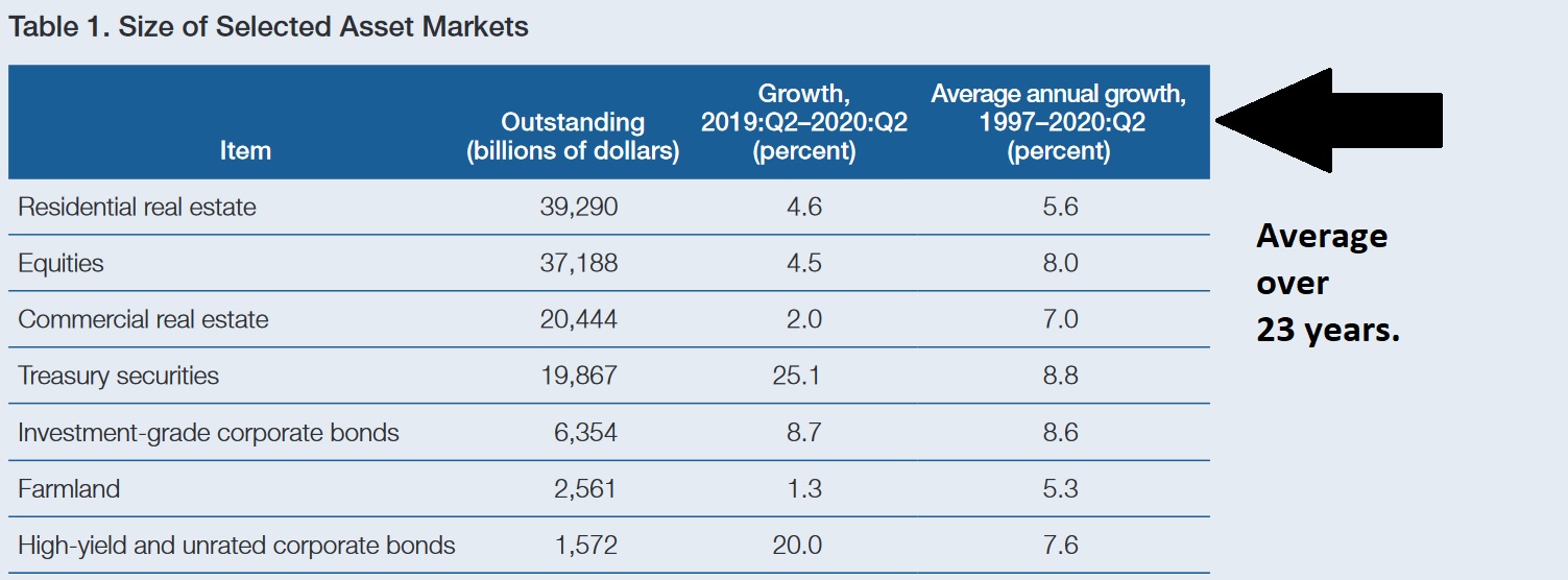
First, let me point out something pretty amazing: If we add up the value of the seven asset groups listed above, the value exceeds $125 trillion. Amazing.
So, between 1997 and today, the assets listed above generated average annual ROIs between 5.3% (farmland) to 8.8% (Treasuries). Impressive, right? Conditions must have been much more stable than today to generate those impressive results, right? Nope.
We’ve experienced numerous periods of instability between 1997 and the present. I’m sure you remember the dot-com bust in 2000? About $8 trillion of stock market “value” evaporated seemingly overnight. How about the Great Recession of 2008? Asset value losses were massive and probably exceeded $30 trillion or more.
And yet, during this 23 year period, investment returns — on the average — year after year have been quite robust. How likely is a repeat of these returns in the next 23 years? Great question. In my opinion, a repeat is very likely … but I think we must take a more intelligent, thoughtful approach than in the past. For example, will all home values, in all locations, increase by an average of 5.6% over the next 23 years? No. I don’t believe so. I believe the concepts of ‘scarcity’ and ‘demand’ will be far more important in the coming years than they were in the past.
How about commercial real estate (CRE)? Can we expect to see an average of 7% per year from our CRE investments? Once again, the answer, in my opinion, is it depends. If you invest in a strip shopping center, expecting stability and easy cash flow, I think the answer is no. But once again, an intelligent, “location-centric” investment strategy within growth segments such as ‘logistics’ may pay off handsomely.
Treasuries. Not a chance. In my opinion, you’ll be lucky to make any return in Treasuries. Why? Treasuries made money — tons of money — while yields consistently tumbled over the past 30 years. Like a rock rolling down a steep hill, they now rest on flat ground at the base of that hill. If rates rise appreciably in the future, holders of long-term Treasuries will find their values much lower over time. Let’s face facts: Rates really can’t go much lower. In my opinion, Treasuries are a loser. 🙂
How about equities? Can we expect an 8% average annual return in equities? Probably not. Again, my opinion. But I don’t think we’ll be able to find an 8% annual return in almost anything that also has a tolerable risk level.
But I think good returns are possible in equities. Especially if interest rates remain at or near their current levels for a long period of time. Which I believe they will. Take a look at this chart, again courtesy of the FEDs financial stability report:
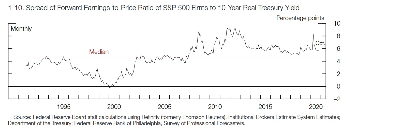
Stock market values are highly correlated with corporate earnings. Growing earnings typically equate to a growing stock value or price. But it turns out interest rates, once again, play a role here. As you look at the chart above, consider where 10-year Treasury yields were at each 5-year milestone:
- <> 1995: Yields started the year near 7.5% … and slid to about 6% by year end.
- <> 2000: Beginning near 6.5%, yields finished 2000 closer to 5%.
- <> 2005: Yields hovered close to 4%.
- <> 2010: The 10-year started in the high 3’s and ended the year near 3%.
- <> 2015: Beginning the year near 1.6%, the 10-year treasury finished 2015 just over 2%.
- <> 2020: We started the year at about 1.5% … but since March we’ve generally hovered between 0.5% and 0.7%. Today, the 10-year treasury is closer to 0.95%.
In 1995, the above chart tells us the “earnings to price” ratio (“ETP ratio”) for the stock market generally hovered near the ‘median’ 4.7% above the 10-year Treasury. Thus, adding the ‘median’ to the 1995 treasury yield, we see that the ETP was about 12%. In other words, stocks were priced and valued about where the company about 12%. As you’ll see below, this number fell significantly as interest rates fell.
2000 was the year of the ‘dot-com’ bust, so we’ll ignore that marker an aberration. By 2005, the math tells us the “earnings to price” ratio was again at the 4.7% median plus 4%, or close to 9%. Note: Stocks were now valued based on 9% earnings … far below the 12% threshold in 1995.
Interestingly enough, by 2010 the ETP ratio had fallen again — now down to about 8%, give or take. But there it has remained. By 2015, the ETP ratio was only slightly below 8% … and by 2020, the ETP ratio had slid only to around 7%.
This consistency, the FED believes, suggests that “investor risk appetite, though higher since May, is still within historic norms.” Meaning, the FED believes the stock markets, in general, are fairly valued. Even at today’s lofty levels. And P/E ratio are definitely up, as the FEDs chart below clearly demonstrates:
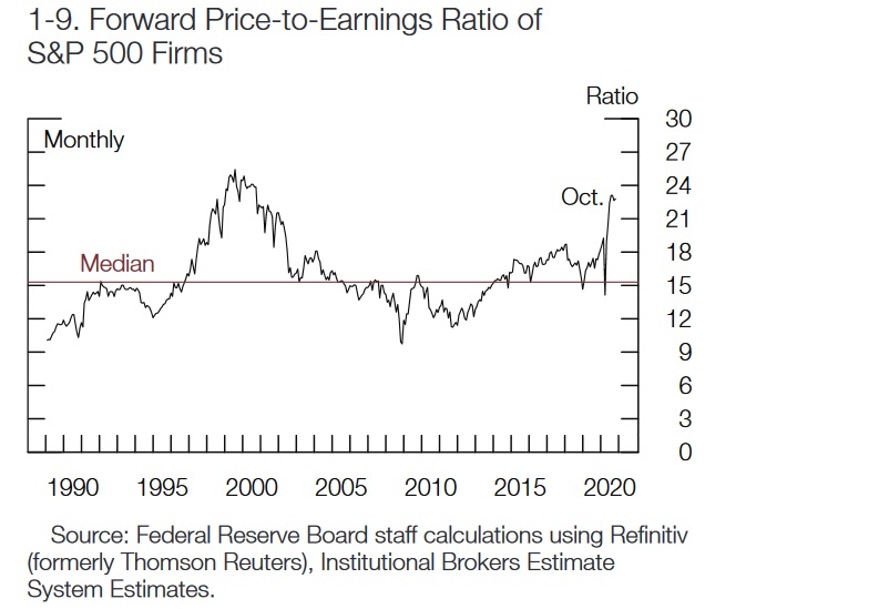
Will P/E ratios continue to increase? I believe they will. The report itself comments:
“Equity prices have risen sharply, with higher valuations supported, in part, by low interest rates.”
My point is this: History has shown that over time, as interest rates fall, investors are willing to pay a higher stock price for the same level of corporate earnings. I expect this trend to continue in the coming years. My 2 cents. 🙂
But then again, this same principle will probably prove true with other asset classes too. Assuming, once again, that US interest rates remain at or near their current levels.
In the final analysis, the foundation supporting all investments, across the globe, are our US and world economies. Without robust economic growth, few investments can thrive. Unless you’ve been living in a cave in the wilderness during 2020, you are very much aware of COVID-19 and the inherent unpredictability of both the diseases spread and the availability of therapeutics and vaccines. COVID has clearly been a systemic shock. And it could be one again in the coming months. We just don’t know yet.
But while we watch and wait, the economy here in the US continues to heal. The graphic below appeared in today’s WSJ:
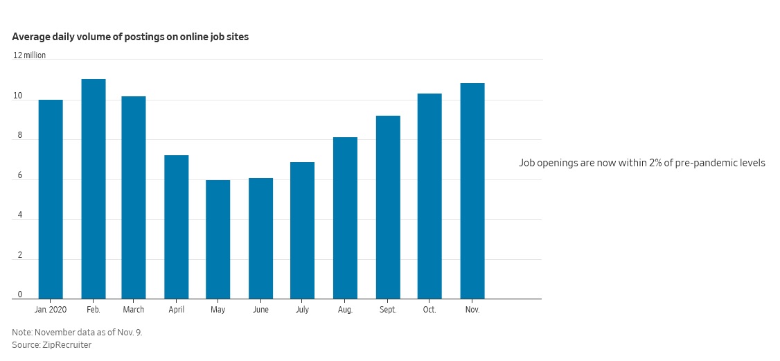
The WSJ article suggested “the numbers are astonishingly good.” I agree. The strength of the recovery in open jobs surprises me. But this metric aside, there are clearly large segments of our economy that remain very, very weak. The COVID winners are apparent … and so are the losers. The graphic below offers us a sobering reminder of today’s realities:
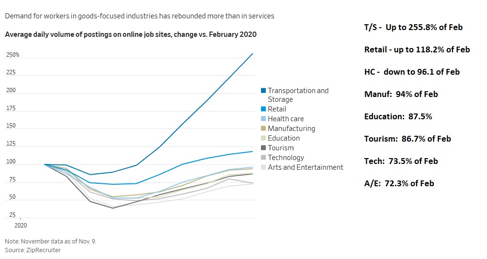
The general trend is clearly up … but the wide disparity is obvious.
Here’s the take away: In the macro, evidence continues to mount suggesting that serious headwinds and threats aside, the economy is healing. Threats remain, but both the economy and the FED are telling us that sitting on the sidelines, waiting to see what happens, is probably not a good investment strategy.
My 2 cents. Good luck out there … stay healthy.
- Terry Liebman