SHI 8.12.25 – The Flipside of Inflation

SHI 7.29.26 — Fun with Numbers!
July 29, 2026
SHI 8.19.26 – Thin Air
August 20, 2026
About 100 years ago, the Great Depression started.
By 1933, the country was solidly in the death grip of the biggest economic crisis the United States had ever experienced. We’ve all seen photos of the human devastation; the bread lines, unemployment rates near 25%.
Over 9,000 banks failed during the 1930s, wiping out the life savings of millions of Americans. Remember, this was before the FDIC insured deposits. And, of course, as everyone knows, the stock markets plummeted for years.
“
Inflation is bad.
Deflation is worse. “
“
Inflation is bad.
Deflation is worse. “
I know we’ve talked about this before, but do you remember how money supply grows or contracts? It’s a very basic process but surprisingly not well understood. Which I find odd when you consider that movements in the level of money supply is a critically and foundational component of the American financial system.
In a stable economy, money supply generally expands as the direct result of new bank loans made. The opposite causes contraction. A shrinking base of bank loans outstanding typically causes money supply to decline. During the 1930s, money supply contraction was on steroids: Bank lending collapsed as bank failures increased. Money supply essentially collapsed as well. By 1933, money supply had shrunk by about 30%.
Something similar arose in 2008 as the Great Recession picked up steam. Almost 500 banks failed between 2008 and 2012. But unlike in the 1930s, the FED stepped in and flooded the financial system with money as the banks could not. Before the Great Recession, the FED balance sheet had about $870 billion of assets. By the end of 2013, that number had ballooned to about $4 trillion. As you recall, this process was repeated again in response to the 2020 pandemic.
Could the FED have countered the massive money supply decline in the 1930s? The answer is a bit more complex, but essentially yes. They could have. But did not. Many economic experts put much if not most of the blame for the debilitating effects of the depression firmly on the shoulders of the FED. It’s not that the FED caused the depression, but more that their inaction in the capital markets extended it significantly, compounding human suffering and years of economic underperformance.
Moving back to the high level, a stable economy is generally moving back and forth, up and down, in and out of equilibrium. Supply and demand has always been the foundational principal at the underpining of all economic frameworks. In 1930s America, the collapse in money supply meant buyers of “stuff” became more scarce. If the buyers of stuff become scarce, then there is more stuff than buyers, leading to widespread, persistent price declines. In the economic world, we call that deflation.
Deflation during the 1930s was massive and unprecedented. And that’s where we’ll start today’s blog.
Welcome to this week’s Steak House Index update.
If you are new to my blog, or you need a refresher on the SHI10, or its objective and methodology, I suggest you open and read the original BLOG: https://www.steakhouseindex.com/move-over-big-mac-index-here-comes-the-steak-house-index/
Why You Should Care: The US economy and US dollar are the bedrock of the world’s economy. But is the US economy expanding or contracting?
Expanding … according the ‘advanced’ reading just released by the BEA, Q4, 2025 GDP grew — in ‘current-dollar‘ terms — at the annual rate of 5.1%.
The ‘real’ growth rate — the number most often touted in the mainstream media — was 1.40%. In current dollar terms, 2025 US annual economic output reached almost $31.50 trillion.
According to the IMF, the world’s annual GDP will expand to over $126 trillion in 2026. Of that amount, the US makes up over 25% — expected to reach $32.4 trillion by the end of 2026. Further, IMF expects global GDP to reach almost $135 trillion by 2028 — an increase of more than 28% in just 5 years.
America’s GDP remains around 25% of all global GDP. Just four countries—the United States, China, Germany, and Japan—generate roughly half of all economic activity worldwide. Collectively, the US, the European Common Market, and China generate about 65% of the global economic output. These are the 3 big, global players. They bear close scrutiny.
The objective of this blog is singular.
It attempts to predict the direction of our GDP ahead of official economic releases. Historically, ‘personal consumption expenditures,’ or PCE, has been the largest component of US GDP growth — typically about 2/3 of all GDP growth. In fact, the majority of all GDP increases (or declines) usually results from (increases or decreases in) consumer spending. Consumer spending is clearly a critical financial metric. In all likelihood, the most important financial metric. The Steak House Index focuses right here … on the “consumer spending” metric. I intend the SHI10 is to be predictive, anticipating where the economy is going – not where it’s been.
Taking action: Keep up with this weekly BLOG update. Not only will we cover the SHI and SHI10, but we’ll explore “fun” items of economic importance. Hopefully you find the discussion fun, too.
If the SHI10 index moves appreciably -– either showing massive improvement or significant declines –- indicating growing economic strength or a potential recession, we’ll discuss possible actions at that time.
The Blog:
Check this out: The Atlanta FED has archived records of select portions of the American economy going back to 1919!
You can find these online, in a publication they call the “Economic Review”.
There is some amazing financial history here. Agriculture was huge in the 1920s. About 30% of the US labor force was employed in agriculture. Today? That figure is less than 1%. Amazing, right? It’s fascinating to see how things change. If you want to get some more details, click HERE to take a look and dig in!
I clipped this image below from a 1933 publication. Take a look at the decline in Wholesale Prices in the 5 years from 1928 to 1933:
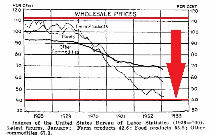
Wholesale prices of “Farm Products” fell from an index value of over 110 to just over 40 by 1933. It doesn’t take an economics Ph.D to know this price decline absolutely destroyed the farmers. Historians estimate that approximately one third of all farmers lost their family farms during the Depressions thru foreclosure. Most previously employed in farming lost their jobs.
The same happened to factory employment. As you see below, both industrial production and factory employment plummeted.
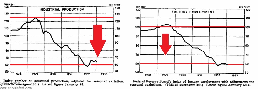
These are the oft quoted economic metrics from the Great Depression.
But one other that is not often discussed was the massive deflationary cycle triggered by these economic events. The price of just about everything declined for years. Remember: At a foundational level the price of “stuff” is created by supply versus demand. As the 1930s began, the supply was relatively unchanged. But demand fell off a cliff. Probably not because consumers did not want to buy; they simply didn’t have the money.
FDR became president in 1933. He immediately declared a “bank holiday” temporarily closing ALL the banks. This slowed bank runs. The FDIC was created shortly thereafter and as 1934 began, deposit insurance was implemented.
Next, FDR suspended “gold convertibility” and US citizens could no longer redeem dollars for gold, giving policymakers the ability to expand money supply. Confidence in the financial systems gradually increased. Of course, confidence growth was not widespread across all Americans. Most citizens were suffering greatly; many were questioning if “unregulated” capitalism had failed America. Many asked of some sort of socialism might be preferable. Interesting, right?
Tracking of the Consumer Price Index — known by the moniker CPI — is arguably one of the best metrics we have to track inflation and deflation in consumer prices. In 1929, the CPI was 17.2. That metric bottomed in 1933 at a reading of 12.9 — a 25% decline in general consumer prices. That’s deflation. FDR was able to inject optimism into the American psyche and between 1933 and 1937, the CPI moved up a bit. But it reversed again in 1938 and 1939. Consumer prices began slipping again. It wasn’t until the WW2 military industrialization reinflated the economy that the deflationary spiral was stopped. The genie had been put back in the bottle. It took a world war to do it.
Under normal conditions, deflation is a hard dragon to slay. Ask any financial expert and they’ll say an inflationary spiral is easier to kill than deflation. That’s because deflation has several self-reinforcing problems. First, consumers aren’t dumb. While instant gratification has a strong pull, if a consumer knows a car or washing machine will be cheaper next month or year, many will wait. If enough people put off the purchase of new durable goods, prices fall further reinforcing the cycle. The other problem is worse: In a deflationary economy, consumer debt is a bad thing.
Consider this: Repaying debt a decade into the future if inflation has cut the value of that debt by 50% — assuming an example of 5% per year inflation — means repaying that debt years in the future is done with cheaper dollars. The opposite is true in a deflationary spiral. Each year, a dollar is worth less, and you’re forced to pay off a dollar of debt with more expensive money. Which means more people default, bank losses increase, loan creation declines and VIOLA! money supply contracts. Further reinforcing the downward price spiral.
So, sure, inflation is bad. But deflation is worse. Just sayin. 🙂
Let’s fast forward: That was then … this is now. Right now, inflation is running hotter than just about everyone would like. The CPI report from earlier this week suggested the current annualized rate of consumer inflation is about 3.4%. The rate is trending down — it was 3.5% at the prior reading — but it remains elevated above the FEDs 2% annual target.
CNBC put together a visual that I felt did a great job showing how the individual components of the CPI contributed to this month’s reading. Take a look:
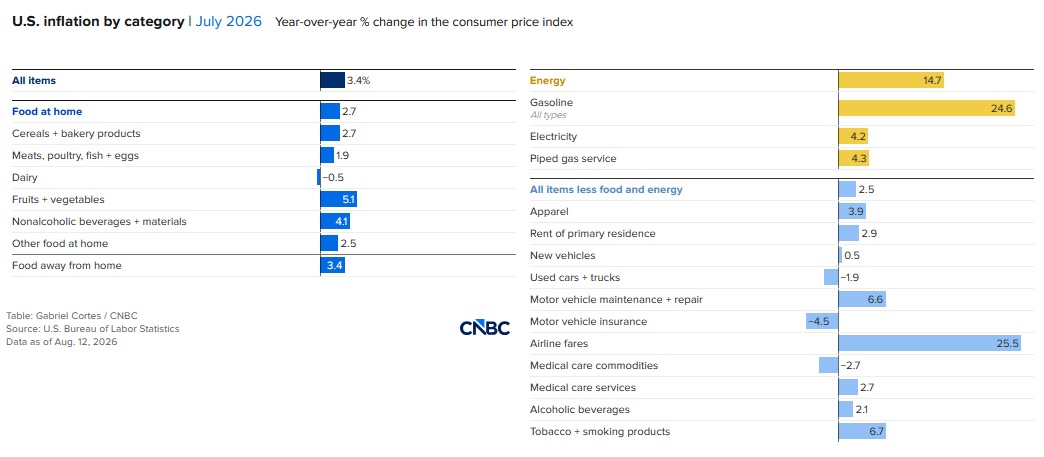
It’s interesting to see that the CPI not a single price monolith but an amalgamation of a bunch of components. This chart separates the components into three meaningful groups — “Food at home” then “Energy” and finally the “everything else” bucket. Let me point out a couple of things. First, the “core” CPI inflation number this month, as we see above, is 2.5% on an annualized basis. This reading excluded both “food” and “energy” in the calculation, as these components are highly volatile.
Price moves of the components in the “everything else” bucket are all over the map. Have you tried to buy an airplane ticket lately? The prices are way up, right? We see that above in the “Airline fares” metric — up by an annualized 25.5% in the prior month. Ouch. But hey, auto insurance costs a bit less. 🙂
Here’s my point: Yes, inflation is now, and will always be, a serious issue for all of us. Persistent inflation, over a long period of time, is exceptionally corrosive for most people. It erodes the value of savings. If inflation is rising quickly, the “real” value of labor compensation can fall, making life’s basics more expensive, year after year. These are persistent problems that most Americans struggle with at times like these.
Moving back to the higher level, I believe it helps to think of the “inflation/deflation” issue more as a pendulum that is slowly but constantly swinging and changing. Market forces, government actions, central banks, and the age old supply/demand relationship framework all impact where that pendulum moves. So here’s a bit of good news for you: Do you have any debt? Yes? Good.
Assuming the FED is successful in achieving and maintaining an average 2% annual inflation rate, that means that 10 years into the future, paying off that debt will cost you 20% less. The math is pretty simple: 2% per year times 10 years … and we see that a $100 debt today can be paid off in 10 years with only 80 of today’s dollars. Trust me. It’s true. 🙂
To the steakhouses!
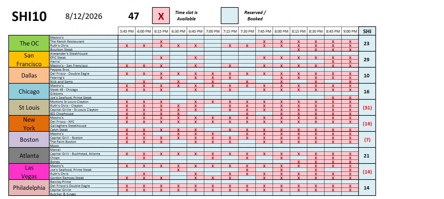
Interesting. Reservation demand in both San Francisco and Dallas saw sizable increases. Could the AI boom in the San Francisco area finally be spreading thru the local economy at large? Is that having a positive economic effect on our expensive eateries? We’ll see. Here’s the long-term chart.
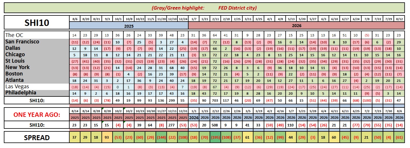
As you know, the SHI10 is an alternative metric — a tool really — that we can use to assess the ongoing strength of the US economy. This week’s reading of a positive 47 is a solid, positive indicator.
At first glance, the latest GDP report we saw last week seemed less exciting: the “advanced” estimate for Q2, 2026 GDP growth was tame at only 1.50%. That is not a smokin’-hot growth rate. But, as always, it pays to look beneath the hood. And here’s what you’ll see: The “gross domestic purchases price index” which is essentially the metric used by the BEA to adjust the nominal or ‘current-dollar’ GDP growth rate into the real growth rate of 1.5%, ran hot in this report. It was 5.7%.
Meaning, essentially, the American economy is on fire. Annualized, the current-dollar GDP growth rate for Q2 was 7.9%!
Folks, trust me on this one: THAT is a smokin’-hot growth rate.
Which is not overly surprising. Forgetting about the spike in imports that depressed this quarter’s GDP reading, when a bunch of hyperscalers decide to spend about a trillion dollars — about half of it here in America — on data centers, all of that spending trickles down into the larger economy. That money gets spent over and over again, fueling tons of activity and economic growth. I am not surprised to see that 7.9% nominal GDP growth rate. The US economy is sizzling.
<Terry Liebman>