
March Employment Report
The Economics of Murder
March 31, 2016Understanding the Yield Spread
April 4, 2016This morning, at 5:37 am, I received an email from the US Bureau of Labor Statistics. Exciting, right? Jealous?
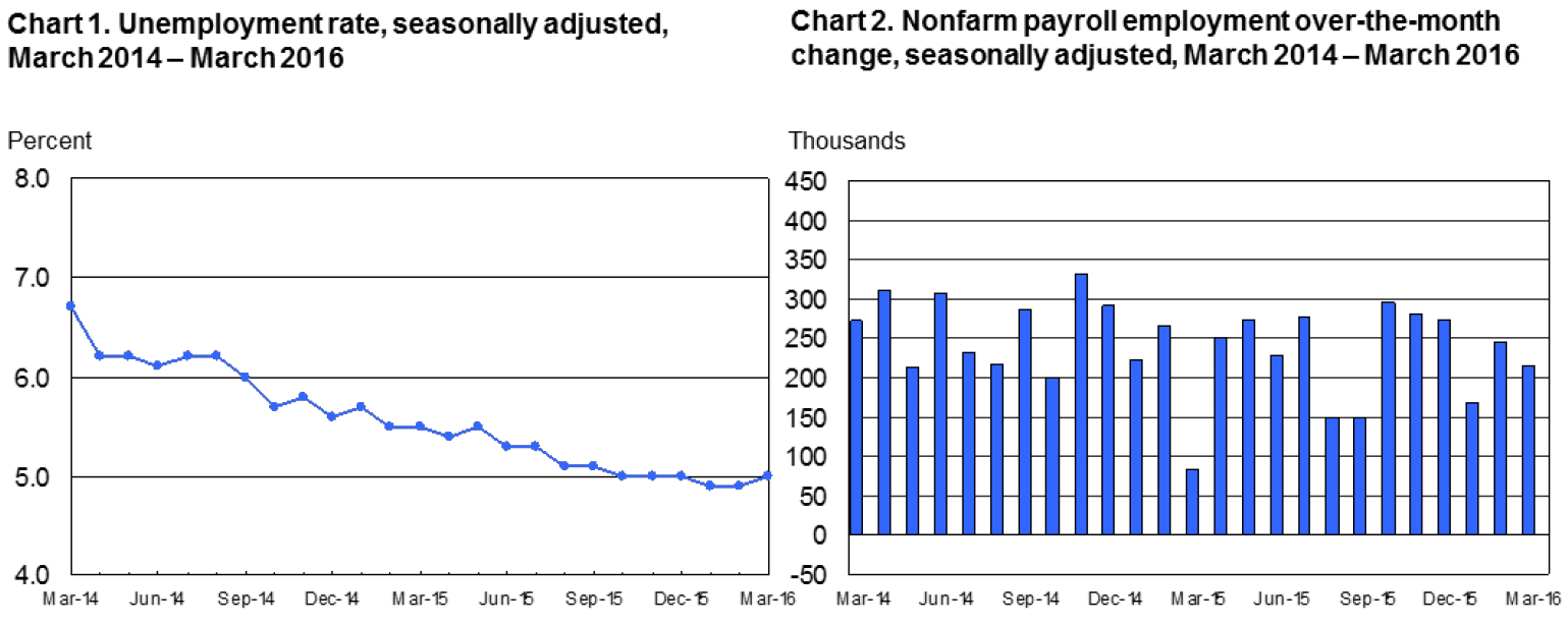
I receive this particular email on the first Friday of every new calendar month, typically within 10 minutes of 5:30 am, the precise time the BLS reports on two metrics. First, the numeric change (up or down) in ‘non-farm payroll employment’ here in the US; and, second, the US unemployment rate.
The email summarized the changes in March: “Total nonfarm payroll employment rose by 215,000 in March, and the unemployment rate was little changed at 5.0 percent. Employment increased in retail trade, construction, and health care. Job losses occurred in manufacturing and mining.”
So it appears another 215,000 new jobs were created in March. Yet, oddly enough, the unemployment rate went UP by 0.1%. 215,000 more people were employed but unemployment increased? (See the graph below.) How does that happen?
To find the answer, we have to dig a bit deeper into the numbers behind the numbers.
The simple answer is the ‘Civilian Labor Force‘ increased significantly. I discussed the CLF last month in my post on labor: https://terryliebman.wordpress.com/2016/03/04/february-2016-non-farm-payrolls/
Remember, every month the both the population of the US and the complexion of that population change. Which means many 15 year-olds became 16 in March. They now ‘count’ as part of the labor force.
And the US population grew. Here’s a nice chart showing annual population increases in the past 5 years:
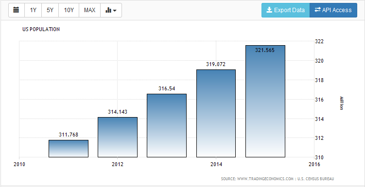
Since 2011 the US population has increased by almost 10 million people (321,565,000 – 311,768,000). An average annual increase of about 2,450,000 folks. Or, about 200,000 per month.
Which makes it easier to understand how 215,000 new jobs can be created in March and unemployment increased. But it’s not the whole answer.
A thing called the ‘participation rate’ also increased in March. Meaning, people previously NOT seeking work decided, for some reason, to throw their hat into the job-hunting ring. And if they didn’t actually find a job in March, they were counted among the unemployed:

This chart, again from the BLS (http://data.bls.gov/timeseries/LNS11300000), shows changes in the participation rate – as a percentage – of the civilian labor force, over the last 10 years. Note the ‘high’ back in 2007 (66.4%). Note the ‘low’ in mid-2015 (62.4%).
Again, let’s dig a bit deeper. The participation rate increased to 63% in March. However, this is still 3.4% lower than the ‘high’ back in 2007. If we multiply the March civilian labor force number (252,768,000) by 3.4% we see that 8,594,112 people who were ‘counted’ in the employment numbers in 2007 are NOT counted today. In theory, they have ‘left’ the labor force. Where’d they go? No where. Per the BLS they’re simply not looking for a job. Hmmm….
And what would the unemployment percentage be if we DID count these folks as unemployed? Well, the number of people ‘unemployed’ in March is reported as 7,966,000. Let’s add our 3.4% back in and we get … 16,560,112 as a total of ‘unemployed‘ and folks ‘busy surfing or watching TV, but, regardless, not looking for a job‘ and an adjusted unemployment rate of 10.4%.
Let me repeat this: If we add back the people who worked BEFORE the ‘great recession’ of 2008 who are now not looking for a job, our unemployment rate is actually above 10%.
Which reading a more accurate? Neither. There are many reasons why people leave the labor force – including retirement. But this exercise of ‘pealing back the economic onion’ to reveal the numbers behind the numbers is telling.
It tells us there is still a lot of slack in the US labor markets. Even with an official 5% unemployment rate.
- Terry Liebman


0 Comments
[…] https://terryliebman.wordpress.com/2016/04/01/march-employment-report/ […]