
Understanding the Yield Spread
March Employment Report
April 1, 2016Much Ado About Nothing?
April 5, 2016Understanding the yield curve/yield spread…and it’s implications is critically important. Many consider it the most important economic barometer available today.
Here’s an excerpt from a FED of New York research piece released earlier today entitled “The Federal Reserve and Market Confidence“:
“We discover a novel monetary policy shock that has a widespread impact on aggregate financial conditions. Our shock can be summarized by the response of long-horizon yields to Federal Open Market Committee (FOMC) announcements; not only is it orthogonal to changes in the near-term path of policy rates, but it also explains more than half of the abnormal variation in the yield curve on announcement days.”
Well. That’s clear, right? Clear as mud. Is ‘orthogonal‘ even a word?
To me, this is the problem with many economic papers. Other than ‘econ’ PhDs, no one understands the content. Let’s see if I can do a bit better as I discuss the US yield curve and the ‘spread’ (the 10-year minus the 3-month yield). First, I’ve written a few prior posts on the topic. Check them out:
Yield Curve Update – March 12, 2016
How to Predict a Recession. Accurately.
OK…now to the the good news: Based on today’s yield spread, there is no US recession in sight. We had a ‘scare’ earlier this year, but the ‘spread’ graph below is assuring us the economy is on sound footing:

The ‘scare’ is the trajectory of the red line. If it continued to move lower (we’ll discuss this below) a recession might be coming. But it reversed course. Notice the ‘spread’ never fell below 1.4%? Meaning the 10-year Treasury yield was remained more than 1.4% above the 3-month Treasury yield.
Now let’s take a look at the long-term graph (beginning in 1982):
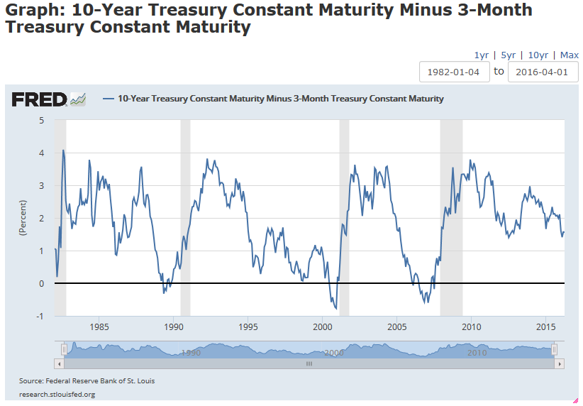
The vertical gray areas are recessions. Notice a sizable decline in the spread predicted most recessions – and a negative spread occurred before every recession?
But every decline did not result in a recession. Take a look at the graph below. I’ve added a horizontal ‘red line’ right at a spread level of 1.4% (look to the right: you’ll see this is where the spread changed direction earlier this year). In 1985/1986, and a few times between 1995 and 2000, the spread fell below 1.4%. Without a subsequent recession. And in 1998 the spread was almost zero. Still no recession.

So, as predictive tool, a falling spread is indicative of a potential recession – coming soon. But not a sure thing. Keep this in mind: Indicative, but not certain. However, it the spread goes negative, it’s very likely a recession is in in the cards. In the very near future.
In my next blog on this topic, I’ll talk more about what causes the spread to move up and down.
- Terry Liebman
The St. Louis FED has a great research platform, called FRED (hyperlink below) where I created these graphs. I’ll revisit this site from time to time, but if you’re interested, go to the site and check it out. Here’s the URL for the data. Check it out … it’s quite amazing:
https://research.stlouisfed.org/fred2/graph/?id=T10Y3M


2 Comments
[…] https://terryliebman.wordpress.com/2016/04/04/understanding-the-yield-spread/ […]
[…] https://terryliebman.wordpress.com/2016/04/04/understanding-the-yield-spread/ […]