SHI 10.11.23 – M2, Monetarists and MMT

SHI 10.4.23 – Higher for Longer?
October 5, 2023
SHI 10.18.23 – Food and Drinking Places
October 18, 2023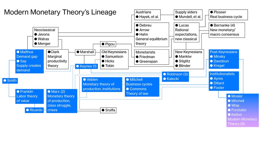
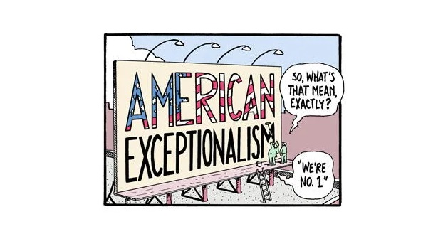
It’s been said a picture is worth a thousand words.
While one could quibble on the “thousand” part, I tend to agree. However, not that image above. That one is just confusing. Let me interpret a little: “Modern” economic theory, in theory, began with Adam Smith back around the time the US declared its independence from Britain. John Maynard Keynes, and his theories from about 100 years ago, remain foundational to modern, mainstream economics today. Friedman pretty much wrote the book on money supply and inflation. Which brings us up to present day. And Modern Monetary Theory.
Which, in my opinion, is total wingnut lunacy. And today I’ll prove it.
“
Bring on the Pix!”
“Bring on the Pix!”
OK … OK … hold your horses, the images are coming soon.
Modern Monetary Theory begins with this idea: Because the United States prints its own currency, it can’t, by definition, run out of money. If we need more, just print it!
Promoters of MMT argue that rather than targeting a balanced budget each year, governments should instead aim for an economy that has full employment. America can do that by printing, spending and creating jobs, even if that means running persistent, larger-and-larger budget deficits which can simply be funded by printing more money! Thus, essentially, Modern Monetary Theory believes deficit spending no longer matters and deficits, regardless of size, have no impact on interest rates or the inflation rate.
🙂
OK, got it? More on this later.
Before the pictures, we need to set the stage. Consider this: Between 2010 and the beginning of 2020, the FED struggled year-after-year to reach a 2% annual inflation rate. Every single year, the inflation rate remained stubbornly low. Reams of economic papers were written to explain the cause; in fact, there were simply too many to even begin to comment. But, essentially, they typically concluded that the relationship between inflation and money supply — Monetarism to you economic wonks — was broken. It was no longer valid. No, these papers said, Monetarism was dead and buried, along with Dr. Milton Friedman, its famous author. Clearly, these folks suggested, it was time for a new approach! Enter MMT. MMT, its promoters assured us, is as American as hot dogs and apple pie! Turn on the printing presses!
Well, here we are at the end of 2023, that theory has been tested. It has been weighed, measured, and found wanting.
In the economic-theory battle between MMT and Milton Friedman, I believe Dr. Friedman has won again. MMT has lost. Bring on the pictures!
Welcome to this week’s Steak House Index update.
If you are new to my blog, or you need a refresher on the SHI10, or its objective and methodology, I suggest you open and read the original BLOG: https://www.steakhouseindex.com/move-over-big-mac-index-here-comes-the-steak-house-index/
Why You Should Care: The US economy and US dollar are the bedrock of the world’s economy.
But is the US economy expanding or contracting?
Expanding … FED rate increases notwithstanding! At the end of Q2, 2023, in ‘current-dollar‘ terms, US annual economic output rose to an annualized rate of $26.84 trillion. After enduring the fastest FED rate hike in over 40 years, America’s current-dollar GDP still increased at an annualized rate of 4.7% during the second quarter of 2023. Even the ‘real’ GDP growth rate was strong … clocking in at the annual rate of 2.4% during Q2. No wonder the FED is concerned.
The world’s annual GDP first grew to over $100 trillion in 2022. According to the IMF, in June of this year, current-dollar global GDP eclipsed $105 trillion! IMF forecasts call for global GDP to reach almost $135 trillion by 2028 — an increase of more than 28% in just 5 years.
America’s GDP remains around 25% of all global GDP. Collectively, the US, the European Common Market, and China generate about 70% of the global economic output. These are the 3 big, global players. They bear close scrutiny.
The objective of this blog is singular.
It attempts to predict the direction of our GDP ahead of official economic releases. Historically, ‘personal consumption expenditures,’ or PCE, has been the largest component of US GDP growth — typically about 2/3 of all GDP growth. In fact, the majority of all GDP increases (or declines) usually results from (increases or decreases in) consumer spending. Consumer spending is clearly a critical financial metric. In all likelihood, the most important financial metric. The Steak House Index focuses right here … on the “consumer spending” metric. I intend the SHI10 is to be predictive, anticipating where the economy is going – not where it’s been.
Taking action: Keep up with this weekly BLOG update. Not only will we cover the SHI and SHI10, but we’ll explore “fun” items of economic importance. Hopefully you find the discussion fun, too.
If the SHI10 index moves appreciably -– either showing massive improvement or significant declines –- indicating growing economic strength or a potential recession, we’ll discuss possible actions at that time.
The Blog:
Economists love equations. Me? Not so much. It’s been years since I’ve played around with them … probably mostly because they are really the polar opposite of a graph or image. If a picture is worth a thousand words, an economic equation typically sucks all the air out of a room. Everyone hates them! Well, everyone except economic PhD candidates.
But, alas, I find myself writing one out for you! “What?” you gasp. “Why is he doing this to us?”
Sorry, but I thought we could start here and quickly move to some pictures! Does that work for you? 🙂
Here goes ….
es + uc + sd + ( gM2 – GDP ) = I
Right. As clear as mud. Let me explain.
Essentially, this equation suggests higher-than-trend inflation — that’s the ‘I’ in the equation above — is generated by excess savings (‘es‘) plus unused or available credit (‘uc‘) plus the difference between the growth in money supply (‘gM2‘) and the ‘real’ GDP growth rate (‘GDP‘).
The US savings rate is a fairly well-known, closely-tracked statistic. And while it has trended down over the past few decades, it has been fairly consistent over time. Until the pandemic. During the pandemic, the savings rate shot toward the moon, the result of Covid economic relief courtesy of the US government. As measured by the FED Z.1 report, excess savings — the amount in American bank accounts above and beyond the historic savings levels — remains quite large to this day.
Unused credit is represented by ‘uc‘ above. It is a bit more nebulous, as it is more conceptual than factual. However, essentially ‘unused credit’ represents overall access Americans have to increase credit card balances, car loans, home equity lines of credit, and other sources of credit balance expansion. Access remains robust, but it is shrinking somewhat today.
Supply disruption — ‘sd‘ in the equation — measures the extent to which embedded supply chains are broken by historically unique events. And boy, was the Covid pandemic unique. Here’s our first picture!
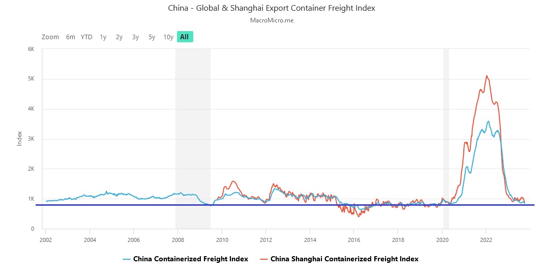
As we see above, the cost to ship a 40 foot container across the Pacific, from China to the US, was relatively static for years. Then Covid hit. Resulting disruptions generated about a 5X increase in shipping cost for a brief time. Today, that index is back near it’s historic average. However, that large ‘blip’ above was a big contributor to the inflation we’ve seen in the past few years.
Clearly, viewed this way one can say freight cost increases were transitory.
The growth in money supply is ‘gM2‘, and GDP is, well, ‘real’ GDP. That one is easy.
On this relationship, the Nobel prizewinning economist Milton Friedman, more concisely said it this way:
“Inflation is always and everywhere a monetary phenomenon, in the sense that it is and can be produced only by a more rapid increase in the quantity of money than in output.”
Dr. Friedman would have hated MMT. His “always and everywhere” comment leaves little to the imagination.
My equation is an attempt to express the relationships between these variables. And I believe the graph below visualizes that same story for us:
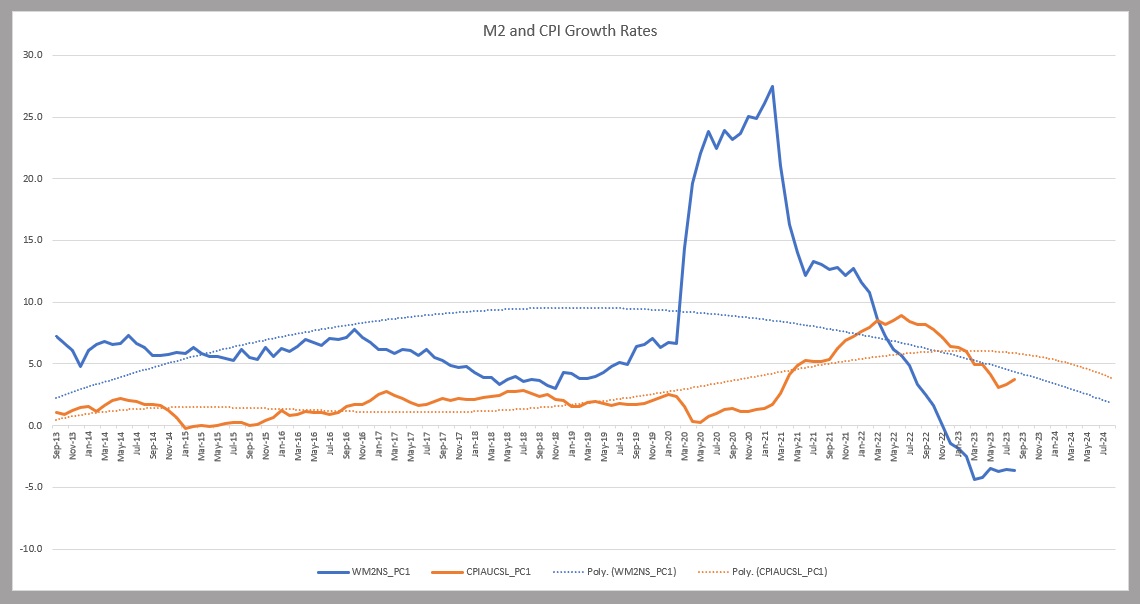
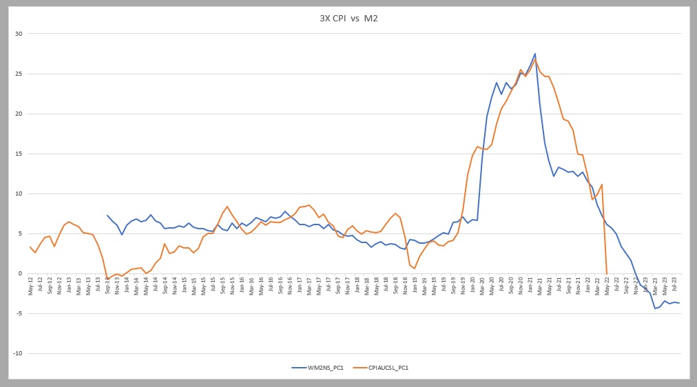
The orange line is CPI and the blue line is M2 or money supply. Look at that massive M2 bulge as 2020 began.
The challenge with this image, of course, is we have trouble visualizing a correlation between the massive growth in M2 and its impact — if any — on consumer prices. The lines on the graph are interesting … but at first glance they don’t appear to work together.
But there are a couple of simple explanations for that. First, the inflation rate shown above — measured by the orange line — is far more muted than the M2 growth line. Dr. Friedman would probably argue that the GDP growth rate was a dampening effect as quite a bit of the M2 growth was absorbed by GDP growth. The second reason is timing. There is a clear lag effect between the dates when M2 spiked and, later, when the CPI spiked. In fact, when I closely studied that graph, I decided the lag effect is almost exactly 16 months. In other words, a spike in M2 will show up in a CPI spike almost exactly 16 months later.
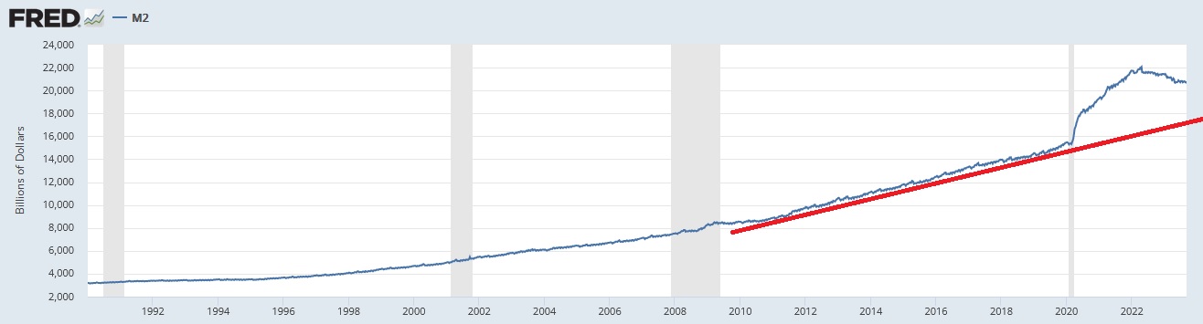
To remove the dampening effect of GDP growth, I multiplied the annual CPI growth rate by 3X. And I realigned the graphs so that I could eliminate the lag effect. This is the result:
Looking at the above graph, it’s easy to see the incredible correlation between M2 growth and CPI spikes. The directional movement and correlation are both undeniable. By shifting the CPI line 16 months into the future, and increasing its amplitude by 3X, the movement overlap is precise. That 16-month delay is called a “lag effect.”
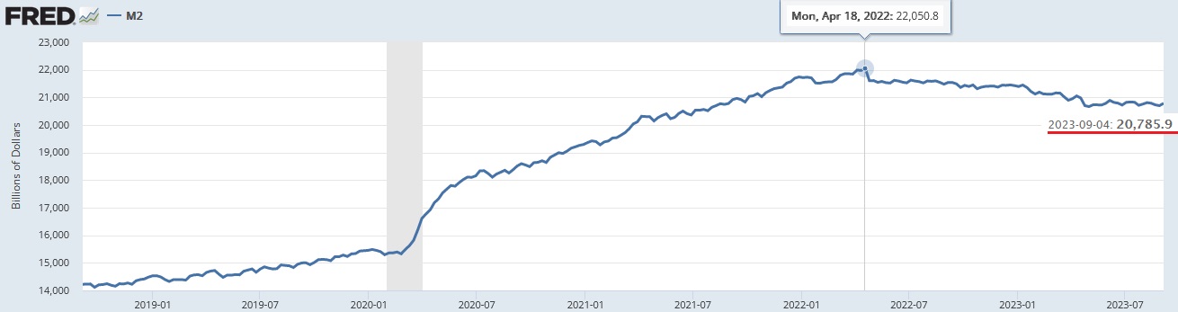
Why was the FED unable to increase inflation to their 2% target between 2010 and 2020? I contend they simply didn’t go big enough. Sure “quantitative easing” increased the FEDs balance sheet by trillions, increasing money supply from about $8.5 trillion in 2010 to $15.5 trillion in 2020, but in retrospect that increase was not adequate to trigger a larger inflationary response. At the time, the FED believed it would be … as did I … but history has proven us both wrong. The extraordinary M2 growth rate post-pandemic, however, did the trick. Consumer price inflation took off. Take a look at the graph below, showing M2 growth between 1990 and today:
The blue line shows M2 growth over the past 30+ years. I added the red line to show the directional trend of that growth rate. The massive bubble we see in 2020 represents the massive injection of fiscal and monetary stimulus, the combination of which triggered the largest M2 increase in history. That’s where you’ll find the cause of the recent inflation surge.
I hope you now agree Modern Monetary Theory is completely debunked. There can be no doubt that massive money supply growth trigger out-sized inflation, even after accounting for robust GDP growth that soaks up some of the inflationary push. Taken to the extreme, a doubling of money supply would simply trigger higher-and-higher consumer price inflation as a result. No, MMT doesn’t work. History has now definitively proven this point.
As you can see in the chart below, M2 money supply growth ended on April 18, 2022 — shortly after the FED began raising rates and shrinking their balance sheet. Are these events related? The short answer is yes. Money supply has declined in amount almost identically to the reduction in FED assets. Let me say that another way: M2 has declined almost dollar-for-dollar with reductions in FED assets on their balance sheet.
And as we see below, M2 has fallen by $1.265 trillion — or by over 5.7% — since that time.
During this same time period, GDP grew by almost $1.5 trillion. The “capital gap” in the past 18 or so months, therefore, is over $2.7 trillion. Without M2 feeding that growth, previous excess M2 — and there was plenty — had to fuel the economic furnace.
These dynamics, I contend, will help tamp down inflation in future quarters. Combine this fact with the reduction in available credit, shrinking excess savings (at least for the bottom 3 quartiles), and the fixed, or at least functioning, supply chains, inflation should continue to moderate toward the FEDs 2% goal.
MMT simply doesn’t work as advertised. Runaway deficit spending will simply create runaway inflation, to the extent M2 growth (in dollars) exceeds GDP growth — in dollars. The past 2 years have proved this unequivocally.
I’ll finish this discussion with a question for you: If excess inflation is the result when the growth rate in money supply is significantly faster than the growth rate in our economy, is the opposite also true? That is, might an economy experience deflation if money supply shrinks too rapidly, thereby denying our economy the fuel to grow and maintain output prices?
Of course, the relationship is more complex that that. However, the short answer is yes. A precipitous decline in money supply could trigger a deflationary cycle. What is precipitous? Today we know a 40% increase in money supply over two years will trigger an outsized inflation event. Presumably the opposite is true.
Money supply is shrinking today. And as the FED plans to continue to shrink their balance sheet, I expect further declines. Might that decline push American into a deflationary spiral in the next few years? Probably not. In my opinion, the move is not large enough. And, in fact, M2 has been relatively stable for the past 4 months. But a lot depends on the future direction. Time will tell.
Time for a steak?

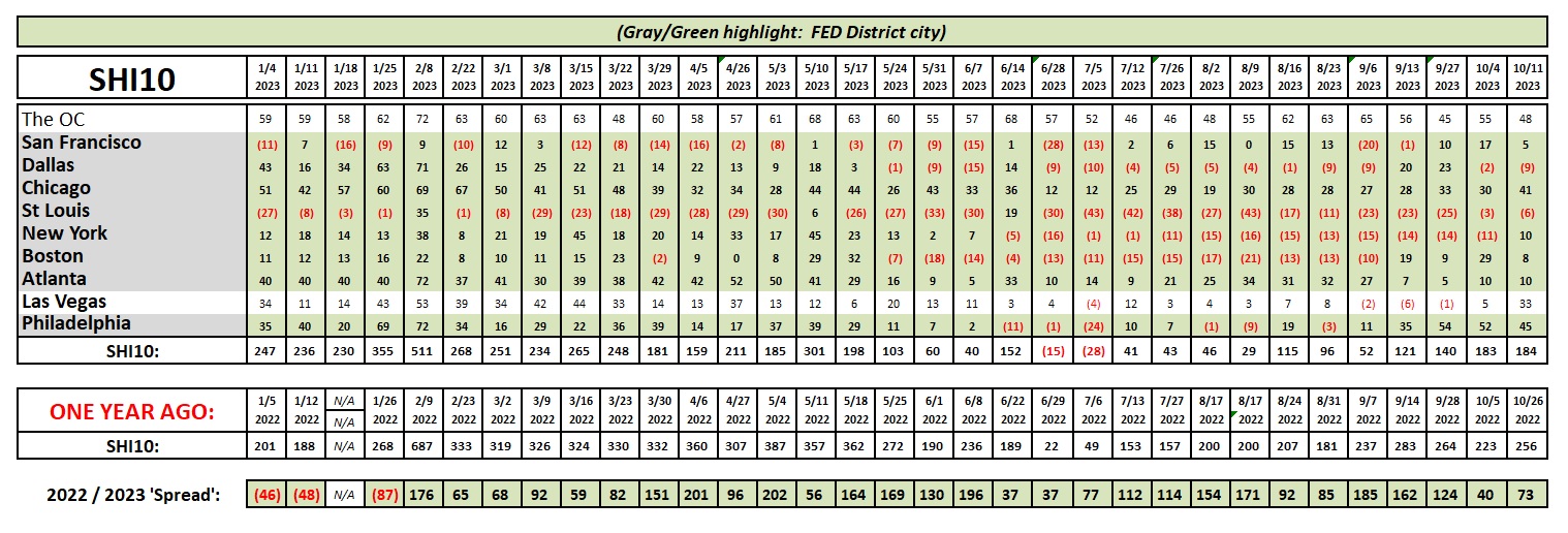
Reservation demand at our steakhouses is on auto-pilot this week … as the SHI10 is almost identical to last week.
Here’s the trend chart.
Well, I suspect by now you’re quite tired of reading my dribble. Sorry. Next week I’ll try to be more succinct. Maybe I’m suffering from word inflation?
My thanks to Sean Solomon for his technical assistance working thru Google graphs. Much appreciated sir!
<> Terry Liebman