SHI 11.24.21 – It Takes A Lot of Power …

SHI 11.14.21 – Looking at the Numbers
November 17, 2021
SHI 12.1.21 – Money Talks
December 1, 2021
… to power America.
I filled the tank in my Porsche the other day. (My license plate frame: “My other car is a Tesla.”) 🙂
And I was thinking, “Wow, it’s over 5 bucks a gallon!” That’s pricey. Have I ever paid more? No, I think this is the highest price per gallon I’ve ever paid. Have you had the same feeling recently? As Americans get ready to take to the roads for Thanksgiving, I am sure many of them will make this comment to anyone near the gas pump …
“
… Gas prices have never been higher!“
“… Gas prices have never been higher!“
This feeling, shared by most driving Americans across the country, is likely one reason behind President Biden’s decision yesterday to “make available” 50 million barrels of oil from the US Strategic Petroleum Reserve. If we believe the “opinion polls”, Americans are not overly happy with President Biden right now. Gas and food prices, many feel, are thru the roof. The place Americans feel inflation most intimately is at the gas pump and the grocery stores. But is the “feeling” accurate? Let’s take a deeper look at energy production, supply/demand, and let’s see if today’s per-gallon price is truly the highest it has ever been.
Welcome to this week’s Steak House Index update.
If you are new to my blog, or you need a refresher on the SHI10, or its objective and methodology, I suggest you open and read the original BLOG: https://www.steakhouseindex.com/move-over-big-mac-index-here-comes-the-steak-house-index/
Why You Should Care: The US economy and US dollar are the bedrock of the world’s economy.
But is the US economy expanding or contracting?
Expanding. Significantly. In fact, in the 6 months of Q2 and Q3, growth nominal terms exceed $1.1 trillion of economic activity. The world’s annual GDP is expect to end 2021 near about $93 trillion. Annualized, America’s GDP settling in at $23.17 trillion — still around 25% of all global GDP. Collectively, the US, the euro zone, and China still generate about 70% of the global economic output. These are your big players.
The objective of this blog is singular.
It attempts to predict the direction of our GDP ahead of official economic releases. Historically, ‘personal consumption expenditures,’ or PCE, has been the largest component of US GDP growth — typically about 2/3 of all GDP growth. In fact, the majority of all GDP increases (or declines) usually results from (increases or decreases in) consumer spending. Consumer spending is clearly a critical financial metric. In all likelihood, the most important financial metric. The Steak House Index focuses right here … on the “consumer spending” metric. I intend the SHI10 is to be predictive, anticipating where the economy is going – not where it’s been.
Taking action: Keep up with this weekly BLOG update. Not only will we cover the SHI and SHI10, but we’ll explore “fun” items of economic importance. Hopefully you find the discussion fun, too.
If the SHI10 index moves appreciably -– either showing massive improvement or significant declines –- indicating growing economic strength or a potential recession, we’ll discuss possible actions at that time.
The Blog:
My long-time readers know the word “real.” In the economic sense. Not in the “real” vs. “imaginary” sense. In economics, ‘real’ simply means the number portrayed has been adjusted downward by an inflation factor. But both meanings are applicable here … so back to the question: Is the per-gallon price at the pump the highest its ever been? Is our feeling real … or is it imaginary?
Our feeling is imaginary. It feels ‘real’ … but it is not. After we consider the effects of inflation, gas prices are actually much cheaper than in 2014 and in the 1980s. Sure, the ‘current-dollar’ price is setting new current-dollar records. But the ‘real’ dollar paid in 2021 is “worth” about the same as the ‘real’ dollar paid in 1976. Meaning that a true and accurate comparison requires that we make an adjustment. We need to convert today’s per-gallon price into “real” dollars to see if our feeling matches reality. Fortunately for me, the EIA has already done this. Take a look at the chart below:
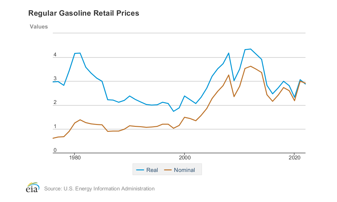
The ‘golden‘ colored line is the ‘current-dollar‘ or nominal price of a gallon of gas since around 1976. Over time, it has gone up, up, up. The ‘blue‘ line is the inflation adjusted, ‘real’ price. Thru this lens, after we remove the effects of inflation, the per-gallon price today is just about the same as back in 1976 — 45 years ago.
In the above chart, the EIA took the “regular” gas retail price today and using the annual CPI to “deflate” historic nominal gas prices, they calculated the inflation adjusted price for that gallon of gas. It turns out that the ‘real’ per-gallon price is lower today than back in the 1980,s and most years up to around 2016. Of course, it doesn’t feel like it. But it’s true.
We’ve talked extensively in my blog about the two lenses, “real” and “nominal,” or current-dollar. The price we pay at the pump is the current-dollar price. That’s today’s price, that’s what we pay, that’s what it is. But for historical accuracy, shouldn’t the number also be stated after a post-inflation adjustment? Like GDP?
After all, the SHI is one of only a handful media outlets where you’ll see both GDP numbers — the current-dollar GDP and the real GDP. Earlier this morning, the ‘second estimate’ for third quarter, 2021 GDP was released by the Bureau of Economic Analysis. GDP growth during the quarter, per the BEA, was adjusted upward slightly to the annualized rate of 2.1%. Buried further down the page, however, is the much more impressive ‘current-dollar’ figure: In Q3, the annualized nominal GDP increase was a whopping 8.1%! Only after shrinking the number for the effects of inflation does the number become 2.1%.
I’m not debating the accuracy of either method … I’m questioning the consistency. If GDP is reported to the general public in ‘real’ terms, why isn’t the price of gas, food, housing, etc? Or, conversely, if we only see current dollar prices at the pump or supermarket, why isn’t GDP reported in current dollars first, and post-inflation second?
The simple answer is that it’s complicated, from a technical perspective, according to the Federal Reserve Bank of Dallas and an extensive explanation they posted a few years ago (right click, open link in new tab):
https://www.dallasfed.org/research/basics/nominal.aspx
Imagine filling your tank, paying $100 on your credit card, and then being told your ‘real’ price was $40? That seems nonsensical, right? But why is that any less absurd than reporting GDP grew 2.1% last quarter when, in fact, the actual increase was 8.1% — and only after subtract the “imaginary” 5.5% reduction for inflation is the official GDP number reported to the American public? The BEA might answer the question this way: “We are attempting to report the true growth in the US economy during the prior quarter. Inflation pushed up the numbers and so only by subtracting out inflation’s effect can we see the true and accurate economic growth number.” I understand the objective. I simply feel the “official” use of inflation-adjusted numbers is inconsistent across the many official economic releases. I’ll step off my soap box now.
We see that corporate profits rose again in the third quarter. As I expected. Even with disrupted supply chains, transportation snarls, labor shortages, etc., corporate profits were up yet again. A lot. During the quarter, corporate profits increased by $121.4 billion. For context, consider the pre-pandemic annual corporate profits figure for 2019 of $2.36 trillion. The annualized run rate of 2021 corporate profits is presently $2.94 trillion — an increase of more than 24% over 2019. Oh? Do I hear a question from the audience? Yes? Yes, you are correct: that figure is reported by the BEA in current-dollars only. No, sorry, they do not adjust the figure for inflation and report a ‘real’ figure. Why not? I have no idea.
Now, I’ll get off my soap box. 🙂
Economically speaking, power and energy are fascinating topics. Consider the never-ending ‘dance’ between supply and demand in the oil patch. Supply and demand are tight, constantly shifting position, responsible for many of the price movements we see:
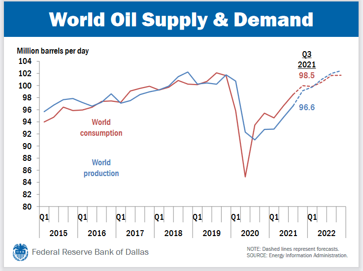
Right now, we see that “world consumption” is far above production. With demand exceeding supply, prices are pushed upward. However, the EIA expects this relationship to reverse by Q1 of 2022. Why? You’ve got me. I have no idea. Looking at the chart below, I find that conclusion to be questionable at best:
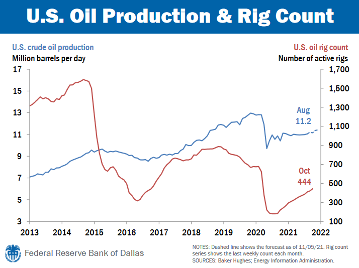
Active oil rigs have plummeted from 2014 thru today. And at 444 active rigs, today’s level is at about half the level at the end of 2018. Why? Again, the reasons are complex, as we will discuss in more detail below.
The ‘blue‘ line above us US oil production. In August, as you see, production was 11.2 million barrels per day. Again, that’s each and every day. So let’s do the math: How long will the administrations release of 50 million barrels from the US SPR last? OK, 50 divided by 11.2 equals … hmmm. Wow. Only about 4.5 days. That’s gonna help supply and push the price down? I’ll leave that answer to you, but keep in mind the official White House plans to release the US reserves over a several month period.
Why is rig count and oil production down? Again that’s a complicated answer, but at a high level, I think we all understand the global push to replace petroleum with renewable energy sources. I can’t argue with the objective. I do support and prefer legitimately “clean” and renewal power sources over those that pollute. But pushing the concept aside for a moment, I suspect the US and the world at large may have a problem with the timing. Shifting away from the power generated by oil products too quickly, without adequate replacement from renewal sources, will cause a supply/demand problem. Leaving many people without power.
Consider this piece from Reuters a few months ago (right click, open in new tab):
I expect we’ll see a many similar articles in the future as our politicians get far out over their skis on this issue. It’s a serious challenge to meet the current energy needs while switching to renewables. Many folks may be left in the dark. So how is the renewable energy movement going? Have we been able to replace petroleum-generated power with renewable power? Let’s take a look at the most recent figures from the US Energy Information Administration — the EIA. After all, electricity powers our homes and businesses.
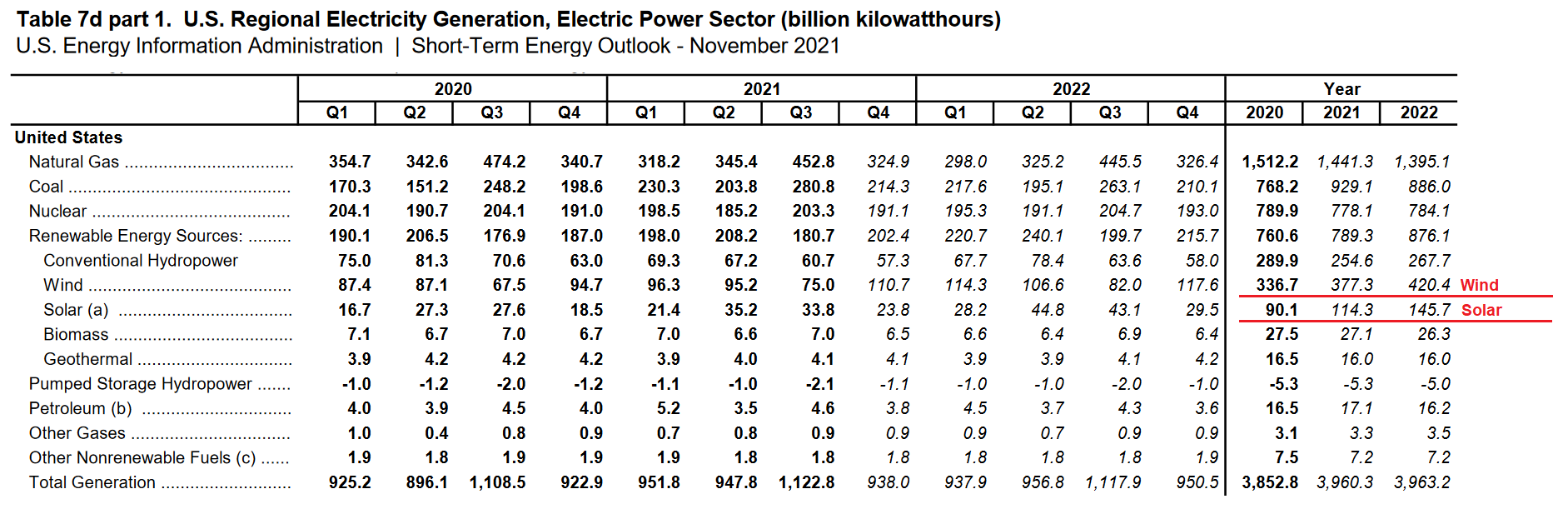
Looking at the chart, I find it interesting that while nuclear electricity production has been fairly flat in 2020 and 2021, and the same is expected in 2022, take a look at the electricity production from natural gas and coal. Coal? Electric power generated from coal is UP here in the US from 2020 to 2021? And not only up … but up by more than 21% in one year? Wow. I’m surprised. Very surprised. Solar power production is expected to see a sizable increase during 2022; and so is wind, to some extent. The increase in both solar and wind, however, expected by 2022 is only about 3% of the total electrical power generated. Just 3%. Renewable energy power sources are not growing fast enough to make up for losses in oil production.
Take a look at the EIA’s chart:
What might happen if the growing commitment in California and to US to a “renewable” policy, if timing issues prevent renewable sources to make up the energy gap? Thereby pushing the supply/demand paradigm even further out of balance? Simple: Rolling power outages. No A/C. Blackouts. Ouch. Nothing good. People will suffer … and businesses too, in the longer run.
OK, enough gloom and doom. It’s the Holiday season!
Don’t worry, be happy!
Let’s head to the steakhouses where they have plenty of natural gas to grill up your steak. I am really curious to see how popular expensive steakhouse reservations will be this coming Saturday, two days after Thanksgiving.
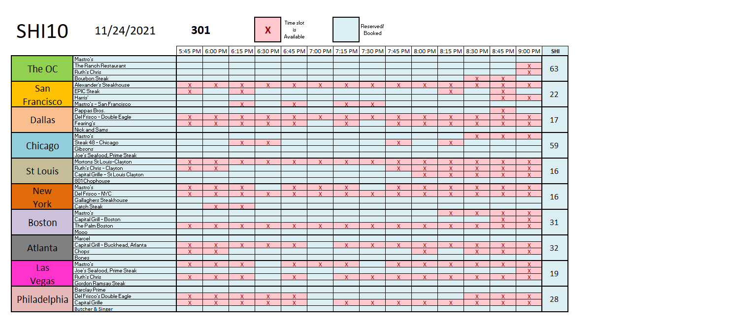
Interesting. The heavy “tourist” cities — Las Vegas and NYC — are both experiencing weaker reservation demand this Saturday. Could the gamblers and theater-lovers be spending this weekend with families and loved ones? Perhaps! But the red meat-eaters in the OC are clearly jawboning for a pricey steak on Saturday after two days with turkey and family. Mastros Ocean Club is fully booked … and the other three are close behind.
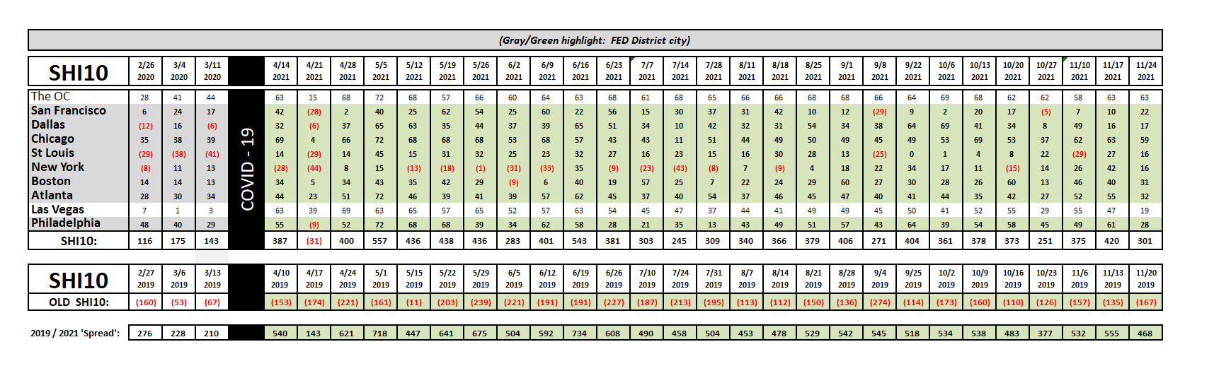
Our longer term trend chart is undaunted by the Thanksgiving holiday. The “spread” remained consistent and all SHI10 markets:
We need look no further than Nordstrom to find a casualty of today’s labor shortages, labor costs, and inventory snafus. At the time of this writing, their stock price fell thru the floor. Down almost 30% in one day this iconic retailer, which opened their doors in 1901 — years before the 1918 Spanish Flu pandemic — is struggling mightily. Nordtrom could be the poster-child for the clear and exigent challenges many individuals, retailers and business face today. The challenges are both adapting to conditions today and accurately predicting tomorrows’. Both are extremely difficult to do, as the Nordstrom results demonstrate.
But as sure as the sun will set today, it will rise tomorrow. Another day, another dollar. 🙂
And while Nordstrom struggles, many other companies have successfully navigated these exceptional challenges and profited greatly. In the aggregate, as I’ve repeated before, our American economy remains on solid footing. Fear not … and Happy Holidays! My hopes for a fantastic holiday with your friends and loved ones.

<:> Terry Liebman