SHI 11.14.21 – Looking at the Numbers

SHI 11.10.21 – Have You Heard About Inflation?
November 10, 2021
SHI 11.24.21 – It Takes A Lot of Power …
November 24, 2021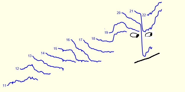
You may believe writing a weekly blog is difficult. It is. But not because I have trouble finding content or topics. No, that part is easy — perhaps too easy. My greatest challenge is editing myself and finding the topic I feel my 6 avid readers might find both interesting and mildly entertaining. 🙂
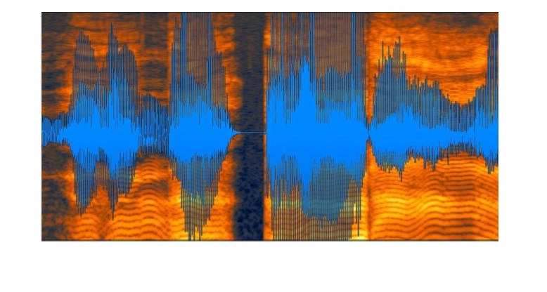
But today, I’ve gone beyond just the numbers … and jumped deep into the art world ‘pool’! What do you think of this week’s image (above)? Yep. I made it myself. I call it “Looking at the Numbers.” Shortly, the image will become an NFT. For my NFT, I will be using the Ethereum blockchain; once complete, I expect Christies to auction my NFT for purchase to the highest bidder. Will that be you? This is a “one-of-a-kind,” folks! This opportunity, once gone, may never repeat!
I will be the next ‘Beeple,‘ people! His $69 million record will fall TO ME! This NFT could be yours!
“
We can’t track GDP without numbers!“
“We can’t track GDP without numbers!“
OK, truth be told, I’ve simply modified an image that I clipped from the Yardeni Research site.
Would I be violating copyright law if I use Yardeni’s work as the basis of my NFT? Probably. And given the fact that I have just 6 blog followers, few of which might be likely to appreciate such a unique expression of the juxtaposition of art and economics, I feel my risk here likely exceeds any potential personal gain. Sorry, loyal readers, no NFT potential here. Beeple, your record is safe for another day.
Welcome to this week’s Steak House Index update.
If you are new to my blog, or you need a refresher on the SHI10, or its objective and methodology, I suggest you open and read the original BLOG: https://www.steakhouseindex.com/move-over-big-mac-index-here-comes-the-steak-house-index/
Why You Should Care: The US economy and US dollar are the bedrock of the world’s economy.
But is the US economy expanding or contracting?
Expanding. Significantly. In fact, in the 6 months of Q2 and Q3, growth nominal terms exceed $1.1 trillion of economic activity. The world’s annual GDP is expect to end 2021 near about $93 trillion. Annualized, America’s GDP settling in at $23.17 trillion — still around 25% of all global GDP. Collectively, the US, the euro zone, and China still generate about 70% of the global economic output. These are your big players.
The objective of this blog is singular.
It attempts to predict the direction of our GDP ahead of official economic releases. Historically, ‘personal consumption expenditures,’ or PCE, has been the largest component of US GDP growth — typically about 2/3 of all GDP growth. In fact, the majority of all GDP increases (or declines) usually results from (increases or decreases in) consumer spending. Consumer spending is clearly a critical financial metric. In all likelihood, the most important financial metric. The Steak House Index focuses right here … on the “consumer spending” metric. I intend the SHI10 is to be predictive, anticipating where the economy is going – not where it’s been.
Taking action: Keep up with this weekly BLOG update. Not only will we cover the SHI and SHI10, but we’ll explore “fun” items of economic importance. Hopefully you find the discussion fun, too.
If the SHI10 index moves appreciably -– either showing massive improvement or significant declines –- indicating growing economic strength or a potential recession, we’ll discuss possible actions at that time.
The Blog:
Before I was carried away by NFT dreams, I first admired the original Yardeni image below, posted on their site a week ago. It’s quite easy to see how the chart got my artistic juices flowing, inspiring my interpretation, right? Are you feeling it too? Doesn’t the chart, in its natural state, look like a face? Sure it does!
In it’s natural state, the chart summarizes the ‘consensus’ of many analysts focused responsible for forecasting S&P 500 earnings for each calendar year. They aren’t very good at it, frankly. And their seemingly never-ending failure reminds me of an old quote by John Kenneth Gailbraith, “The only function of economic forecasting is to make astrology look respectable.” Ouch, John. That’s harsh. True, but harsh. 🙂
Clearly after, November 10th (publication date), each image on the chart is a forecast; before the 10th, the numbers reflect the history of earnings forecasts, made weekly, for the prior 10+ years. I find it fascinating that analysts’ are optimists: Their corporate earnings expectation typically tend to be appreciably higher on January 2nd than as the year progresses. This was true in 2012 thru 2017, and again in 2020. But we all know why S&P 500 earnings expectations fell thru the floor in 2020. No mystery there.
Each of the lines and numbers on the chart correspond to that calendar year. 2020 easily makes our ‘nose,’ and a modified 2019 and 2021 gave us eyes. The mouth? That is my own, personal, unique addition. Hmmm …. perhaps I can use an image of just the mouth for my NFT? There’s an idea! Anyone interested in paying me 230 ETH for just the mouth? That’s the NFT “buy it now” price. Get back to me. Soon!
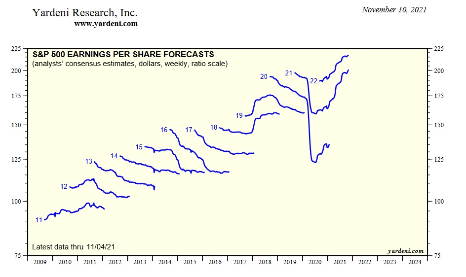
Let me get to my point: As I’ve mentioned in numerous prior blogs, and as you already know, the “earnings” of the S&P 500 companies, in the aggregate, power the stock markets. Stock prices are not only reliant on earnings, but earnings — their growth or decline — are a critical component in stock valuation. Show me rising earnings … and I can probably show you a rising S&P 500 valuation. My personal opinion: I expect the 2022 forecast above will prove conservative. I believe many large US companies, for the first time in more than a decade, have the pricing power to increase both top- and bottom-line incomes in this environment. Am I right? Time will tell.
Like S&P earnings, consumer spending — known as “Personal consumption expenditures” in GDP parlance, drive GDP growth. Personal consumption expenditure, known as PCE, is a combination of both “goods” and “services.” Interestingly, services consumption exceed goods consumption by a ratio of about 2 to 1.
The growth, or decline, in PCE is a critical component in the continuing growth of the US economy. For that reason, here at the SHI I track PCE movement quite methodically. Fortunately for me, so does the US Census Bureau. Below, I’ve combined the most recent monthly readings for each, courtesy of ‘FRED’ over at the St Louis FED.
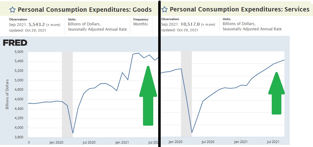
As the image states, the numbers are updated monthly, but the figures shown above for ‘Sept 2021’ are the most recent, annualized figures. Thus, adding them together, we see that PCE, as of September 2021, totaled over $16 trillion annually, on a nominal basis. As Q3, 2021 GDP clocked in at $23.173 trillion, simple math suggests that PCE represents just about 70% of the US economy. Consumer spending is clearly the backbone of our economy. Just as expensive steakhouse restaurant reservations are the backbone of the consumer economy.
OK, I made that last part up. That’s hogwash. But the entire staff over here at the SHI hope maybe it’s a little true. 🙂
The point here is this: Consumer spending in both goods and services are up significantly post-pandemic (which is easy to discern in the image above … the darker gray area is the pandemic-caused recession back in March of 2020). In fact, the size of the increase in the numbers may surprise you:
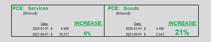
That’s right: The sale of services in September — which, again, are about 2X the size of the goods segment — is 6% higher than pre-pandemic. But the sale of goods is thru the roof: Up 21% from pre-pandemic metrics. Could this “goods” demand increase be driving month-over-month inflation up? Clearly, the answer is an obvious “yes.”
Why is demand for “goods” so much higher?
What would cause such a large increase? Cash. The American consumer is flush with cash. Just as earnings growth can propel the S&P to record highs, record amounts of cash in the hands of consumers can — and will — propel PCE expenditures to new highs.
But even as consumer spending and expensive steak sales increase in today’s environment, my friends over at Yardeni Research have opened my eyes to something I had not previously understood. Take a look at the image below, courtesy of Yardeni, that tracks personal consumption expenditures movement since 1960 — more than 60 years in total. The grid lines on both the left hand side and the right are identical. Thus, its easy to see that TOTAL PCE — as a percentage of ‘current dollar’ GDP — has increase generally consistently, year after year. Total PCE is the blue line, and it has increased from about 60% of the US economy back in 1960 up to almost 70% today. Again, this is why consumer spending is such an important metric for us to track when attempting to forecast GDP performance, and why the SHI, in my humble opinion, is an excellent alternative indicator for consumer spending.
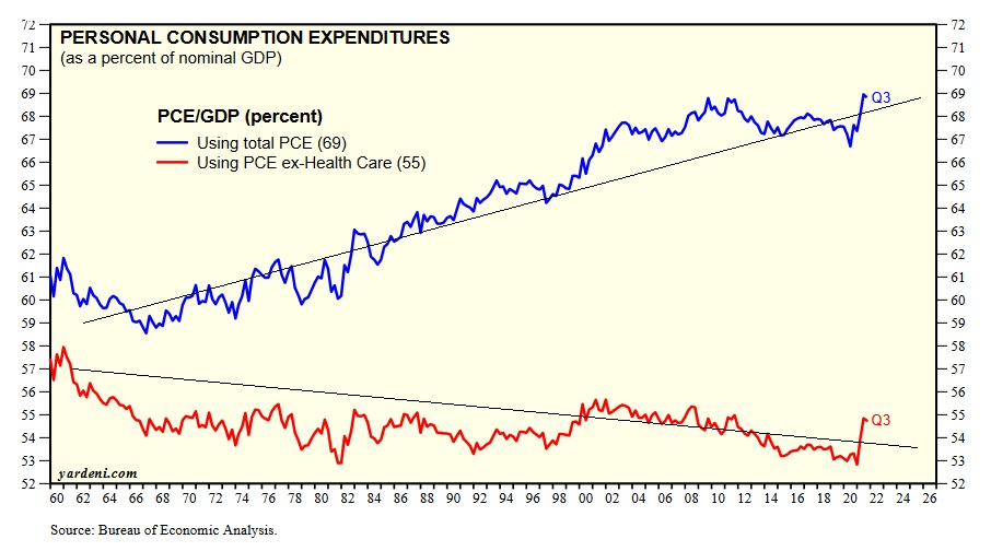
The dark cloud here, in my opinion, is the red line. The red line shows the change in PCE since 1960 — after subtracting American consumer spending on healthcare. In fact, the PCE excluding healthcare was about 57% of the nominal GDP 60 years ago. Today, the PCE excluding healthcare is closer to 54 or 55%. Why is this a dark cloud? Because unlike “fun” spending on new washing machines, vacations to Bora Bora, or ridiculously expensive steak dinners at Mastros, consumer spending on healthcare is often not so much a choice but a need. Sure, some healthcare is a choice — cosmetic surgery, for example — but most, I suspect, is not. The growth in spending within this segment, over the past 50 year, is downright staggering:
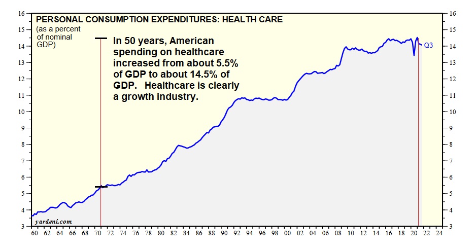
I’ve highlighted the time-period between 1971 and 2021 — a 50 year span. Healthcare spending has almost tripled during this time.
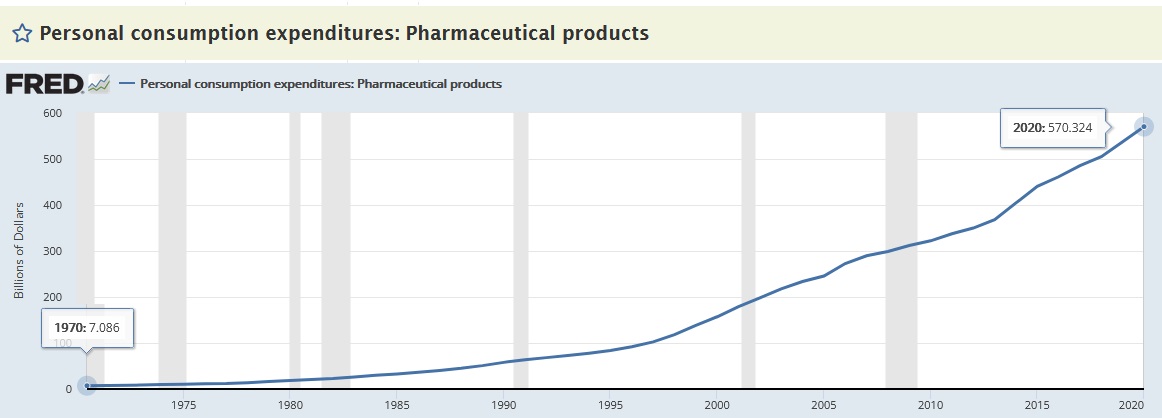
Digging even deeper into healthcare spending, the sub-category of “pharmaceutical products” — which is included as a part of “other nondurable goods” like games and pet products — we see even more staggering growth: Back in 1970, Americans spent less than $7 billion a year on pharma products. 50 years later, our spending increased to over $570 billion per year, as you can see in the chart below.
Perhaps like me, you’ve been wondering why just about every other TV commercial (yeah, I watch TV) seems to be a drug commercial. I would think the list of side effects, would be enough to scare everyone far away from the drug. But apparently I’m wrong. I’m guessing the drug companies hope the “consumer” watching the TV show and commercial will ask their doctor about the advertised drug. Who will then prescribe it. That game plan must work really well … because American pharma spending is thru the roof and still climbing:
Is the growth in healthcare and pharma spending a good thing or bad? As usual, I’ll sidestep that debate, and leave it to the politicians. However, after joining me on this short detour thru the labyrinth of consumer spending, I suspect you too can see why healthcare cost has been such a large political hot-potato in recent years. Americans are spending more money than ever before on healthcare and drugs, and the shape of the curves above, as well as US demographic trends, suggest even more increases in the future.
In years to come, might healthcare spending “crowd out” other, more enjoyable, PCE discretionary spending by Americans? Perhaps. The data suggests that is a legitimate question. Remember: This was all pre-Covid. Rampant increases in pharma spending may have been an “American Thing” pre-Covid … but now, I’m guessing, it may become a world-wide thing. Time will tell.
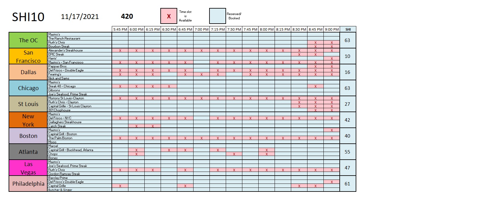
Time for a steak. Last week’s reservation demand trend continues this week. Even St Louis is back in the ‘black’ this week:
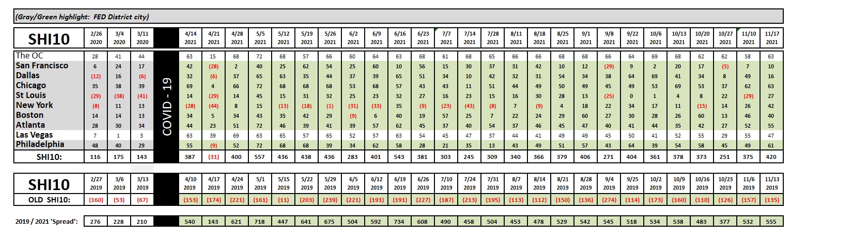
Here’s the weekly SHI10 chart:
Expensive eatery reservation demand in San Francisco remains a bit weak, and for some reason Dallas isn’t hankering for a steak this Saturday either, but reservation demand in most of the other SHI markets remains robust.
This is a choppy economy, filled with many challenges and roadblocks. And disagreement. The “experts” seem at odds on just about every economic issue. Ignore the noise. The US economy remains on solid footing. GDP growth, I believe, will be exceptionally strong this quarter. To be frank, I’d probably be more worried if most forecasters agreed with me. 🙂
Happy Holidays!
<:> Terry Liebman