SHI 4.3.19 — Inversion Reversion, Fear and Loathing

SHI 3.27.19 – Why Inflation Matters
March 27, 2019
SHI 4.10.19 – Steaks, Nighttime Lights and the GDP
April 10, 2019
“I googled ‘yield curve inversion’ and got 23.6 million hits in 0.51 seconds.”
There is no doubt: Yield curve inversion is a popular topic! And we all know why: Because ‘inversion’ it is a much-ballyhooed, highly-precise recession indicator, right? It is widely believed that inversion is the beginning of a one-two punch: First … curve inversion, then — RECESSION!!!
Sorry but it’s not that simple. The duration and depth of the inversion matter, too. Remember: this is economics! Nothing in economics is ever simple! 🙂
Welcome to this week’s Steak House Index update.
If you are new to my blog, or you need a refresher on the SHI10, or its objective and methodology, I suggest you open and read the original BLOG: https://www.steakhouseindex.com/move-over-big-mac-index-here-comes-the-steak-house-index/
Why You Should Care: The US economy and US dollar are the bedrock of the world’s economy. This has been the case for decades … and will be true for years to come.
But is the US economy expanding or contracting?
According to the IMF (the ‘International Monetary Fund’), the world’s annual GDP is about $80 trillion today. US ‘current dollar’ GDP now exceeds $20.89 trillion. In Q4 of 2018, nominal GDP grew by 4.6%…following a 4.9% increase in Q3. We remain about 25% of global GDP. Other than China — a distant second at around $12 trillion — the GDP of no other country is close. We can’t forget about the EU — collectively their GDP almost equals the U.S. So, together, the U.S., the EU and China generate about 2/3 of the globe’s economic output. Worth watching, right?
The objective of the SHI10 and this blog is simple: To predict US GDP movement ahead of official economic releases — an important objective since BEA (the ‘Bureau of Economic Analysis’) gross domestic product data is outdated the day it’s released. Historically, ‘personal consumption expenditures,’ or PCE, has been the largest component of US GDP growth — typically about 2/3 of all GDP growth. In fact, the majority of all GDP increases (or declines) usually results from (increases or decreases in) consumer spending. Consumer spending is clearly a critical financial metric. In all likelihood, the most important financial metric. The Steak House Index focuses right here … on the “consumer spending” metric. I intend the SHI10 is to be predictive, anticipating where the economy is going – not where it’s been.
Taking action: Keep up with this weekly BLOG update. Not only will we cover the SHI and SHI10, but we’ll explore related items of economic importance.
If the SHI10 index moves appreciably -– either showing massive improvement or significant declines –- indicating growing economic strength or a potential recession, we’ll discuss possible actions at that time.
The BLOG:
What causes yield curve inversion? Try to think of the yield curve as a ‘see-saw,’ much like you would find in a child’s playground. Usually the bottom (left) is low, and the top (right) is high. But when in an inverted state, the opposite is true. And this is typically the result of the FED (left side) pushing short term rates UP at the same time global bond traders/investors (right side) pushing longer term rates DOWN.
Bond traders push long-term rates down via a simple “herd” mechanism: When traders in the aggregate believe long-term rates will be lower in the future than they are today, they increase their holdings. Once the demand increase pushes the “supply/demand” equilibrium out of balance — where demand exceeds current supply — bond prices increase and yields decrease. Over time, assuming the FED holds short-term rates constant, the curve inverts.
Here’s the ’10-year minus the 3 month’ Treasury chart covering the past three (3) recessions, courtesy of our friends at the St Louis FED. The red arrows show when the inversion first appeared … and the vertical gray bars show the beginning, and duration, of the following recession. But remember: Per the NBER (National Bureau of Economic Research), a recession usually begins after two consecutive negative GDP readings. And since we only get actual GDP readings many months after the end of a calendar quarter, we won’t know we’re IN a recession until close to 8 months after we actually are. Here’s the chart:
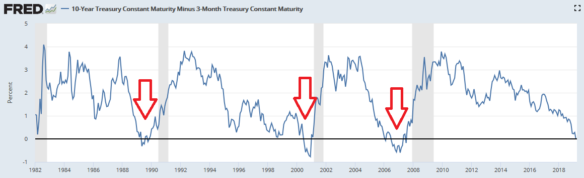
We can glean the following facts from the chart:
- The 10-yr/3-mo curve inverted in December of 1988. In July of 1990, the recession began.
- Again, it inverted in May of 1998; the recession was here in March of 2001.
- Finally, it inverted in December of 2005; the recession began in December of 2007.
There are three (3) important takeaways here. First, the inversion period is always a number of months. Not just a few days. Meaning those bond investors are committed to their positions — they are convinced long term rates will decline.
Second, a recession did not follow shortly after inversion. In fact, in each case above, about 2 years passed before U.S. GDP growth turned negative.
And here’s the third — which, frankly, you cannot see in this chart. After each inversion settled in for a month or two (or 3), the FED began to cut short-term rates. Thereby ending the curve inversion. Said another way, had the FED not cut rates, the inversion would have lasted much longer than it did.
And so, here are the conditions I need to see before I believe a recession is heading our way a year or two in the future:
- Yield curve inversion for at least 1-2 consecutive months.
- A cut of at least 50 basis points in the FED funds rate.
Inasmuch as neither has happened yet, a recession is not yet in the cards. Not yet.
Let’s see if the steakhouses agree.
Before I bring up the charts, I have some sad news: The Morton’s in Miami has closed its doors. Here is the image I saw today when running my restaurant reservation check on OpenTable:
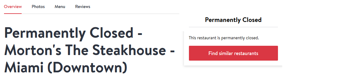
So sad. 🙁
But given the fact that Miami reservation demand for our pricey steakhouses has been weak, at best, for as long as we’ve tracked the market, I can’t say I’m overly surprised. Frankly, there is no expensive steakhouse in the city of Miami that has ever rivaled the reservation demand we have seen in other marketplaces, like Seattle, Dallas or here in the OC. Perhaps their lease was up. And they elected not to renew, due to weak long-term demand. But this possibility aside, the closure might suggest something more sinister is at work here. Perhaps Morton’s is throwing in the towel in Miami … believing the economy is turning — or has turned — negative.
Because our long-term trend chart is suggesting this might be the case. Once again, this week’s SHI10 reading is far below expectations, when compared to the reading from this week, one year ago:
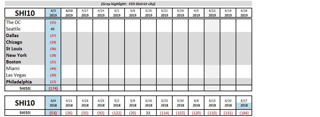
Let me summarize. Sink your teeth into this data:
- 3/20/19 – our SHI10 reading was a negative <143> compared to a <46> from a year ago.
- 3/2719- our SHI10 reading was <153>; last year, <66>.
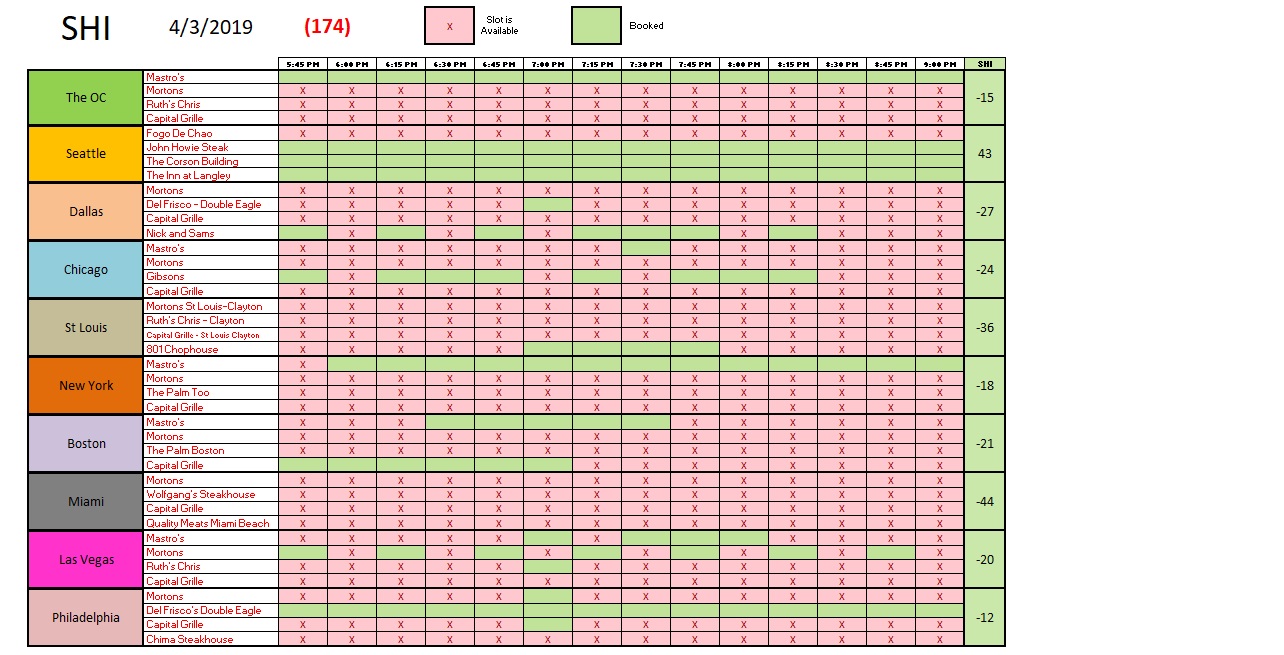
- 4/3/19 – the reading was a whopping negative <174> vs a negative <53> a year ago.
For three weeks now, restaurant reservation demand in our high-brow steakhouses has been way, way down. This is not a positive trend.
Here is the current week SHI10:
But I’m not yet worried the U.S. is slipping into a recession. Yes, I believe we’re now experiencing slower GDP growth … but growth nonetheless.
If you really feel compelled to worry about something, how about this? Debt. I’m not worried about U.S. debt (beyond, of course, our national debt accumulation). No, U.S. has deleveraged fairly nicely since the ‘Great Recession.’ Except for student debt — which is growing like a weed — and auto loans to a lesser degree, U.S. household debt is not appreciably higher than 10 years ago. Take a look:
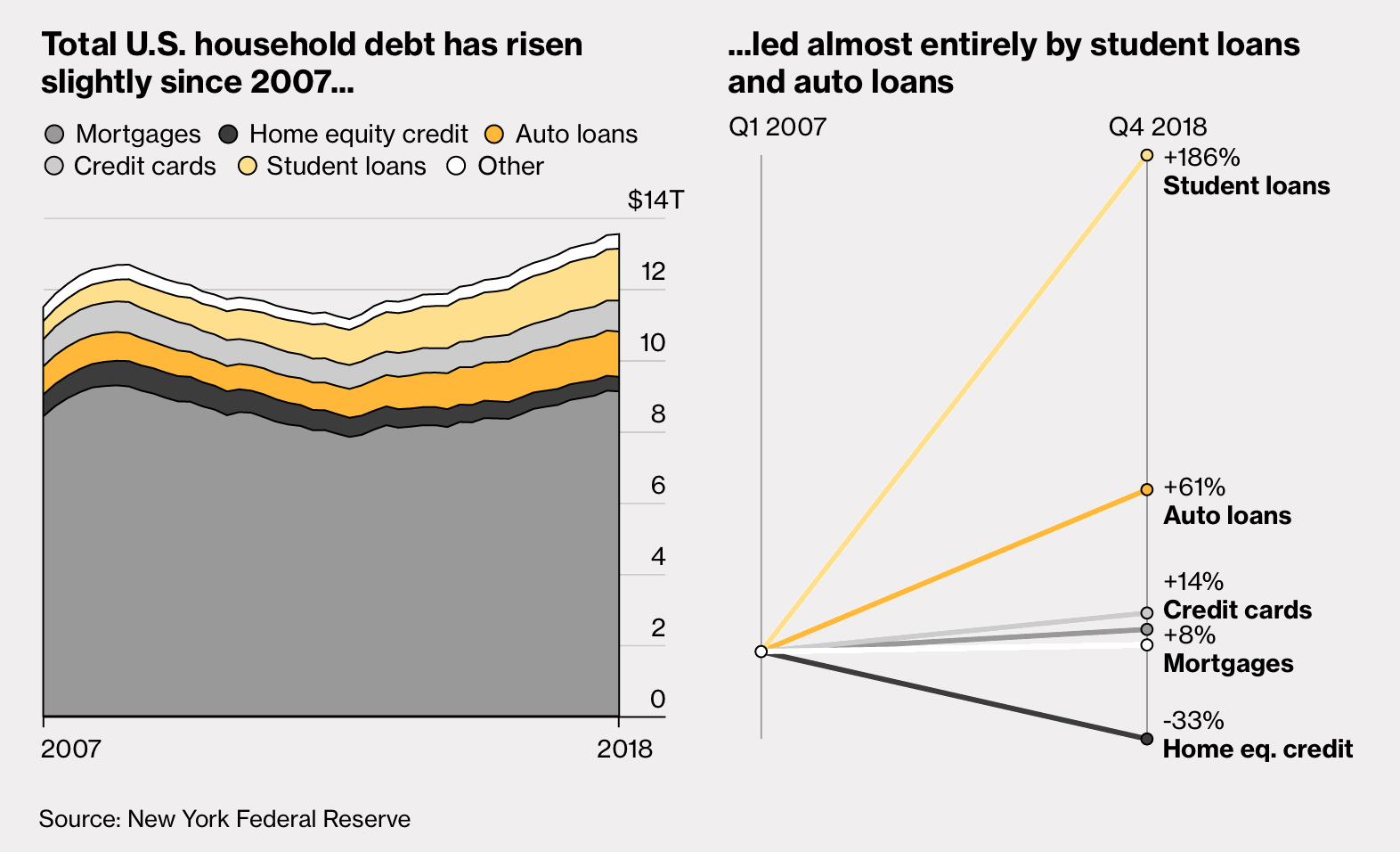
(Student debt is something else to worry about. It has doubled in size in the past 10 years: from $1.36 trillion to over $2.7 trillion today. Staggering.)
No, the debt we need to worry about is China. Take a look:
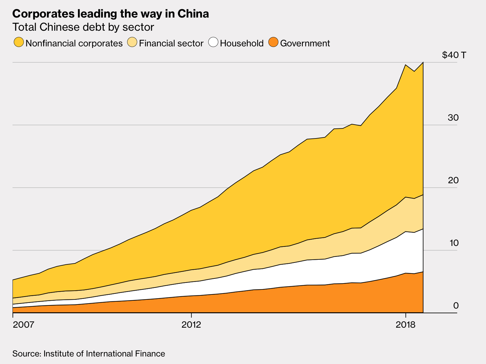
It’s worth noting that China’s total debt load has increased 7X since “the Great Recession” of 2008. I’ll repeat: China debt has grown seven fold in about 10 years. China’s ‘private sector’ has taken on 70% of all new debt in the world since the financial crisis. That’s amazing.
When 2009 began, China’s annual GDP was around $5 trillion. Today it exceeds $12 trillion. Much of their growth has been fueled by this massive debt run-up. This trend cannot continue. At $40 trillion today, China’s total debt dwarfs every other country on the planet with the sole exception being the U.S. Arguably, some would say this is as it should be. After all, they have the 2nd largest GDP on the planet, too. But their debt growth rate is unsustainable. At this rate (7X in 10 years), China’s debt would equal $280 trillion in 10 years — more than the total of all debt of all countries combined.
Which means their GDP growth rate — which has been highly correlated with debt growth — will moderate downward, too. This is something to worry about … for us and for Premier Li. And it’s another reason for China to settle the trade “dispute” with the U.S. Which I believe they will. Soon.
No … the U.S economy has picked up a few scrapes and bruises in the past 6 or so months, but we’re still chugging along. Slower perhaps, but we’re still chugging. 🙂
- Terry Liebman