SHI 9.4.19 – Global Government Debt

SHI 8.28.19 – It Depends on How You Look at It
August 28, 2019
SHI 9.25.19 – Recession Talk
September 25, 2019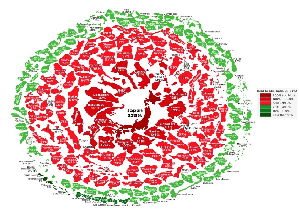
“Piles of government debt. Some negative, some positive. You have questions? Here are some answers.”
The image above was borrowed from: https://howmuch.net/articles/state-of-the-worlds-government-debt If you want to get really worried, really fast, click the link (right click, open in a new window.) It looks scary to me!
And here’s another deep dive into debt, courtesy of the World Economic Forum: https://www.weforum.org/agenda/2019/01/visualizing-the-snowball-of-government-debt
Even without knowing how much government debt is sloshing around the globe, everyone tracking economic events knows a ton of government debt sports negative yields today. Folks seem content lending money to governments with no return at all … even negative returns. This condition is both unusual and unprecedented.
I wanted to understand … so I went looking for answers … answers to questions such as these:
-
What’s the total? How much debt do countries have?
-
Who owns the debt (meaning, who is the ‘lender’)?
-
How much of the total government debt has a negative yield?
-
What durations (across the country’s yield curve) are negative yielding … are any durations positive?
-
How much of the country’s debt is owned by its central bank?
-
Will US interest rates go negative?
And finally, and perhaps most importantly:
Should I be worried?
Permit me to answer this question first. It turns out the answer is ‘no.’ Don’t worry. At least not yet. Let me explain below.
Welcome to this week’s Steak House Index update.
If you are new to my blog, or you need a refresher on the SHI10, or its objective and methodology, I suggest you open and read the original BLOG: https://www.steakhouseindex.com/move-over-big-mac-index-here-comes-the-steak-house-index/
Why You Should Care: The US economy and US dollar are the bedrock of the world’s economy. This has been the case for decades … and will be true for years to come.
But is the US economy expanding or contracting?
According to the IMF (the ‘International Monetary Fund’), the world’s annual GDP is about $85 trillion today. US ‘current dollar’ GDP now exceeds $21.3 trillion. In Q2 of 2019, nominal GDP grew by 4.6%. The US still produces about 25% of global GDP. Other than China — in a distant ‘second place’ at around $13 trillion — the GDP of no other country is close. The GDP output of the 28 countries of the European Union collectively approximates US GDP. So, together, the U.S., the EU and China generate about 70% of the global economic output. This is worth watching carefully, right?
The objective of the SHI10 and this blog is simple: To predict US GDP movement ahead of official economic releases — an important objective since BEA (the ‘Bureau of Economic Analysis’) gross domestic product data is outdated the day it’s released. Historically, ‘personal consumption expenditures,’ or PCE, has been the largest component of US GDP growth — typically about 2/3 of all GDP growth. In fact, the majority of all GDP increases (or declines) usually results from (increases or decreases in) consumer spending. Consumer spending is clearly a critical financial metric. In all likelihood, the most important financial metric. The Steak House Index focuses right here … on the “consumer spending” metric. I intend the SHI10 is to be predictive, anticipating where the economy is going – not where it’s been.
Taking action: Keep up with this weekly BLOG update. Not only will we cover the SHI and SHI10, but we’ll explore related items of economic importance.
If the SHI10 index moves appreciably -– either showing massive improvement or significant declines –- indicating growing economic strength or a potential recession, we’ll discuss possible actions at that time.
The BLOG:
As I write this blog post, total government debt is about $63 to $64 trillion. Quite a pile, right? Did you think the number would be bigger? I did. The negative debt phenomenon, too, is troubling. What does it portend? Let me start today’s blog post at the end, and then I’ll return to the beginning:
-
Japan is an enigma; almost all their debt is owned by their central bank or Japanese citizens/entities. As their debt is “internal” and yen-denominated, it poses no threat to global financial markets.
-
The United States and the European Union countries, together, owe about half of the $63-64 trillion owed by ALL governments.
-
Because the population of the EU is shrinking, their economies will probably shrink. Hoping to moderate the effect ‘shrinkage’ will have on their collective economic performance, the ECB has “eased” financial conditions and bought about half the debt issued by EU countries, driving yields on EU debt far into negative territory.
-
Fear not: The same will NOT happen here in the US. US interest rates will, in general, remain positive.
Now, let’s head back to the beginning.
People have been borrowing money for thousands of years. The term “debtor” appears in the King James Bible. According to Wikipedia, “Interest is the fee paid by the borrower to the lender.”
But not anymore. This is no longer true. Never before, not one time in the 5,000 or so years that people have been borrowing and lending money, have they paid the borrower to get the borrower to take their money. So why now? What’s changed? This is where I started.
“What’s changed?,” I asked myself.
Why are lenders accepting negative interest rates today? This seems crazy! Let’s dig in and look for some answers.
First, take a look at my chart below. It is packed full of data from many different sources. Let me walk you thru it.
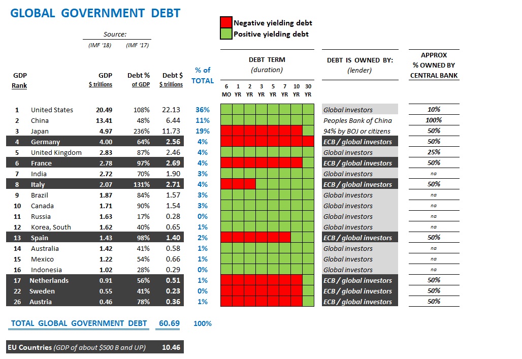
- The left column shows each country’s GDP ‘rank’ — compared to the other 190 or so countries on the globe. As we know, the US is #1. As you can see, the GDP of only sixteen (16) countries exceeds $1 trillion. Note: Countries which are members of the ‘European Union’ are highlighted in BLACK with white lettering.
- To make visualization easier, the “GDP” number for each shown is $ trillions. For example, Germany shows a GDP of “4.00”. This means their annual GDP is $4 trillion. And so on.
- The “Debt %” reflects the most recent measure, per the International Monetary Fund, of each country’s debt-to-GDP ratio. In this column, we see Russia has the lowest debt-to-GDP ratio.
- And then we have the actual amount — again in $ trillions — each country owes. The US? We owe about $22 trillion. Japan? Almost $12 trillion. And check out Japan’s debt-to-GDP ratio … at 236%, the sheer size of this number is staggering and alarming!
- The ‘% of Total” column — in light blue — illustrates what percent of the TOTAL GLOBAL GOVERNMENT DEBT each country shown actually owes. See the top 3? Interesting right?
- And then we get to the green and red grid. What does this grid tell us? It tells us two things: (1) whether the country’s debt is sporting a positive (green) or negative (red) yield, and (2) which yields are negative; more specifically, which durations are negative? For example, in France, all debt durations are now negative except their 30-year debt. Right now, that debt security is paying about 0.4% per year. It remains positive. For now. 🙂
- Who owns the debt? Said another way, who — specifically — is the ‘lender?’ Look at the BLACK-highlighted EU countries: Their debt of these countries is owned by both the European Central Bank and ‘global investors.’
- Finally, what percentage of each country’s debt is owned by that country’s central bank? Here in the US? About 10% of outstanding Treasury debt is owned by the FED. How about China? 100%. Every single penny of Chinese debt issued by the Chinese treasury is owned by the ‘PBOC,’ or Peoples Bank of China.
I’m sure you’ll agree, there’s a lot of data here. So let me offer a few summary points:
First, TOTAL GLOBAL GOVERNMENT DEBT is not as large as I expected. Sure, I don’t have all 190 countries listed here. But I’ve listed the countries that owe the vast majority of the outstanding debt. For example, with a ‘debt-top-GDP‘ ratio of almost 182%, Greece is probably in deep trouble. They have WAY TOO MUCH DEBT given the size and strength of their economy. How much does Greece owe? About $340 billion. With a debt-to-GDP ratio of about 120%, Portugal, too, owes a bunch of money. About $250 billion. Add up all the debt from these smaller economies and we find maybe another $2 or $3 trillion of sovereign debt floating around out there. Not insignificant, by any measure, but not enough to worry about, in the big scheme of things.
Summarizing, here are the important things to note about total global government debt for the countries in the chart shown above:
- The total is about $63 trillion.
- The US owes about 1/3 of this total; Japan, another 11%; and the EU countries, another 10%. Combined, these 3 countries (groups) owe about 60% of all sovereign debt.
- All the other 185+ countries in the world, combined, owe only about 40% of the total debt.
Take a closer look at China and Japan. Almost all their debt is “internal.” Meaning that either their central bank owns the debt, or their citizens own the debt. Only a very small portion of Japan’s debt is owned by non-Japan citizens or entities. For this reason, in my opinion, neither of these countries presents a systemic concern in my opinion.
Is the US hogging the global debt markets? Sure. We are. But we’re also the wealthiest country on the planet. You may recall from a prior blog post the “total net worth” of all global citizens was pegged at around $317 trillion. Per the Federal Reserve “Z.1 Financial Accounts of the United States” report, released in June of this year, the “Household net worth” of all Americans combined is almost $109 trillion — ironically almost exactly equal to the percentage of US debt to total global government debt.
Understanding the chart above, I’m no longer worried about a global sovereign debt crisis. Sure, there are problems brewing. For example in Greece and Argentina. But these countries, in my opinion, are unlikely to be a contagion. Over the long-term, of course, if the EU economies shrink meaningfully, they run the risk of (1) deflation and, (2) a challenge repaying their debts. But this outcome, if it occurs, is too far in the future to worry about today.
This “negative debt thing” on the other hand, is troubling.
Not because the concept of negative rates is, in itself, a problem. No, the problem is more that every bank, life insurance company, and pension fund, around the globe, was designed to function in a positive interest rate environment. Long-term, rate-sensitive institutions and instruments we designed on a foundation of positive yields.
And here’s where I see a silver lining to the storm clouds. A small one, perhaps, but a silver lining nonetheless. Look at the above chart again. You’ll see that almost all the negative debt is issued by EU countries. In fact, other than Japan, ALL the negative debt belongs to the EU countries. Why? Well, I contend this is the result of 2 dynamic factors:
- The populations of these countries are shrinking, year after year. Japan’s is the fastest shrinking country on the planet. I believe every country in the EU has a ‘fertility rate’ below the replacement rate of 2.1. Even worse, of the three EU countries with the largest GDPs — Germany, France and Italy, only France is close to neutral (with a fertility rate of 1.96%). Germany has a fertility rate of 1.5% … both Italy and Spain are down closer to 1.3%. Ouch. As they shrink, their labor force will shrink, and their GDPs won’t be too far behind.
- Their central bank — the ECB — has purchased about 1/2 of all available EU country debt. The ECB, by their actions, has effectively pushed yields into the negative.
By comparison, look at the debt yields of the other countries on the chart above. They are green. These are countries with growing populations, growing labor forces, and growing GDPs. They have positive yields on their government debt. With their growth, they experiencing some inflation and GDPs growth. I believe the yield on their debt will remain positive.
The fertility rate in the US, however, is now below replacement. By the most recent count, we are at an all-time low of 1.73. Ouch. Yet our general population is still growing. At the slowest rate since 1937, but still growing. How can this be true with the low fertility rate? Immigration. Immigrants still believe “America’s streets are paved with gold.” 🙂
With the dollar at the world’s reserve currency, and a still-growing population and labor force, generally speaking I don’t think the US will join the EU countries in negative rate territory. However, our population and labor force growth rates are low. And as a result, I expect our interest rates to be very low as well. For a protracted period. There is a larger discussion here around the relationship with interest rates and inflation, but I will save that for another day.
The population story is contributing to the problem in another way: As a country’s population ages, consumption falls and savings increase. Generally, savers seek “safe” investments, such as bonds, annuities, CDs, etc. Thus the pool of funds seeking “safe” returns grows larger and larger. The size of this capital “pool” seeking safe returns has never been larger than it is today. Viewed thru the lens of “supply and demand,” we can see that the enlarged size of this investment pool would have the effect of pushing down yields and interest rates.
For now, I’ll summarize with this comment:
I believe US interest rates will generally remain positive.
Could the FED lower their short-term rate into negative territory? Yes. This could happen. In fact, shorter dated maturities might go negative. Possibly. Maybe. Remember: The US yield curve is currently inverted. Absent inflation, only with a series of FED rate cuts will the inversion be eliminated. And if longer-dated maturities are very low, the FED funds rate and other ultra-short durations may dip into negative territory. For a period of time. And then return to positive when the FED begins to lift rates again.
Phew. I need a fully loaded baked potato. And a steak. And a glass of 1999 Opus One.

Which is a good thing … because few people are heading to our steakhouses on Saturday. This weeks SHI10 reading of negative (274) is the lowest reading we’ve ever had. Ouch. Even Seattle is feeling the pinch. Of the 40 restaurants we track nationally, only three (3) have no availability on Saturday. If this becomes a trend, this is concerning. Here is the longer term trend chart:
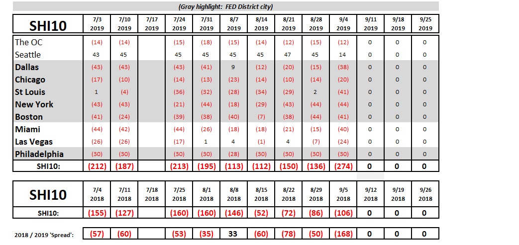
It’s easy to see this week’s index numbers are very weak. This week’s reading is 168 points below the same week in 2018, and far lower than the index value from the past 3 or 4 weeks.
The FED‘s Beige Book was released today. The FED produces this economic update 8 times per year. As you know, the Beige Book reviews overall economic condition in each of the FED 12 districts across the country — 6 of which (highlighted in gray above) are also in our SHI10. And what’s the ‘general’ message from the Beige Book:
“Economic activity expanded at a modest pace.”
In most districts. In some, activity remained unchanged. But no district reported robust growth. Interesting. Is this expansion running out of steam? That seems to be what the SHI10 is telling us. If this trend continues, it will be time to batten down the hatches. Stay tuned.
Oh, one final comment: While the timing is definitely bad, the Steakhouse Index is going on vacation! I planned this trip a year ago … so unfortunately, the timing can’t be helped. Sorry, but unless time (and technology) permits as I travel, don’t expect to see another blog post for a couple of weeks. I suggest you visit a few steakhouses, in my absence, for personal research. 🙂
– Terry Liebman