
SHI Update 6/28/17: Inflation? Where?
SHI Update 6/21/17: Slowdown
June 21, 2017SHI Update 7/5/17: A Shrinking World
July 5, 2017
Where the heck is inflation?
In the May press release, the BLS told us the US unemployment rate is now 4.3%. According to the folks at the St. Louis FED, the “natural long-term unemployment rate”, commonly referred to as “NAIRU,” is 4.73%. Thus, at present, the unemployment rate (UR) is below NAIRU by about 0.43%. With a labor force or around 160 million, the math suggests we’re short about 680 thousand workers.
Economic theory and the FED are both heavily reliant on the “Phillips Curve.” This theory suggests that when the UR is below NAIRU inflation increases dramatically.
Thus, according to the FED, higher inflation should be here now. Now that the US unemployment rate has fallen significantly below NAIRU, competition for labor should trigger a sizable increase in wage-generated inflation. Should, perhaps, but it has not. They seem puzzled.
I am not. I believe their methodology is flawed.
Welcome to this week’s Steak House Index update.
As always, if you need a refresher on the SHI, or its objective and methodology, I suggest you open and read the original BLOG: https://terryliebman.wordpress.com/2016/03/02/move-over-big-mac-index-here-comes-the-steak-house-index/)
Why You Should Care: The US economy and US dollar are the bedrock of the world’s economy. Is it expanding or contracting?
The world’s GDP is about $76 trillion. Our US GDP is almost $19 trillion — about 25% of the total. No other country is even close.
The objective of the SHI is simple: To help us predict US GDP movement ahead of official economic releases — important since BEA data is outdated the day they release it.
‘Personal consumption expenditures,’ or PCE, is the single largest component of US GDP. In fact, the majority of all US GDP increases (or declines) usually result from (increases or decreases in) consumer spending. Thus, this is clearly an important metric to track. The Steak House Index focuses right here … right on the “consumer spending” metric.
I intend the SHI is to be predictive, anticipating where the economy is going – not where it’s been. Thereby giving us the ability to take action early. Not when it’s too late.
Taking action: Keep up with this weekly BLOG update.
If the SHI index moves appreciably – either showing massive improvement or significant declines – indicating expanding economic strength or a potential recession, we’ll discuss possible actions at that time.
The BLOG:
The FED relies on ‘Phillips Curve’ theory as the basis for their inflation forecasts. In a nutshell, Phillips Curve theory suggests there is an inverse relationship between the unemployment and inflation rates for any given time period. Sounds logical. But it doesn’t work. The Phillips Curve is great theory, but that’s all it is. Theory. Reality is much different.
I’ve reviewed the actual quarterly data for the past 65-70 years … beginning 1/1/1949 thru 1/1/2017. I’ve compared the relationship between the unemployment rate, NAIRU, and the CPI for each calendar quarter. By subtracting the NAIRU rate from that same quarter’s unemployment rate (as we did above), I find we’ve had many periods where the unemployment rate was below NAIRU — which, per the Phillips Curve, should trigger rampant inflation. This condition existed in almost every quarter of the 1950s, from 1964 to 1974, and then for scattered periods of time since then. The CPI during many of these time periods was high – sometimes quite high.
Anyone remember Gerald Ford’s campaign to “whip inflation now!” back in 1974? President Ford declared inflation to be “public enemy number one” in a Congressional speech on October 8, 1974. How did he plan to beat this enemy? By making and distribution button-pins to all Americans. “W.I.N.” buttons were whipped up, handed out … and almost immediately became objects of ridicule. And they did not work. 🙂
Inflation increased dramatically. The CPI peaked in 1980 at almost 14.5%. Ouch. And while wage inflation was rampant, it was most certainly the effect of the inflationary spiral, not the cause.
There is no meaningful correlation between inflation and unemployment. Sure, there were time periods where the UR was far below NAIRU, AND the CPI (and wage growth) was extraordinarily high. But the opposite has also been true: From late 1952 thru 1956, this same condition existed, but the CPI was quite low — and for over a year, it was negative!
In the past 7 decades, we’ve seen time periods where results seemed to support the theory. And many others where they did not. Remember: At its core, the theory makes sense. It sounds right: When the unemployment rate falls too low, and an economy effectively runs out of workers (labor), then the price (wage) for each subsequent ‘unit’ of labor should increase. Simply another play on ‘supply’ and ‘demand.’ When demand exceeds supply, the price increases. Makes sense.
It just doesn’t work. Not convinced yet? Let’s get a bit more scientific.
Here is a recent data set. There are 59 calendar quarters between January of 2000 and August of 2014. In 15 of those 59 quarters, the unemployment rate was below NAIRU. Here is a scatter graph of the unemployment and inflation data, courtesy of Wikipedia:

Notice the big, red arrow? This is a statistical metric called “R squared.” In statistics, R-squared is commonly called the “Coefficient of Determination” for a reason: the closer to 1 an R-squared value becomes, the stronger the correlation between the two variables. The closer to zero, well, then the correlation is highly suspect.
Our R2 value is 0.271. That’s pretty close to zero. The Phillips curve doesn’t work. It is not an accurate predictor of future inflation.
Still not convinced? Well, then consider this: ROBOTS! I know, I know, I do like talking about robots. But for good reason. Automation, ML, AI are already removing jobs from our economy. Why do you think Amazon bought Whole Foods? Bloomberg has an opinion:
“It’s an example of the technological forces that are increasing competition and further limiting companies’ ability to pass on higher wage costs to customers.”
I agree. Are you familiar with Amazon GO and its success in Seattle? No? Well, take a look at this YouTube video:
https://www.youtube.com/watch?v=NrmMk1Myrxc
Amazon clearly plans to use Whole Foods to expand the Amazon GO footprint across the US. And, while they do, eliminate a bunch of grocery store jobs, which will enable them to lower prices even further. Fewer jobs, lower prices…no inflation pressures here. (For now. In 2025…we may see a different story.)
The condition of labor is now far different than at any time in history. Today, our US labor force includes the “civilian labor force”, technology, automation, ML and AI — and the labor/automation available to US companies in many countries across the globe.
Like it or not, today, labor is exceedingly fungible. Quickly and at lower cost. This fact make the Phillips Curve even more obsolete as an inflation forecast tool.
I know what you’re wondering: Might the Whole Foods acquisition soon lower steak prices at Mastros? Probably not. But lack of demand might. Let’s see how popular our pricey eateries are faring this week:
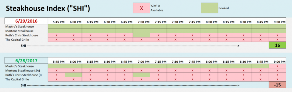
Not too well. One year ago, on June 29th, both Mastros and Mortons were fully booked. Today, neither is. In fact, while Mastros continues to perform admirably, demand for our other three extravagant epicurean eateries seems to have fallen off the map. Consider this: Mastros Ocean Club aside , we haven’t seen strong reservation activity in any other restaurant since May 17 — about 6 weeks ago:

It’s clear to me we’re seeing a slowdown in reservation demand. This week’s SHI is a <negative -15>; one year ago, we saw a positive 16. This is a massive spread. In fact, if the SHI is a proxy for the consumer spending component of GDP, as our theory states, then we are definitely seeing a large, meaningful slowdown in consumer spending.
Will the SHI prove a better predictor of future events than the Phillips Curve? I believe my theory has predictive value, but time will tell. The good news: We won’t have to wait decades to find out. If consumer spending is slowing, we should see it’s effect in the Q3 GDP figure being released on October 17th.
While we wait, permit me to summarize the inflation debate above with a few recent comments from the President of the Chicago FED, Charles Evans:
“For me, it just seems like technology keeps moving, it’s disruptive, and it’s showing up in places where — probably nobody thought too much three years ago about Amazon merging with Whole Foods.”
Evans tells us he is less confident than most of his colleagues at the FED that inflation will soon rise to the 2 percent target. He remains concerned that deflationary competitive pressures could have become more important for the overall trend in prices than the Phillips Curve relationship.
Ultimately, if unemployment continues to fall and inflation doesn’t respond, the Phillips Curve may fall further out of favor as a guide to inflation dynamics, and by extension, interest-rate policy, Evans commented to CNBC: “If that’s the case — and I think that’s just speculative at this point — then it means we need even more accommodation to get inflation up,” he said.
I couldn’t agree more.
- Terry Liebman


2 Comments
Love your analysis and blog. Best, Rob
Thanks Rob!