SHI 6.8.22 – Where Did You Go?

SHI 6.1.22 – More Whisper than JOLT
June 1, 2022
SHI 6.22.22 – We Are Not Alone!
June 22, 2022
After reading last week’s blog, one of my 6 readers asked a great question: “Where did they go?”
Of course, he was referring to the Civilian Labor Force, which I’ll now call the “CLF,” and the fact that per official government statistics it shrunk substantially in early 2020 as the pandemic began, as I reported in last week’s blog. Millions left the labor force when the pandemic hit. Where did they go? A great question.
It’s a great question because upon reflection, it does seem odd that the CLF could shrink. After all, measuring the CLF is a lot like measuring the US population – in theory, it really shouldn’t be highly variable. Especially because the CLF is highly correlated with total population. In fact, it the CLF is a sub-set of the US population, defined as:
“…all people age 16 and older who are classified as either employed or unemployed.”
Well, that’s simple enough. All Americans. 16 and older. And either employed or unemployed. That should include everyone over the age of 16, right? By this standard, the calculation should be quite simple. But, as you’ve probably guessed by now, it is not.
“
Where did they go?”
“Where did they go?”
Like many government statistics and metrics, the answer is nuanced, a bit complex and quite interesting to an Econ-nerd like me. 🙂
Welcome to this week’s Steak House Index update.
If you are new to my blog, or you need a refresher on the SHI10, or its objective and methodology, I suggest you open and read the original BLOG: https://www.steakhouseindex.com/move-over-big-mac-index-here-comes-the-steak-house-index/
Why You Should Care: The US economy and US dollar are the bedrock of the world’s economy.
But is the US economy expanding or contracting?
Expanding. Significantly. By the end of Q1, 2022, in ‘current-dollar’ terms US annual economic output clocked in at $24.38 trillion. Yes, during Q1, the current-dollar GDP increased at the annualized rate of 6.5%. The world’s annual GDP rose to about $95 trillion at the end of 2021. America’s GDP remains around 25% of all global GDP. Collectively, the US, the euro zone, and China still generate about 70% of the global economic output. These are the big, global players.
The objective of this blog is singular.
It attempts to predict the direction of our GDP ahead of official economic releases. Historically, ‘personal consumption expenditures,’ or PCE, has been the largest component of US GDP growth — typically about 2/3 of all GDP growth. In fact, the majority of all GDP increases (or declines) usually results from (increases or decreases in) consumer spending. Consumer spending is clearly a critical financial metric. In all likelihood, the most important financial metric. The Steak House Index focuses right here … on the “consumer spending” metric. I intend the SHI10 is to be predictive, anticipating where the economy is going – not where it’s been.
Taking action: Keep up with this weekly BLOG update. Not only will we cover the SHI and SHI10, but we’ll explore “fun” items of economic importance. Hopefully you find the discussion fun, too.
If the SHI10 index moves appreciably -– either showing massive improvement or significant declines –- indicating growing economic strength or a potential recession, we’ll discuss possible actions at that time.
The Blog:
The math should be simple: If you add all the “employed” people together with the “unemployed” people, the number should be fairly constant. Sure, some older workers retire. And some pass away. But one would think that the number of people over the age of 16 who are either employed or not should, in theory, be fairly consistent.
Yet the CLF fell from about 164.5 million in February of 2020 all the way down to 156.3 million in April of 2020. Said another way, in only 2 months, the CLF precipitously declined by 8.2 million people – an almost 5% drop! Where did they go?
The nuance is in the definition of “employed.” Believe it or not, the employment status of a US citizen over the age of 16 is not binary. People are considered to be “not in the labor force” if (1) there were not employed during the survey week and (2) they had “not actively looked for work” for some reason within the past 4 weeks. So what does “not actively looked for work” mean? Well, those people might be “discouraged workers”, “not available to take a job”, “marginally attached” to the labor force, and the list goes on. Perhaps this graphic, courtesy of the Bureau of Labor Statics, will help:
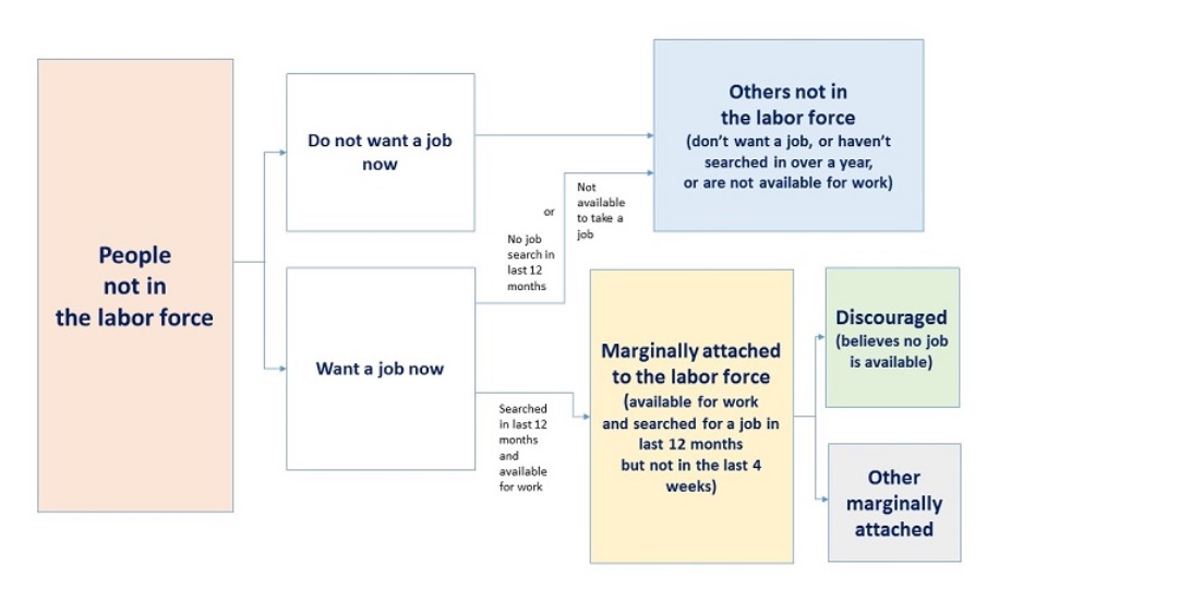
Summarizing, for a variety of reasons, by April of 2020, 8.2 million Americans who were in the labor force in February told the BLS surveyors that they were no longer in the labor force just 2 months later. The categories above excluding people which include words like “in over a year” or “in the past 12 months” clearly don’t apply – as only 2 months had passed. During those 2 months, for some reason the “do not want a job now” respondents must have grown significantly. Is this what happened?
Essentially, yes. Clearly, the “do not want a job now” group increased in size post-pandemic. But before we look deeper into the numbers and causes, it’s important to note that while labor force participation plummeted in April of 2020, it recovered significantly by June. By June, survey’s showed that the CLF had regained about 3.5 million; thus, the longer-term decline in the CLF, post-pandemic, was probably closer to 4.5 million folks, or about 2.8% of the labor force. I’m of the opinion that this segment of the “do not want a job now” were likely initially anxious and frightened at the pandemic start and decided, for personal safety reasons, to stay home. Borrowing a term from the FED, this group’s fear proved “transitory.” Within a few months, they returned to the labor force and the job hunt.
But about 4 and ½ million did not quickly return to the labor force. So where did they go?
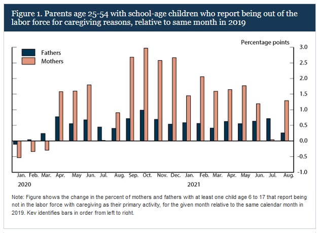
Many went home to care for their kids. You’ll recall schools were closed, due to pandemic shut-downs. Thus, when asked, “Are you looking for a job?,” their answer was a resounding no. And the vast majority were women, as this image courtesy of the BLS clearly demonstrates:
So part of the answer of “Where did they go?” can be answered: Home. To provide daycare. But that’s not the entire answer.
As you may have suspected, if paid to stay home, some members of the labor force did precisely that. CNBC has recently conducted a number of surveys that delve into this murky topic. In one survey, they asked 2,000 respondents if the “pandemic unemployment benefits” offered by both state and federal agencies “enabled (you) to remain out of work longer.” It probably comes as no surprise that about half of the respondents said yes. Essentially, one out of two remained out of the work force for a longer period of time than if unemployment benefits were lower or unavailable.
Summarizing, once the initial shock and fear dissipated somewhat, the number one reason many left the labor force was child-care. The #2 reason was compensation: If some people were paid “enough” to not work, that was their choice. Clearly, “enough” is an individual choice and calculation.
In February of 2020, the labor force participation rate (“LFPR”) – or the percentage of the American population ages 16+ either working or actively looking for work – stood 63.3%. And despite improvement since then, the LFPR has remained depressed relative to its pre-COVID level. The most recent official metric suggests the LFPR was at 62.3% as of May, 2022, exactly 1% below the 2020 peak. In other words, about 1.6 million people who were in the labor force pre-pandemic remain out of the labor force today.
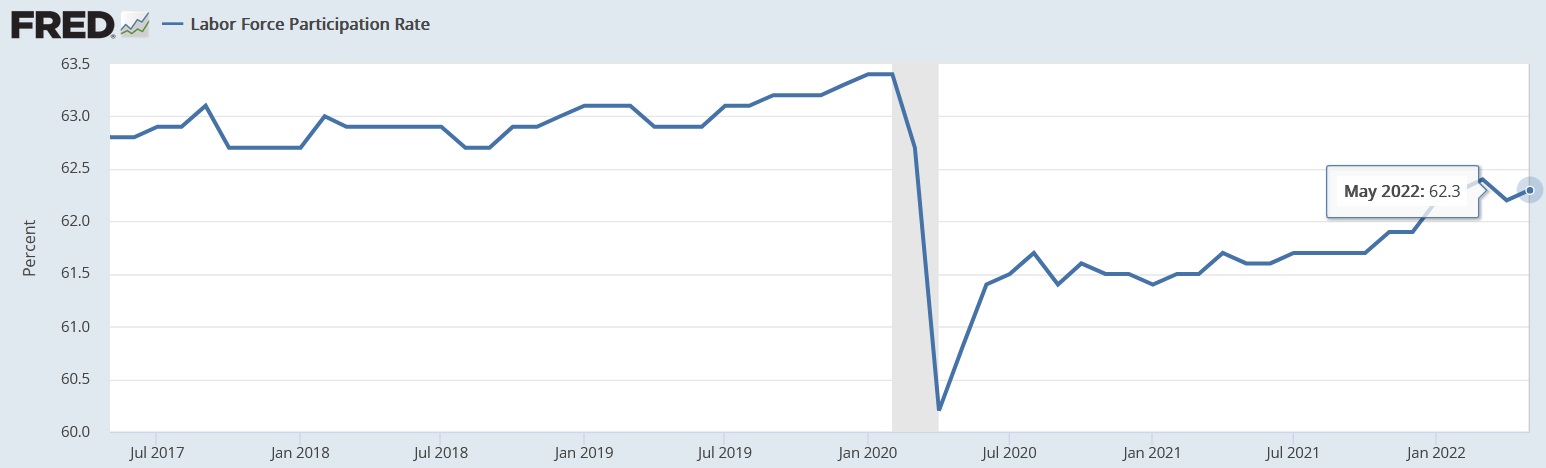
I could go on and on … but I suspect even my most ardent and nerdy readers grow weary at this point. So before we head to the steak houses, I’ll close with this comment and suggestion: As this century began, our American labor force participation rate peaked at just over 67%. It has steadily declined since that time. The trend-line is down. I’ll leave you with both the hyperlink (below) and this question: Why? Why has the long-term trend-line been heading down for over 2 decades now? (Right click, open in new tab — this may help find your answer.) 🙂
https://fred.stlouisfed.org/series/CIVPART
Is it time for a glass or two of a 2000 vintage Chateau Lafite Rothchild? And a New York strip? Join me at Mortons – they need the business!
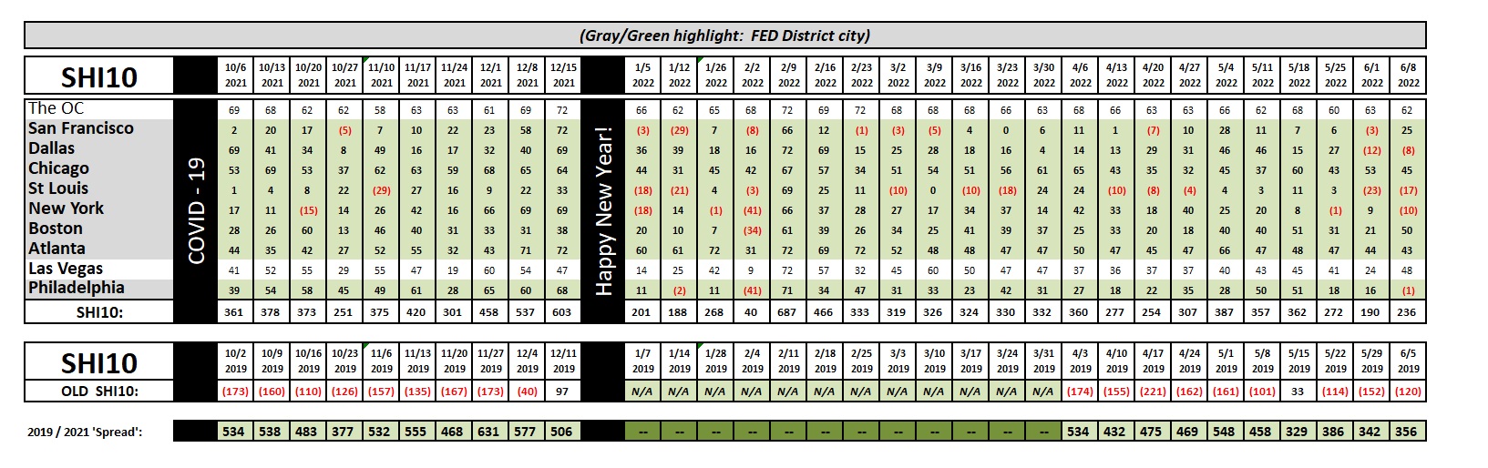
Consistent. This week’s SHI10 reading is consistent. The SHI is telling us this Saturday’s reservation demand at pricey steak houses is relatively unchanged week-over-week. Of course, we are generally lower than a month or two ago … so while the SHI suggests the US economy is “stable,” it is stable at a lower output level. Opulent eatery reservation demand in the OC is almost unchanged W-O-W, reservation demand in Boston seems to have spiked, and NYC is weaker; but, overall, this weeks reading is benign. Here are the individual restaurants in each of the ten (10) SHI markets.
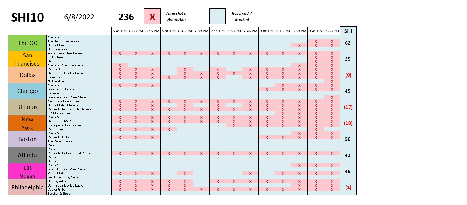
I do find it interesting that certain expensive eateries are consistently fully available. Mortons in St Louis, for example. It seems one can always get a table for 4 at Mortons on Saturday. The same seems true for Alexanders Steakhouse in San Francisco. But if you plan to weekend in Atlanta, and you’re hankering for a beautifully grilled steak, you’d better plan ahead. Marcel, Chops and Bones are almost always fully booked. Fascinating.
The economy is chugging along … steady as she goes. For now, at least, clear skies and smooth sailing.
<:> Terry Liebman