
SHI 8/9/17: Fact, Opinion or Fiction?

SHI 8/2/17: Where’s the Beef?
August 2, 2017
SHI 8/16/17: Cornucopia
August 16, 2017
How can we tell economic “fact” from “opinion” … and even worse, hooey?
I keep CNBC on constantly. This TV show does an adequate job, keeping their finger “on the pulse” so to speak, following meaningful financial news. Of course, every few minutes they have a new guest who shares his or her thoughts on the issue of the moment.
Recently, one guest opined that “Gross Output” was a much better economic growth barometer than “Gross Domestic Product.” GO, he commented, proves the US economy is growing much, much faster that we think it is. Interesting.
Another guest, Larry Kudlow, suggested American worker’s income is actually increasing much faster than the BEA “Employment Situation Summary” posted on August 4th would have us believe. “Really?”, I thought. Sure, he said, while the BEA stated “average hourly earnings” for employees increased by only 2.53% Y-O-Y from last July, simultaneously the “index of aggregate weekly hours” also increased by 1.68%. If we combine the two, Larry claimed, employee earnings are growing at over 4% per year!
I was intrigued by both comments. I decided to dig a bit deeper to see if these opinions are meaty fact we can sink our teeth into, more of an opinion, or just the inedible fatty gristle at the edge of a beautifully grilled rib-eye.
Welcome to this week’s Steak House Index update.
As always, if you need a refresher on the SHI, or its objective and methodology, I suggest you open and read the original BLOG: https://terryliebman.wordpress.com/2016/03/02/move-over-big-mac-index-here-comes-the-steak-house-index/)
Why You Should Care: The US economy and US dollar are the bedrock of the world’s economy. At present, is the US economy expanding or contracting? We need to know.
The world’s GDP is about $76 trillion. At last count, our ‘current dollar’ US GDP is now over $19 trillion — about 25% of the total. No other country is even close.
The objective of the SHI is simple: To help us predict US GDP movement ahead of official economic releases — important since BEA data is outdated the day they release it.
‘Personal consumption expenditures,’ or PCE, is the single largest component of US GDP — about 2/3 of the total. In fact, the majority of all US GDP increases (or declines) usually result from (increases or decreases in) consumer spending. Thus, this is clearly an important metric to track. The Steak House Index focuses right here … right on the “consumer spending” metric.
I intend the SHI is to be predictive, anticipating where the economy is going – not where it’s been. Thereby giving us the ability to take action early.
Taking action: Keep up with this weekly BLOG update.
If the SHI index moves appreciably -– either showing massive improvement or significant declines –- indicating expanding economic strength or a potential recession, we’ll discuss possible actions at that time.
The BLOG:
What exactly is “Gross Output?” It is another economic metric calculated and tracked by the BEA. Like the GDP, the GO tracks — and sums — the sales or receipts of industry. Unlike the GDP, the GO includes both the “value added” and what are called “intermediate inputs.” Simply said, intermediate inputs represent the goods and services used by industry to produce the final good or service.
Which means the GO double-counts the data, generating a result that I feel is a bit misleading. I’m all for robust numbers, but if an economic metric leads us to an unsupported conclusion, we have to question it’s value as a forecasting tool. But don’t just take my word for it. Here’s what the BEA had to say about Gross Output:
“Because gross output reflects double-counting — both the sales of intermediate and final products — it is often referred to as “gross duplicated output.””
Yes, I’m quoting. These are the BEAs words. “Gross duplicated output?” Well, gee, that’s not much of a testimonial.
Sure enough, when we compare GO to GDP we see that GO is typically significantly more robust than GDP:
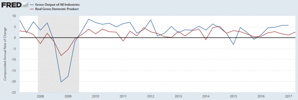
Sure enough, the blue line (GO) definitely swings both higher and lower than the red line (real GDP.)
In Q1 of 2017, real GDP measured 1.23%. Gross Output, on the other hand, grew at the whopping (annualized) rate 5.67%! Wow! This is a staggering growth number! If this metric is an accurate barometer, our US economy is growing like a weed! Even double-counting the “inputs” couldn’t account for this wide divergence … so I dug a bit deeper. Here is the BEA comment about Gross Output in Q1 2017:
“Real gross output—principally a measure of an industry’s sales or receipts, which includes sales to final users in the economy (GDP) and sales to other industries (intermediate inputs)—increased in the first quarter. This reflected increases in real gross output for both the private goods- and services-producing sectors, while the government sector decreased. Overall, real gross output increased in 15 of 22 industry groups.”
OK … that sounds pretty good. 15 out of 22 industry groups experienced output growth. Excellent. Let’s dig a bit deeper. Here’s a “Gross Output” chart from the BEA Q1 report entitled, “Gross Domestic Product by Industry”:
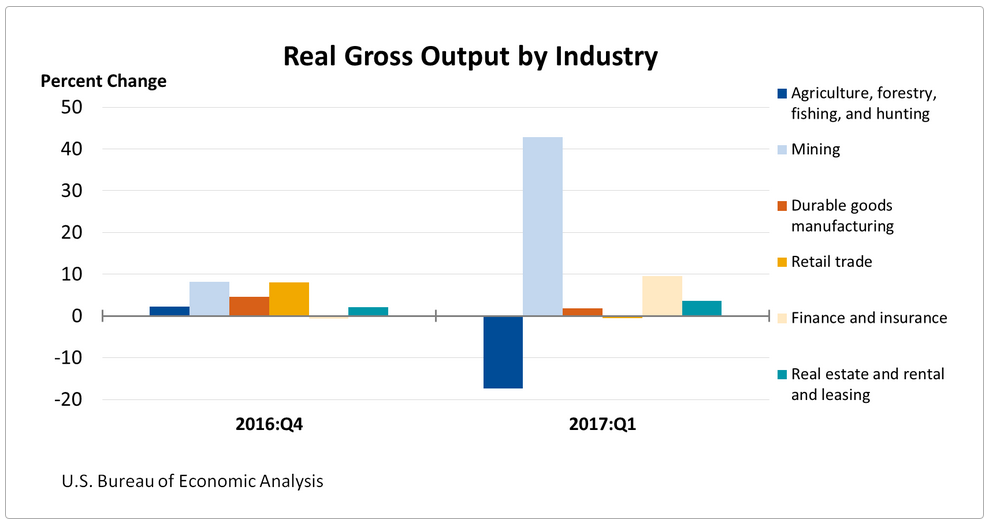
Whoa! Check out that light blue colored bar! “Mining” is the group represented by the light blue bar. Apparently miners went crazy during Q1…mining away…generating a huge amount of output. What were they mining? Gold? Silver? Palladium?
No. Oil. Oil and gas exploration activity is contained within the “mining” category. O&G extraction propelled this segment up 42.8% over the prior quarter. In the words of the BEA:
“The first quarter growth primarily reflected increases in oil and gas extraction, as well as support activities for mining. This was the largest increase since the fourth quarter of 2014.”
Right. Sure enough, if we take a look at the Baker Hughes ‘Rig Count’ data for the US, we see the following:
- Drilling Rigs in service on December 30, 2016: 815
- Drilling Rigs in service on March 31, 2017: 979
An increase in rig count of over 20% in Q1 … and rig count continues to grow. At last count, on 8/4, the number was up to 1,171. (Here’s some interesting fact: After peaking at a count of 2,026 on November 4, 2011, the US rig count fell all the way to 404 on May 27, 2016. Quite the roller coaster.)
Clearly the increased US rig count and improved operating efficiency generated a massive increase in gross output within the mining segment. However, counting the investment in new rigs AND the increased output from those rigs is double counting. And it dramatically overstates the strength of our economy. It’s misleading. Total hooey.
Clearly, GO is not an accurate barometer of US economic growth.
What about Larry Kudlow’s comment? Was Larry spouting fact or fiction? Like most folks using statistics to prove their point, the answer is a little of both. Remember, “there are three kinds of lies: lies, damned lies, and statistics.” I’ve always loved that expression … and it definitely fits here.
Larry is right. “The Employment Situation,” released by the BEA on August 4th does — in fact — unequivocally show Y-O-Y income growth in the 4% range. You have to dig pretty deep to find it…all the way to Table B-3 (page 33 of 39) and Table B-9 (page 39 of 39). But the data is there. It’s accurate. Good.
The problem is not the data but how it’s being used. Like the other guest who wanted us to believe the economy is much stronger than the GDP suggests, Larry is suggesting wage growth is much stronger than the BEA data “hourly earnings of all employees on private nonfarm payrolls…” suggests. It would be inaccurate to state wage growth is up 4%. Earnings may be — when we combine the 2.53% Y-O-Y earnings growth — with more hours worked.
But, once again, it’s a bit misleading. Because an increase in “hours worked” is finite … people cannot continue to increase the number of hours worked, year after year, indefinitely. Unlike potential wage increases, time is finite. Total employee income will increase commensurately with the number of hours worked, but that’s no way to “prove” we’re experiencing a stronger economy. Sorry Larry. While your comment is not complete hooey, neither is it completely accurate.
Unfortunately, this type of data manipulation by economists and forecasters is fairly common. Further, as economics is often more theory than fact, we can quickly see why there are so many conflicting financial and economic opinions floating around.
For example, compare “economics” to “physics.” I’ve never heard gravity described as a theory. As Robin Williams once said, “Gravity works.” It’s easy to predict that a dropped object will fall to the earth. Economic forecasting, on the other hand, involves more theory and opinion. And as one moves from “macro” to “micro”, the theory framework becomes even more pronounced. I believe “economic theory” does a better job explaining large directional moves, not precise outcomes.
In my opinion, economic data analyses are typically inherently flawed. And if the analysis itself is not, the manner in which the data is used often is.
Consider the CPI, the GDP and the unemployment rate, U-3. All 3 of these metrics are promoted by the experts as “facts.” But nothing could be further from the truth. Not only is the design of the foundational methodology flawed based on data inclusion or exclusion (designer bias), but over time, as the world evolves over long periods of time, rarely does the methodology. Sometimes data that may prove valuable to the analyst is simply unavailable, or more difficult to obtain than the benefit created.
So, more important than any one number, is the rigid consistency of the analysis process itself. Maintaining consistency in the data set, the analysis timetable, etc., in itself creates a framework wherein the perfection of the design is less important than the consistency used in applying the process. Done correctly, the movement — or change from one metric to the next, over time — becomes the meaningful variable.
For example, consider today’s official “unemployment rate” of 4.3%. This number is very low by historic standards. It’s the trend, not the number itself, that speaks volumes. As we know, another name for the unemployment rate is U-3. There are 6 unemployment metrics — ranging, for course, from U1 to U6. Which one is the “best?” Who knows.
The methodology behind each is flawed — this cannot be helped. But it’s the movement of the metric over time — which when calculated using a rigid, consistent time-based methodology — that’s important. That movement is the gem. Not the number itself. Because that number is rarely precise, rarely accurate.
It’s the trend that matters. Does this help you better understand the theory that frames the SHI?
In your mind, create a mental image: Imagine our steakhouse are actually a series of “buckets” … arranged like a vertical fountain, where the bucket highest up — once full — overflows into the bucket below. In this mythical fountain, Mastros Ocean Club is the top bucket. The next rung is, perhaps, Ruths’ Chris, followed by Mortons and, finally, The Capital Grill at the bottom.
The SHI theorizes that if Mastros is fully reserved (meaning, their “bucket” is full), consumer demand will simply cascade down into the Ruths’ Chris bucket. And once RC is full, demand will simply “overflow” and cascade down, once again, this time into Mortons bucket. And finally into The Capital Grille. Easy to visualize, right?
Imagine a condition where (1) everyone in Orange County loved steaks and (2) everyone in OC had tons of money and insisted a nice steakhouse was on the menu for Saturday. In that case, all 4 of our elegant eateries would be fully booked … but they would “fill” in order of popularity. Presumably following my “bucket theory” above. Until they were all full.
And the opposite, I’m suggesting, is true as well. The fact that Mastros is consistently the only opulent eatery filling each week suggests consumer demand is, overall, weak. And once again, the pattern repeats today:
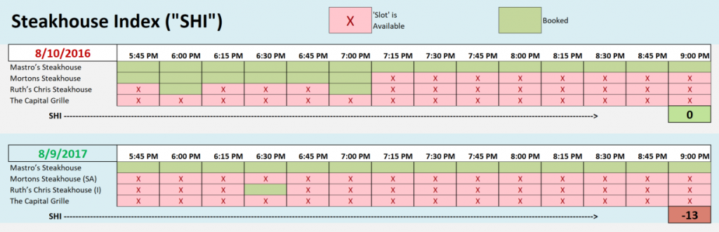
This week, the SHI reading is a negative <-13.> Which follows on the heals of a negative 15 reading last week. It’s interesting to see the numeric difference between last year’s SHI readings and those we’re seeing this year. It appears the gap (the bottom gray bar below) is hovering right around 14 points for each week in the last month:

Permit me to summarize: The SHI is only meaningful if it proves to be an accurate “macro” barometer for consumer spending. If that proves true, perhaps over time I’ll work on the precision of the predictive ability…but for now, I’m simply curious to see if it helps show general direction of future GDP releases. Time will tell.
But for now, once again, the SHI is predicting no change in GDP growth. Still weak, but steady.
- Terry Liebman

2 Comments
Nice research and analysis. And, true, only time will tell!
Correct you are. Only time will tell!